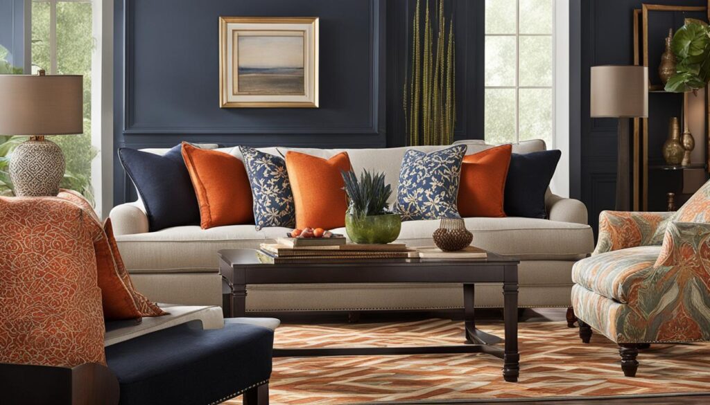
As a lover of all things design, I’ve discovered the transformative power of decorating with patterns. There’s a world of difference between a bland space and one that sings with personality, and often, it’s the artful mixing of patterns that hits the right note. In the quest to create a living room that feels both unique and cohesive, the secret lies in mastering the subtle dance of mixing patterns. Through interior design, we can weave together diverse textiles and prints, constructing a narrative in our living spaces that is as compelling as it is comfortable. Let’s unpack how to navigate the rich tapestry of mixed patterns and turn your living room into a visual symphony.
Key Takeaways
- Mastering decorative patterns means combining different designs and colors for a personalized look.
- Understanding pattern scale and color schemes is essential for a balanced living space.
- Patterns can add depth and character to a room when mixed with intention and strategy.
- Creating a cohesive pattern mix involves a mix of different scales and types of patterns.
- Effective pattern pairing elevates the style and vibe of a living area, making it truly your own.
The Basics of Pattern Play in Home Decor
Decorating with patterns that go together is an art that transforms a living space from the mundane to the extraordinary. It’s about striking a balance between variety and cohesion, creating a tapestry of textures that delights the eye. Whether you’re a seasoned interior designer or a home decor enthusiast, understanding the basics of pattern play is essential for crafting aesthetically pleasing interiors.
Understanding the Visual Impact of Patterns
Patterns have the power to influence a room’s atmosphere. They can make a space feel larger, cozier, or more structured, depending on their application. The key to using decoration patterns effectively lies in their visual impact—how they interact with space, light, and the other elements in a room. When I mix and match decor patterns, I’m conscious of not just their beauty, but also their scale, color, and texture.
Selecting the Right Patterns for Your Space
When it comes to how to mix patterns in interior design, selecting the right decorations is crucial. I advise starting with patterns that share a color palette or theme. This serves as a foundation, ensuring the various elements in the room communicate with one another harmoniously. From delicate florals to bold geometrics, each decoration pattern should complement rather than compete with the others.
The Power of Odd Numbers: A Decorator’s Secret
I’ve discovered a decorator’s secret: the use of odd numbers. Odd numbers create harmony and visual interest in a way that even numbers can’t quite match. When you’re ready to decorate with patterns, begin with three different patterns in various scales—small, medium, and large. This trio sets the stage for a dynamic but balanced look. And, once you’re comfortable with three, why not elevate your design game to five? It’s all about mixing patterns that bring vibrancy and character to your space.

Playing with Scale: The Key to Pattern Pairing
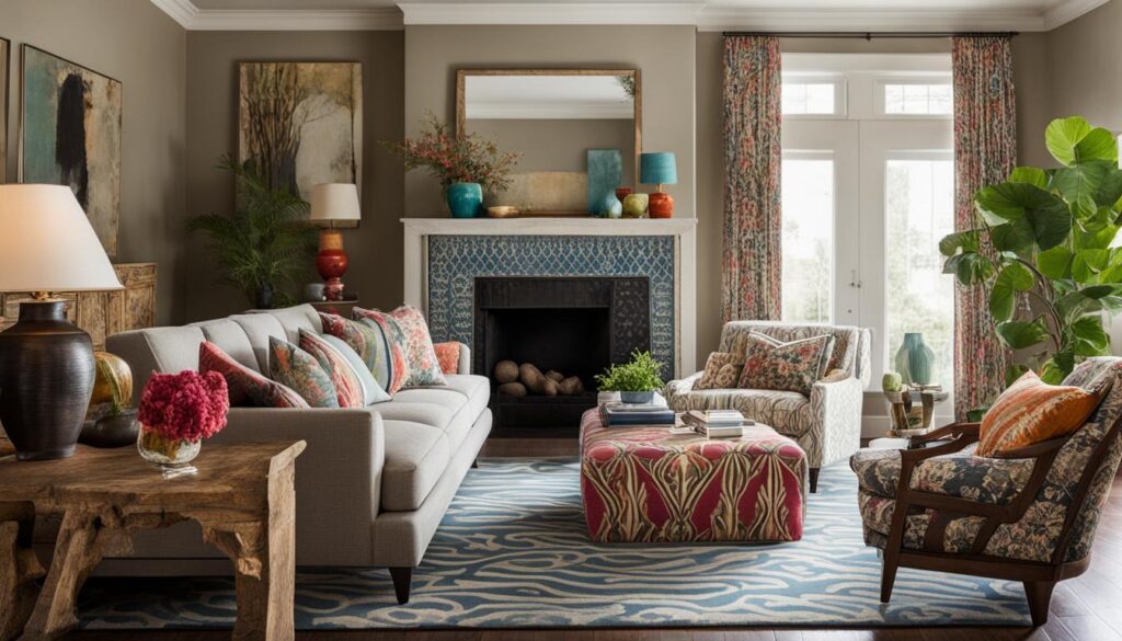
As I delve into the world of home decor, one principle stands out to me in the rules for mixing patterns in decorating—the significance of scale. My journey taught me that the right pattern size is as crucial as the pattern itself when designing a space. So, let me share with you how to choose and pair patterns with confidence.
- Anchor with Large Patterns: Start by selecting a large-scale pattern that ties together your color palette. This could be a vividly patterned wallpaper or an expansive rug that sets the stage for the rest of your space.
- Medium Patterns for Balance: The medium-sized patterns are your balancing act, ideal for drapes or accent chairs, ensuring that the pattern play flows naturally without overwhelming your senses.
- Accent with Small Patterns: Lastly, sprinkle in small patterns, like those on throw pillows or vases, to complete the layered look that gives your room character without clutter.
By understanding how to mix patterns effectively—working from large scales down to small—I’ve realized that coordinating decor can be less about matching and more about harmonizing. It’s all about creating a visually enticing landscape in your home where each pattern has its place to shine. Let’s continue to explore this magical approach to mixing patterns where scale is the maestro of your design symphony.

Mixing Geometric and Organic Motifs Seamlessly
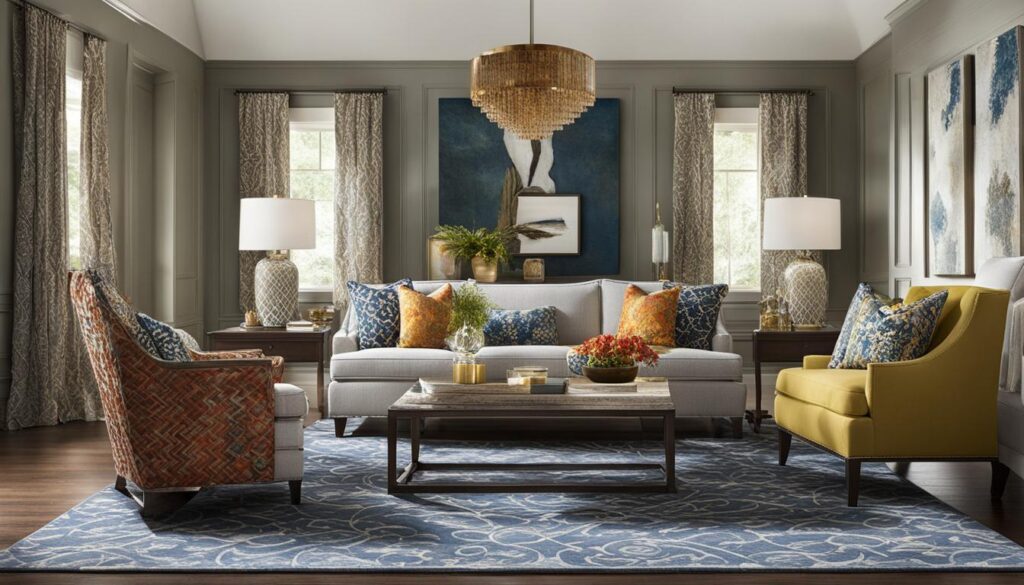
I’ve always been fascinated by the challenge of mixing prints in home decor, particularly when it involves mixing geometric and floral patterns. The interplay between the structured lines of geometric shapes and the natural, flowing forms of organic motifs can create a dynamic and engaging space. I believe that the key to a successful pattern mixing interior design is not just the patterns themselves, but the methodology behind the mix.
Large Patterns on Major Elements
In my work, I’ve found that starting with large patterns on major elements like wall coverings, rugs or statement furniture pieces acts as an anchor for the entire room’s aesthetic. By selecting a captivating, large-scale pattern that encapsulates the desired color palette, you set the stage for a cohesive look. This dominant piece serves as a reference point for all subsequent pattern mixing.
Coordinating Patterns Through Common Colors
Once the large patterns are in place, coordination is key. I aim to bring together medium and small patterns that echo at least one or two colors from the large pattern. This creates a sense of unity among diverse prints. For instance, if a large floral wallpaper features blues and greens, I’ll introduce a geometric pillow in a similar blue or a small-scale green botanical print in a throw. The result? A harmonious blend where both geometric and organic patterns shine without overwhelming the senses.
- Start with a striking large-scale organic or floral pattern on a major interior element.
- Introduce geometric patterns in medium and small scales to complement the larger design.
- Use a common color palette across different pattern types to unify the design.
Ultimately, it’s about balance and harmony. Whether you’re looking to create a bold statement or a more subdued ambiance, integrating geometric shapes with natural forms adds complexity and personal touch to your home’s decor. So go ahead, mix it up and watch your space come to life with the beauty of prints!
Color Harmony in Pattern Mixing
As I delve into the art of home decor, I’ve come to treasure one rule above all: maintain color harmony when mixing patterns. This approach has become my trusted method for ensuring that the blends of prints and patterns in my living space exude a seamless charm. Mastering how to mix prints and patterns in home decor all begins with aligning color intensities; a task that calls for a discerning eye and a penchant for coordination.
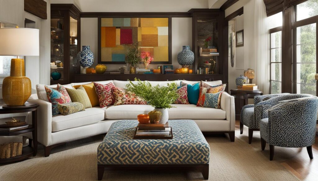

My journey in discovering patterns that go together has taught me the significance of pairing pastels with pastels for a soft, serene feeling, and bolds with bolds for a striking, vibrant presence. This not just avoids clashing but also weaves together a tapestry of designs that sing in visual symphony. In a monochromatic scheme, the beauty lies in the subtlety of different shades and tints of a single color—each layer adding depth and dimension to the space.
- Connecting patterns through a common pastel palette for a tranquil ambiance
- Mixing bold patterns for a dynamic, energetic decor
- Playing with various shades within a monochromatic scheme for subtle sophistication
Striking the right chord with color intensities paves the way for a harmonized home environment where patterns don’t just occupy a space; they tell a story. It’s a melody composed of designs and shades playing in concert—an interior symphony I’m continuously learning to conduct with artful mastery.
Monochromatic Magic: Using Patterns in Single-Hue Spaces
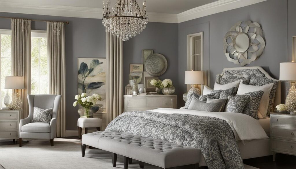
When I think about mixing patterns in the bedroom or anywhere in my home, there’s often a misconception that it requires a plethora of colors. Yet there’s something truly enchanting about the subtlety and depth a monochromatic scheme can offer. For those of us who adore patterned home decor, diving into a single-hue space doesn’t mean sacrificing complexity or flair. In fact, it’s an opportunity to showcase sophistication through the mingling of patterns, shades, and textures.

Varying Textures Within Monochrome
In my bedroom, the use of different textures plays a pivotal role in creating interest and dimension. A plush, knitted throw contrasts elegantly with smooth, satin sheets, both in the same color family yet delightfully distinct. Whether it’s a ruffled pillow or a sleek, modern lampshade, incorporating a variety of textures within a cohesive color palette makes all the difference.
Shades and Tints: Depth Without Contrast
I’ve discovered that introducing various shades and tints of a single hue adds an extraordinary depth to my space without the need for stark contrast. By experimenting with lighter and darker versions of the same color, I create a layered look that feels both cohesive and dynamic. This approach allows each pattern to stand out while still contributing to a unified design story.
- Silk vs. Linen: Combining glossy and matte finishes for a tactile experience.
- Sheer vs. Opaque: Playing with light and shadow through window treatments.
- Smooth vs. Embossed: Featuring varying textures for visual intrigue.
As I curate pieces for my monochromatic sanctuary, the interplay of the same hue in different mediums continues to be both a calming and creative journey — proving that the magic of monochrome is both limitless and enchanting.
Accenting with Solids for Balance
As someone who loves incorporating patterns in home decor, I find that there’s an art to creating a sense of equilibrium. Stylish patterned designs bring energy and personality to a room, but without balance, they can become overwhelming. That’s why I often introduce solid colors as a strategic counterpoint.

When and Where to Use Solid Colors
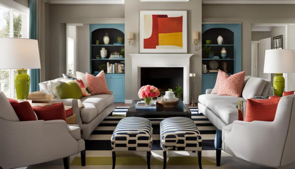
In a space abundant with patterns, solid accents provide moments of calm. I’ll often choose a hue from the pattern itself and add solid-colored pillows or throws to enhance continuity. Even in spaces like an eclectic living room or a boldly adorned bedroom, a solid rug or curtain can anchor the space, allowing other patterns to shine without competing for attention.
Giving Patterns a Visual Resting Place
The goal with solid colors is not to detract from the lively patterns but to give the eye a place to rest. Imagine a gallery wall full of vivid, varied artwork; it’s the neutral wall that frames and gives prominence to each piece. Similarly, a solid-colored lampshade or vase can provide a restful touch amidst a riot of pattern, offering balance and simplicity in a thoughtfully patterned room. By mindfully placing solids amid intricate designs, every element gets a chance to contribute to the room’s overall charisma.
Decorating with Patterns That Reflect Your Style
When I think about trendy patterned interiors, it’s not just about what’s in vogue; it’s about what feels right for me and my home. Using patterns in interior design is like speaking a language that expresses who I am without a single word. My selection isn’t just based on what’s popular; it’s deeply personal, influenced by my own tastes and life experiences. This is what makes my space authentic – filled with stories and reflections of my journey.
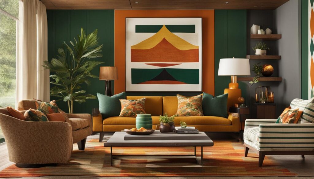
Florals and plaids have always given me that traditional comfort, while chevrons and ikats seem to strike a chord with my modern sensibilities. But why choose one over the other? In my home, I want to awaken every corner with character, and for that, I need to mix prints across different styles thoughtfully. It took trials and introspection, but now every pattern serves a purpose, telling a piece of my story.
- The intricate paisley of a throw pillow inherited from my grandmother shares space with the clean lines of a contemporary area rug.
- Vibrant geometric shapes on the walls cohabit with softly textured stripes on the upholstery.
- The calming hues of a striped vase provide a visual resting point amidst the lively chevron drapes.
This marriage of patterns doesn’t just happen; it’s curated. Each piece is a conscious choice, a harmonious part of the whole, much like every experience in my life contributes to who I am. Whether you’re a fan of trendy patterned interiors or prefer a timeless approach to using patterns in interior design, make sure it’s a true reflection of you.

In creating a home that feels undeniably mine, I’ve learned to listen—not to the fleeting whispers of trends, but to the enduring voice of my own style. And that’s the beauty of interior design; it’s a canvas for personal expression, a way to envelop myself in a comfort that’s as unique as I am.
Strategic Placement of Patterns for Cohesion
When I’m contemplating how to decorate with patterns, I always prioritize strategic placement. It’s not just about the selection of lively patterned accents for home decorating; placement influences the harmony within the space. It’s a careful balancing act to ensure the room feels both interesting and at ease, much like a well-conducted orchestra.
Creating Focal Points with Pattern Choices
A bold pattern on a large area rug or a vibrant accent wall can define the entire room, serving as a magnetic center that draws the eye and anchors the decor. I consider these to be my foundational pieces, upon which I build the character of the room.
Distributing Visual Weight Evenly
It’s essential for me to ensure that the visual weight of patterns is distributed evenly. This means integrating patterned accents like throw pillows, window treatments, or art pieces across the space. I find that this approach guides the eye smoothly around the room, allowing each design element to contribute to a sense of balance and unity.
- Avoid clustering all patterns in one area; it can overwhelm the senses.
- Use symmetry to your advantage; matching patterned accents on opposite sides of a room can be visually pleasing.
- Consider the sightlines from all entry points to the room to ensure cohesive visual flow.
With these strategies in mind, my ultimate goal is to craft spaces that feel cohesive, express my unique style, and most importantly, feel like home.
Consistency in Pattern Intensity and Room Themes
When I delve into the realm of patterned home decor, I always remind myself that the intensity of the patterns I choose sets the stage for the room’s narrative. Like a beautiful story, every element should contribute to a cohesive theme, weaving a seamless visual tale. To furnish tips for successful patterns for a beautiful home, I emphasize the importance of consistent pattern intensity.
Imagine walking into a room where the wallpaper shouts in vibrant geometrics while the understated, delicate linens whisper. The dialogue between decorations feels disjointed. To avoid this, I look for patterns from the same collection or those designed to work in concert. This not only maintains a harmonious intensity across different elements but also reinforces the room’s overarching theme.
Selecting the right intensity is much like choosing the volume for a piece of music in a space; too loud, and it overwhelms, too soft, and it’s lost. Here’s what I consider:
- The room’s purpose – a quiet study versus a lively living area demands different pattern intensities.
- The lighting – natural light can soften bold patterns, while artificial light might highlight subtle ones.
- The existing decor – I ensure that new additions complement rather than clash with what I already have.
Ultimately, a beautiful home resonates with the balance between pattern intensity and room themes. Matching energy and choosing compatible designs craft that visually captivating narrative we all seek to achieve in our home-spaces.
Conclusion
Embracing the creative journey of mixing patterns can infuse your home with both personality and sophistication. Adhering to some key guidelines, such as coordinating colors and balancing patterns, paves the way for a beautifully harmonious space. Remember, the effective use of patterns is not solely about adhering to rules; it’s also about trusting your instincts. Inviting patterns into your home decor should be a reflection of who you are—strive to create a space where your spirit feels at home.
Whether I’m selecting patterns for a vibrant living area or a serene bedroom, it’s all about crafting that perfect mix that speaks to my style. By maintaining a thematic consistency, I ensure that the various elements of my room interplay seamlessly, contributing to a cohesive feel. Tips for patterned home decor consistently point towards an intentional strategy, yet it’s important to let personal taste lead the way to a beautiful home.
So, while guidelines provide a solid foundation for starting your pattern-mixing adventure, allowing for a bit of experimentation can lead to pleasantly unexpected results. The secret behind patterns for a beautiful home lies in that sweet spot where expertise meets individuality. So go ahead, mix, match, and let the patterns in your space tell your unique story.
FAQ
What are the basics of using patterns in home decor?
The basics of using patterns in home decor include understanding the visual impact of patterns, selecting the right patterns for your space, and utilizing an odd number of patterns to create a dynamic yet harmonious look. Start with three and graduate to five as you become more comfortable mixing patterns.
Can you explain the importance of scale when mixing patterns?
Scale is crucial when mixing patterns because it ensures that patterns complement rather than compete with each other. The general guideline is to choose a combination of large, medium, and small-scale patterns to create balance within the space.
How do I coordinate geometric and floral patterns?
To coordinate geometric and floral patterns, start with a dominant large pattern, perhaps a floral design, that includes all the colors present in your décor. Then add geometric patterns in different scales that feature some of these colors to create a cohesive look.
What should I consider when mixing patterns to maintain color harmony?
Color harmony in pattern mixing can be achieved by ensuring that pattern colors are consistent in intensity—pastels with pastels, bolds with bolds. This prevents clashing and ensures a visually cohesive space.
How do patterns work in a monochromatic space?
In a monochromatic space, patterns add depth and interest through varying textures and shades. Using patterns within the same color family, but in different scales and styles, helps to keep the space cohesive yet dynamic.
When should I incorporate solid colors in a pattern-heavy room?
Solid colors should be used to balance and ground a room with multiple patterns. They provide a visual resting place and can enhance the impact of the surrounding patterns by giving the eye a break from continuous prints.
How do I choose patterns that reflect my personal style in home decor?
Choose patterns that resonate with you personally, whether they are traditional, such as florals and plaids, or more contemporary, like chevrons and ikats. Stylish patterned interiors showcase your taste and ensure your space feels authentic and inviting.
Where should I strategically place patterns in my space for the best effect?
Place bold patterns on large elements like rugs to act as focal points and sprinkle patterned accents throughout the room, such as on cushions or window treatments, to distribute the visual weight evenly and maintain cohesion.
How do I maintain consistency in pattern intensity?
To maintain consistency in pattern intensity, choose patterns that share a similar level of busyness or simplicity, which helps different elements in the room harmonize and enhances the overall theme.
Are there any tips for successfully mixing patterns for a beautiful home?
Successful pattern mixing involves selecting and coordinating colors wisely, balancing pattern scales, maintaining thematic consistency, and strategically placing patterns for a cohesive look. Experimenting and trusting your personal style also play an important role in achieving a home that you love and feel connected to.

