
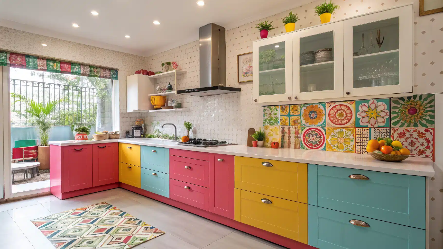
1. Sprinkle Joy Studio

Picture a kitchen that giggles a little when you walk in—that’s this one. Pink Shaker cabinets and a speckled terrazzo backsplash do the heavy lifting while brass pulls tie the whole party together. Keep every cabinet in one happy pink and let the wild tile be the star—consistency is what keeps it fun instead of frantic. Toss in a pink utensil crock and you’ve basically moved into a candy store.
★ Steal This Look
- Paint Color: Sherwin-Williams Pink Flamingo SW 6579
- Furniture: custom pink Shaker-style base cabinets with brass cup pulls and matching wall cabinets flanking a statement range
- Lighting: integrated brass range hood with built-in clock detail and concealed ventilation lighting
- Materials: speckled terrazzo-look tile backsplash, brushed brass metal accents, marble-look quartz countertops, smooth lacquer cabinet fronts
This kitchen dares you to stop playing it safe with beige—it’s for the home cook who treats every Tuesday dinner like a celebration and believes appliances should spark as much joy as the food they create.
2. Citrus Radiance Room

This space bottles sunshine and pours it over the cabinets. Tangerine, lime, and lemon hues pair with glossy counters for a fresh, juicy hit that wakes the room right up. Let streamlined shapes carry the palette so the color never tips into chaos. Cooking here stops feeling like a chore and starts feeling like a citrus-scented ritual.
🎨 Steal This Look
- Paint Color: Benjamin Moore Tangerine Tango 2012-30
- Furniture: high-gloss lacquered base cabinets with flat-panel doors and integrated pull handles
- Lighting: recessed LED ceiling cans plus under-cabinet LED strip lighting
- Materials: lacquered MDF cabinetry, quartz composite countertop, beveled ceramic subway tile backsplash, brushed nickel hardware, light oak flooring
This kitchen dares you to wake up fully caffeinated just by walking in—it’s the kind of space that turns Monday morning scrambled eggs into something worth Instagramming.
3. Luxe Gloss Retreat

Mirror, mirror, on the cabinet—this kitchen is one big, shiny hug. Lacquered fronts and reflective surfaces bounce light around like a disco ball with better manners. The bold color reads elevated, not flashy, because every surface shares the same glossy language. It’s modern, expressive, and confidently dressed up.
✎ Steal This Look
- Paint Color: Farrow & Ball Nancy’s Blushes 278
- Furniture: high-gloss lacquered kitchen island with waterfall edge and integrated LED base lighting
- Lighting: cylindrical crystal pendant lights with warm LED filaments hung in staggered trio over island
- Materials: lacquered acrylic cabinet fronts, iridescent glass mosaic backsplash, polished chrome range hood, acrylic bar stools with ribbed seats, reflective quartz composite countertops
This kitchen dares you to stop apologizing for loving color—it’s the culinary equivalent of stepping into your favorite synth-pop album cover, and honestly, mornings here would feel electric.
4. Soft Curve Kitchen

Round edges and pillowy shapes give this kitchen a soft, welcoming handshake. Curved cabinetry and bubble-inspired tiles set up a gentle visual rhythm your eyes actually relax into. Pastel tones add the sweetness while gloss accents keep the depth warm. Creative and cozy at the same time—hard to pull off, easy to love.
💡 Steal This Look
- Paint Color: Behr Pink Mimosa M160-2
- Furniture: arched open shelving with integrated range hood
- Lighting: cluster of three ribbed glass globe pendants in blush and brass
- Materials: terrazzo-look countertops, matte lavender cabinetry, brushed brass shell pulls, speckled ceramic backsplash
This kitchen feels like baking cookies at your coolest friend’s place—playful enough to spark joy, but the soft curves keep it from ever feeling like a gimmick.
5. Prism Palette Space

Layered rainbow tones turn this room into a fearless little art gallery. The cabinetry colors blend into the décor so smoothly you’d think a stylist spent a month on it. Gloss surfaces unify the rainbow and bounce natural light back at you. Every shade high-fives the next one—curated, not chaotic.
🌟 Steal This Look
- Paint Color: Valspar Celestial Blue 5008-10B
- Furniture: color-blocked metal Tolix-style counter stools in graduated rainbow tones
- Lighting: handblown glass globe pendant cluster in amber, plum, and clear finishes
- Materials: high-gloss lacquered cabinet fronts, warm walnut plank flooring, brushed stainless steel appliances, glossy subway tile backsplash
This kitchen dares you to stop apologizing for loving color—it’s the visual equivalent of turning up your favorite song and dancing while the coffee brews.
6. Island Glow Center

One vivid island hue anchors the whole room and dares you to stare. Saturated color becomes the focal point while everything around it stays sleek and calm. Metallic fixtures add the sophistication that keeps the pop from feeling like a shout. Perfect for hosting, gathering, or just leaning on it with a coffee.
🏠 Steal This Look
- Paint Color: PPG Teal Bayou PPG1231-7
- Furniture: high-gloss hot pink waterfall kitchen island with integrated storage
- Lighting: oversized clear glass globe pendant lights with visible Edison filament bulbs on black chain
- Materials: lacquered high-gloss cabinetry, brushed stainless steel appliances, corrugated metallic backsplash, warm wood flooring
This kitchen dares you to stop playing it safe—it’s the kind of space where you actually want to cook Sunday brunch instead of ordering in.
7. Neon Light Haven

Strategic lighting is the real MVP here 🙂 LED strips trace the cabinetry and countertops for a dramatic glow that shifts beautifully from day to night. Deep saturated colors do their best work against reflective finishes—that’s where the neon really sings. Dynamic, modern, and immersive enough to make dinner feel like a club (the good kind).
★ Steal This Look
- Paint Color: Dunn-Edwards Black DEA187
- Furniture: matte black flat-panel kitchen cabinets with integrated pulls
- Lighting: clustered glass globe pendant lights with Edison bulbs plus recessed can lights and magenta LED strip lighting
- Materials: polished marble-look quartz countertops, high-gloss porcelain floor tile, smoked glass backsplash panels
This kitchen is for the night owl who treats cooking like a ritual and wants their space to feel alive after sunset—it’s bold, unapologetic, and built for making memories, not just meals.
8. Pastel Bliss Kitchen

Soft, confection-inspired tones make this kitchen feel airy and weirdly uplifting. Smooth cabinetry and rounded hardware lean into the gentle mood without losing their polish. Gloss countertops add the shine while the palette stays playful yet refined. The overall vibe is soothing, optimistic, and a little bit sweet.
💡 Steal This Look
- Paint Color: Clare Paint Good Vibrations 005
- Furniture: vintage-style yellow gas range with chrome trim and matching mint base cabinets with scalloped yellow hardware
- Lighting: flush-mount chrome kitchen hood with integrated lighting
- Materials: glossy pink laminate countertops, beveled white ceramic subway tile, painted wood open shelving with curved mint brackets
This kitchen feels like baking cookies on a Saturday morning—it’s the kind of space that makes even toast feel celebratory.
9. Bold Color Canvas

Striking primary colors crash together here and somehow make total sense. A graphic backsplash and sleek chrome accents keep the look crisp instead of loud. Every cabinet becomes a deliberate splash of personality, and reflective flooring doubles the brightness. Organized yet energetic—proof that primary colors grew up.
🌟 Steal This Look
- Paint Color: Fine Paints of Europe Hollandlac Brilliant Deep Blue C-2
- Furniture: lacquered red kitchen island base with black stone waterfall countertop
- Lighting: mustard yellow rattan fringe pendant lights in dome shape
- Materials: high-gloss lacquer cabinets, patterned encaustic-look tile, chrome hardware, black wire mesh bar stools
This kitchen dares you to stop playing it safe with beige—it’s the kind of space that makes Monday morning coffee feel like an event.
10. Sunny Storage Style

Colorful shelving turns storage into the main event instead of an afterthought. Open displays show off vibrant containers and glossy finishes you’d usually hide. When organization looks this good, tidying up stops feeling like a punishment. Function meets flair in the most uplifting way possible.
✎ Steal This Look
- Paint Color: Backdrop Turquoise 33-04
- Furniture: mint green floating open shelving with chrome bracket supports
- Lighting: flush-mount chrome dome ceiling light with high CRI bulb
- Materials: glossy ceramic tile backsplash, lacquered wood cabinets, glass canisters with silicone seal lids, powder-coated metal utensil crocks
This kitchen feels like the person who owns it actually enjoys unloading the dishwasher—there’s permission to play, to mismatch, to let your grapefruit bowls be the main character.
11. Luminous Tile Glow

Translucent tilework pulls glowing depth straight into the walls. Light filters through those colored surfaces and adds dimension you can practically feel. Neutral cabinetry is the secret—it balances the candy tones so the look stays elevated. Playful but grown-up, with a backsplash that doubles as art.
🏠 Steal This Look
- Paint Color: Sherwin-Williams Snapdragon SW 7017
- Furniture: mustard yellow flat-panel base cabinets with integrated pulls
- Lighting: under-cabinet LED strip lighting with warm white output
- Materials: iridescent glass subway tiles, stainless steel appliances, glossy acrylic cabinet fronts
This kitchen dares you to wake up happy; it’s for the person who thinks cooking should feel like a party, not a chore.
12. Creamy Color Kitchen

Creamy pastel layers meet sleek finishes for a kitchen that feels light and totally put-together. Rounded appliances soften the edges while white accents keep everything clear. Every detail feels intentional, and the palette radiates positivity without shouting. Refreshing in the best, never-overpowering way.
🖼 Steal This Look
- Paint Color: Benjamin Moore First Light 2102-70
- Furniture: Pastel lavender Smeg-style retro refrigerator, mint green open-front display cabinets with glass doors, curved peach bar stools with slim metal legs
- Lighting: Cluster of three ribbed glass pendant lights in graduated sunset tones (deep orange, pale peach, warm cream)
- Materials: Vertical beadboard paneling, smooth lacquered cabinet fronts, ribbed glass, brushed chrome faucet, terrazzo-look countertops
This kitchen feels like Saturday morning optimism in physical form—it’s the kind of space that makes pouring cereal feel like a small celebration.
13. Playful Pop Pantry

Adorable pastel contrasts and whimsical shapes sneak personality in without dropping the sophistication. Gloss finishes keep the whole thing modern and polished. Subtle graphic accents are the charm—fun with real finesse. Your pantry finally gets to have a little attitude.
🎨 Steal This Look
- Paint Color: Farrow & Ball Nancy’s Blushes 278
- Furniture: pink upholstered bar stools with gold metal frames and rounded cushioned seats
- Lighting: brass dome pendant lights with white glass diffusers in a row of four
- Materials: high-gloss lacquered cabinetry, beveled subway tile backsplash, brushed brass hardware, white marble-look countertops
This kitchen dares you to stop apologizing for loving pink—it’s the grown-up version of a childhood dream, complete with the stand mixer you’ll actually use.
14. Pearl Shine Space

Soft shimmer and pearlescent textures give this kitchen a quiet kind of glam. Light glides across the reflective surfaces and deepens the whole room. Neutral tones stay calm while iridescent accents and chrome details deliver the sparkle. The effect is luminous, refined, and très chic.
🖼 Steal This Look
- Paint Color: Behr Swiss Coffee 12
- Furniture: purple velvet bar stools with brass nailhead trim and adjustable height bases
- Lighting: brass dome pendant lights with cascading crystal fringe
- Materials: iridescent glass mosaic tile, polished quartz countertop, brushed brass hardware, marble backsplash
This kitchen feels like getting dressed up just to make coffee—and honestly, that’s the dopamine hit we deserve before 9 a.m.
15. Gradient Glow Gallery

Gradient cabinetry fades color into color and turns the kitchen into a legit masterpiece. Clean lines frame those shifting tones so the artistry gets top billing. Keep the surrounding space minimal so the cabinets stay the hero. Bold, controlled, and the obvious centerpiece of any transformation.
💡 Steal This Look
- Paint Color: Valspar Hot Pink 1008-6A
- Furniture: glossy flat-panel kitchen cabinets with integrated chrome bar handles
- Lighting: under-cabinet LED strip lighting with warm white glow
- Materials: high-gloss lacquer cabinet fronts, polished chrome hardware, reflective glass backsplash, stainless steel countertops
This kitchen doesn’t whisper—it sings—and that’s exactly the point of dopamine decor: waking up happy every time you reach for your morning coffee.
Save this article
Enter your email and we’ll send it straight to your inbox.
16. Radiant Island Moment

A radiant island color sets the warm, vibrant tone for the entire room. Sculptural lighting and sleek cabinetry make it impossible to ignore. Coordinated décor elements pull it all together so the space feels social and inspiring. This is a gathering spot that radiates good energy, not just a place to chop onions.
🏠 Steal This Look
- Paint Color: PPG Caribbean Splash PPG1233-5
- Furniture: orange lacquered kitchen island base with waterfall white quartz countertop, chrome cantilever bar stools with molded orange seats
- Lighting: three oversized glossy orange dome pendant lights with chrome hardware
- Materials: high-gloss lacquer finish, polished chrome metal, white quartz, beveled white subway tile, brushed nickel cabinet pulls
This kitchen begs for weekend brunch with friends—there’s something about that punch of orange that makes even Monday morning coffee feel like a celebration.
17. Statement Stove Glow

A brightly colored range steals the show and somehow makes cooking feel powerful. Gloss cabinets and layered backsplashes play perfectly off the bold appliance. Metallic finishes add the depth that makes the whole design feel curated. Let your stove be the diva—it earned the spotlight.
💡 Steal This Look
- Paint Color: Dunn-Edwards Aqua Azure DE5718
- Furniture: vintage-inspired 36-inch gas range in buttercup yellow with chrome trim and matching range hood
- Lighting: flush-mount ceiling fixture with warm brass finish and frosted glass shade
- Materials: gloss lacquer cabinet fronts, hand-painted Moroccan cement tile backsplash, Carrara marble countertops, terracotta floor tile
This kitchen understands that the stove is where the real magic happens—it’s the heart, the hearth, and now, the headline.
18. Illuminated Wall Wonder

Illuminated glass panels and radiant tiles bring a glowing personality to the walls. The shifting hues change the mood from morning coffee to midnight snack. Keep the furniture simple so the feature wall stays the star. Futuristic yet warm, and instantly impactful the second you flip the switch.
🖼 Steal This Look
- Paint Color: Clare Paint Good Vibrations C-085
- Furniture: curved gloss-finish base cabinets with integrated LED toe-kick lighting and frosted glass upper cabinets
- Lighting: recessed RGBW LED strip cove lighting along curved ceiling bulkhead plus under-cabinet LED puck lights
- Materials: iridescent glass mosaic tile, backlit onyx-look acrylic panels, high-gloss lacquer cabinet fronts, reflective quartz composite countertops
This kitchen feels like cooking inside a sunset—it’s the kind of space that makes Monday morning coffee feel like an event, not a chore.
19. Vibrant Motion Kitchen

Energetic tones and playful detailing put this kitchen in constant, happy motion. Neon cabinetry against sleek countertops makes a striking contrast that actually works. Unique fixtures inject the personality that keeps every corner inspiring. Active, optimistic, and alive with ideas.
🎨 Steal This Look
- Paint Color: Fine Paints of Europe Hollandlac Brilliant Orange 1005-Y50R
- Furniture: High-gloss lacquered base cabinets in chartreuse with chrome cup pulls, paired with matching upper cabinets in tangerine orange
- Lighting: Sleek stainless steel chimney range hood with integrated LED downlighting and recessed can lights in polished chrome
- Materials: Glossy lacquered MDF cabinetry, square white ceramic wall tile with dark grout, polished granite countertops, black-and-white checkerboard porcelain floor tile
This kitchen doesn’t whisper—it shouts your morning coffee into existence, and honestly, who needs caffeine when your stove is this purple?
20. Graphic Energy Hub

Large-scale graphics and saturated finishes give this kitchen unmistakable presence the moment you enter. Integrated lighting cranks the intensity and the mood at the same time. Every surface makes a confident statement, so the room feels fearless on purpose. Unapologetically vibrant, and proud of it.
✎ Steal This Look
- Paint Color: Backdrop Safety Orange 0006
- Furniture: glossy lacquer kitchen cabinets in tangerine with integrated channel pulls
- Lighting: oversized Edison bulb pendant lights with black cord suspension
- Materials: high-gloss lacquer, polished granite, beveled subway tile, neon acrylic accents
This kitchen demands a homeowner who cooks with the music loud and isn’t afraid of fingerprints—it’s a space built for energy, not perfection.
✅ Get The Look
21. Dreamy Pastel Cookspace

Soft-toned appliances wrapped in reflective cabinetry create a dreamy, floaty atmosphere. Rounded edges keep the flow gentle and the softness real. Light enhances every pastel detail, so the whole room feels warm and balanced. Charming, contemporary, and very easy to linger in.
🖼 Steal This Look
- Paint Color: Sherwin-Williams Alabaster SW 7008
- Furniture: custom inset cabinetry with raised panel doors and furniture-style feet
- Lighting: natural light from large divided-light windows with no window treatments
- Materials: glossy beveled subway tile, polished brass hardware, white marble countertops, warm hardwood flooring, woven lavender runner
This kitchen whispers rather than shouts, proving dopamine decor doesn’t need neon to spark joy—sometimes a single lavender range against creamy cabinets is all the happiness you need.
22. Ambient Flame Focus

Layered lighting around the cooking zone sets a mood instead of just illuminating it. Coordinated cabinetry reinforces the calm harmony. Soft gloss textures glow without any harsh edges, turning the stove area into a feature. Functional and atmospheric—the kitchen you actually want to cook in.
✎ Steal This Look
- Paint Color: Benjamin Moore Deep Royal 2061-10
- Furniture: matte black dual-fuel range with illuminated knobs
- Lighting: RGB LED under-cabinet strip lighting with remote dimming
- Materials: high-gloss marble-look quartz backsplash, brushed stainless steel hood, lacquered navy cabinetry
This kitchen understands that cooking is sensory theater—those glowing knobs feel like pilot lights for creativity, turning even weeknight pasta into an event worth lingering over.
23. Color Clash Harmony

Unexpected bold pairings land seamlessly here, and that’s the magic. Alternating cabinet colors build a rhythm your eye happily follows. Lacquered finishes keep it refined so the palette stays expressive but cohesive. Every choice feels deliberate, never accidental.
💡 Steal This Look
- Paint Color: Farrow & Ball Vardoe No. 288
- Furniture: coral-painted backless counter stools with tapered legs
- Lighting: oversized mustard yellow dome pendant lights with brass hardware
- Materials: high-gloss lacquered cabinetry, white quartz countertops, fish-scale mosaic tile backsplash, brushed brass pulls
This kitchen dares you to stop playing it safe with beige—there’s real joy in cooking somewhere that feels like a party every morning, even if you’re just making toast.
24. Shine Grid Kitchen

Structured tile layouts and high-shine finishes give this room both order and excitement. Graphic patterns set the rhythm while bold cabinetry throws in the personality. Chrome accents sharpen the whole design and light reflection boosts the clarity. Crisp yet joyful—structured color done right.
★ Steal This Look
- Paint Color: Behr Magenta Burst MQ4-62
- Furniture: glossy hot pink flat-panel kitchen cabinets with integrated handles
- Lighting: stainless steel chimney range hood with built-in LED task lighting
- Materials: iridescent pink glass mosaic tile backsplash, polished chrome hardware, white quartz countertops
This kitchen doesn’t whisper—it throws a party before your coffee’s even brewed, and honestly, who wouldn’t want to chop vegetables in a space this unapologetically alive?
25. Spark Pop Space

Effervescent tones and curved fixtures energize this kitchen with playful sophistication. Gloss flooring mirrors every hue like a calm little pond of color. Vibrant backsplashes add the sparkle that keeps it spirited but refined. Uplifting from absolutely every angle.
🖼 Steal This Look
- Paint Color: Valspar Oceanic 5006-10C
- Furniture: red molded ABS plastic bar stools with chrome pedestal bases
- Lighting: cluster of four coral-red dome pendant lights with chrome hardware
- Materials: high-gloss acrylic bar top, penny-round mosaic tile in red/white/aqua mix, polished chrome accents
This kitchen dares you to have fun with your morning coffee—it’s the kind of space that turns Tuesday pancakes into a mini celebration.
🎁 Get The Look
26. Retro Cool Kitchen

A candy-colored refrigerator commands the room and refuses to apologize for it. Coordinated cabinetry and glossy finishes back up the statement piece perfectly. Rounded edges add nostalgic charm while minimalist hardware keeps it modern. Fresh, fun, and a bold appliance can absolutely redefine a space.
🏠 Steal This Look
- Paint Color: PPG Delicate Blue PPG1151-3
- Furniture: retro-style bottom-freezer refrigerator in pastel pink with chrome handles
- Lighting: vintage-inspired glass bell pendant with crystal tiered shade and brass hardware
- Materials: marble-look quartz countertops, light oak floating shelves, beveled subway tile backsplash, brushed brass cabinet hardware
This kitchen feels like baking cookies with your coolest aunt—playful enough to spark joy every morning, but polished enough that you actually want to host brunch.
🔔 Get The Look
27. Fluid Counter Charm

Fluid countertop shapes and layered pastels give this kitchen a soft, artistic edge. Streamlined appliances hold the modern balance while graphic accents add crisp contrast. The design stays imaginative yet composed, so it invites you in instead of showing off. Playful focal points, done with restraint.
💡 Steal This Look
- Paint Color: Dunn-Edwards Purple Pizzazz DEA162
- Furniture: curved custom kitchen island with tiered waterfall edge in high-gloss purple laminate
- Lighting: cluster of amber crackle-glass teardrop pendants with warm LED filament bulbs
- Materials: high-gloss lacquered cabinetry, 3D wavy textured backsplash paneling, polished hardwood flooring, reflective resin countertops
This kitchen dares you to stop playing it safe with beige—it’s the kind of space where you’d actually want to host a dinner party at midnight just to show it off.
28. Bright Table Moment

A vibrant prep table anchors the room with bold, unmissable personality. Gloss finishes deepen the color under soft lighting that flatters everything. Coordinated seating and shelving complete the look, with subtle gradients tying it together. Practical and eye-catching—make your dining surface a statement of pure joy.
★ Steal This Look
- Paint Color: Clare Paint Daydream 03
- Furniture: curved waterfall-edge kitchen island in high-gloss cobalt resin
- Lighting: clustered organic bubble glass pendant in pale lavender
- Materials: iridescent resin, polished marble-look porcelain, transparent acrylic, reflective chrome ceiling panels
This kitchen feels like stepping inside a sunset—it’s the kind of space that makes Monday morning coffee feel like an event worth dressing up for.
29. Electric Pulse Kitchen

Electric hues and glowing accents bring high-speed excitement straight into the kitchen. Coordinated cookware reinforces the theme so nothing feels random. LED lighting pumps up every saturated shade and the space radiates confidence and movement. Ignite your kitchen with electrifying color energy and never look back.
🏠 Steal This Look
- Paint Color: Fine Paints of Europe Koninginnedag 4003
- Furniture: waterfall-edge kitchen island with glossy magenta lacquer finish and integrated black quartz countertop
- Lighting: three teardrop-shaped glass pendant lights with visible Edison bulbs on black cord
- Materials: high-gloss lacquered cabinetry, iridescent purple glass mosaic tile backsplash, polished chrome bar stools with hydraulic bases, black engineered stone countertops, gray wood-look porcelain flooring
This kitchen doesn’t whisper—it shouts with joy, and that’s exactly the point when your morning coffee deserves a dopamine hit before the caffeine even kicks in.
Bringing It All Together
Here’s the thing: your kitchen can be just as joyful as any room in the house, and these ideas prove it. From bold cabinet colors to playful backsplash patterns, every single choice you make adds a little burst of happiness to your daily routine. The real beauty of dopamine decor is its fearless embrace of color, texture, and personality—it turns ordinary kitchens into spaces that actually energize you. Go all-in with saturated hues or start small with colorful accessories; either way, your kitchen deserves to make you smile every time you walk in.
Wrapping It Up
And that’s the whole rainbow 🙂 Pick one idea that made you do a double-take and run with it—you don’t have to repaint the whole house to feel the joy. Start small, stack the color, and let your kitchen show off a little personality. Which of these 29 looks are you trying first? Tell us in the comments and go make something colorful.
Save this article
We’ll email you the link so you can find it again later.