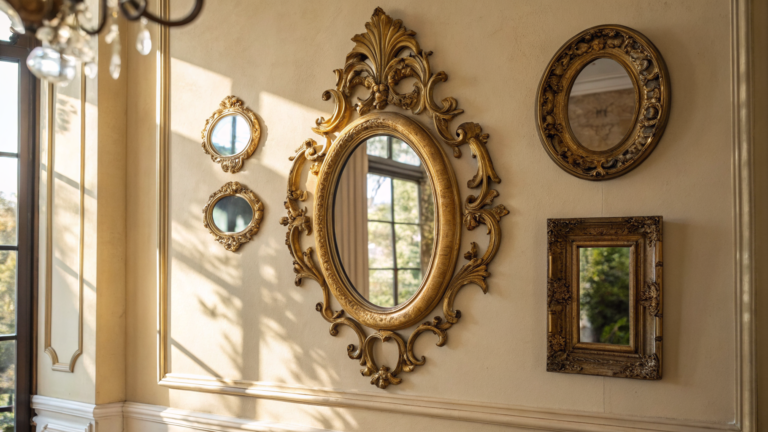


For the longest time I was convinced grey walls would turn my living room into a dentist’s waiting room — flat, cold, vaguely anxiety-inducing. Then a friend told me to toss a beige linen sofa and a warm jute rug into the mix, and suddenly the whole space felt like somewhere I actually wanted to park myself. That’s the trick with grey and beige living rooms: the cool grey gives you structure while the beige does the cozy heavy-lifting. The 29 rooms below show just how far you can push that pairing.
1. Modern Balance Feels Effortless
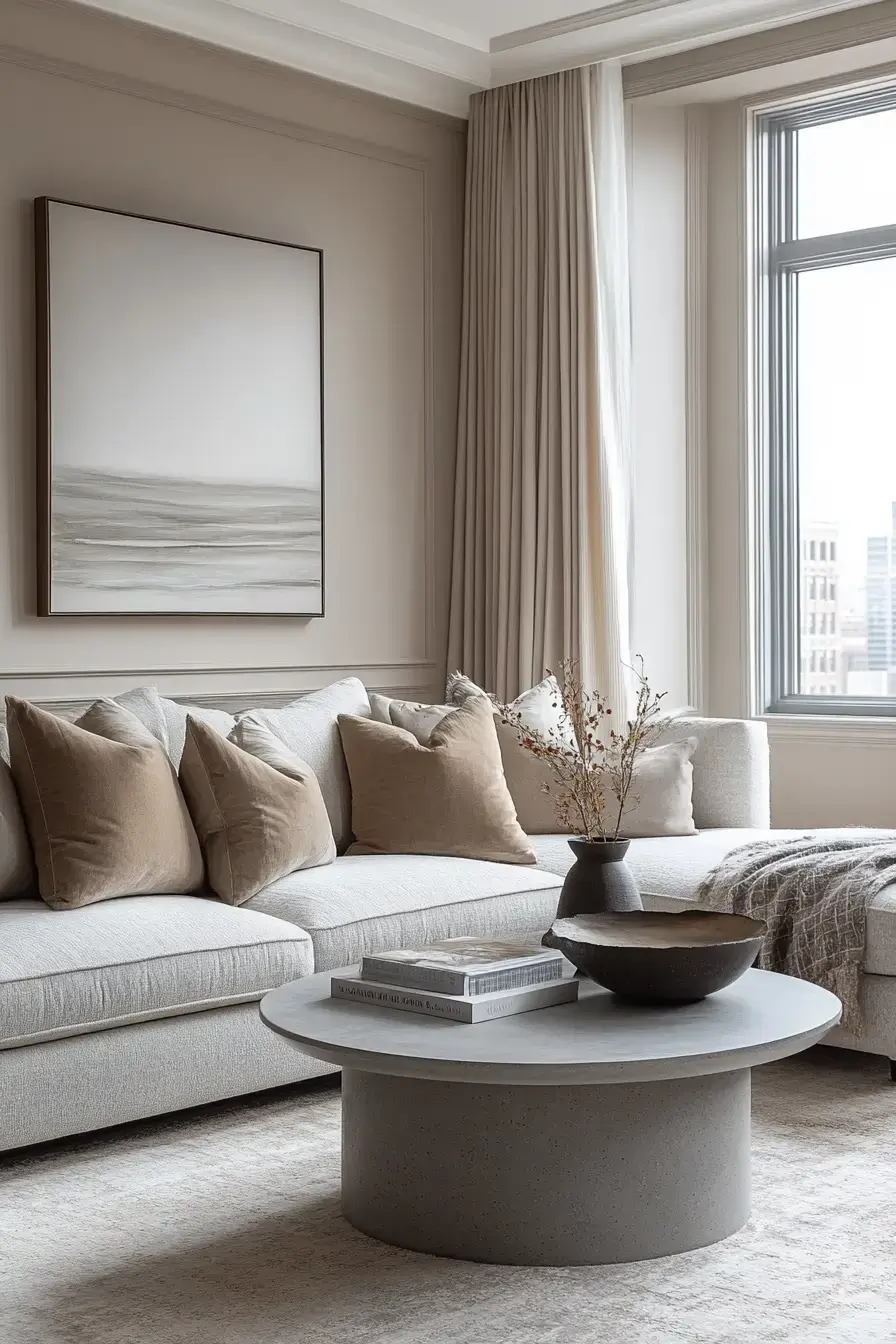
This room nails that effortless modern look without trying too hard. The cool grey gives the space its bones — clean lines, structured seating, tailored textiles — while warm beige surfaces soften everything so it never feels like a showroom. The magic is in the balance: structure plus comfort, no fuss. Want more? Browse our living room category for the full home-decor tour, or check out these grey and beige living room ideas and save the spaces that sharpen your eye.
2. Neutral Harmony Offers Flexibility
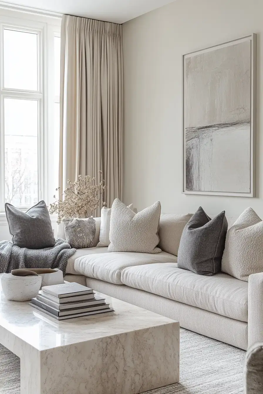
Beige and grey are the ultimate ‘yes, and’ color combo — they get along with literally everything you throw at them. Casual slipcovered chairs? Elegant statement pieces? Both work, because the neutral base just absorbs it all. This pairing grows with you, so the room can shift as your taste does. For more ways to make your home feel complete, we’ve got you covered.
3. Sculptural Curves Soften Everything
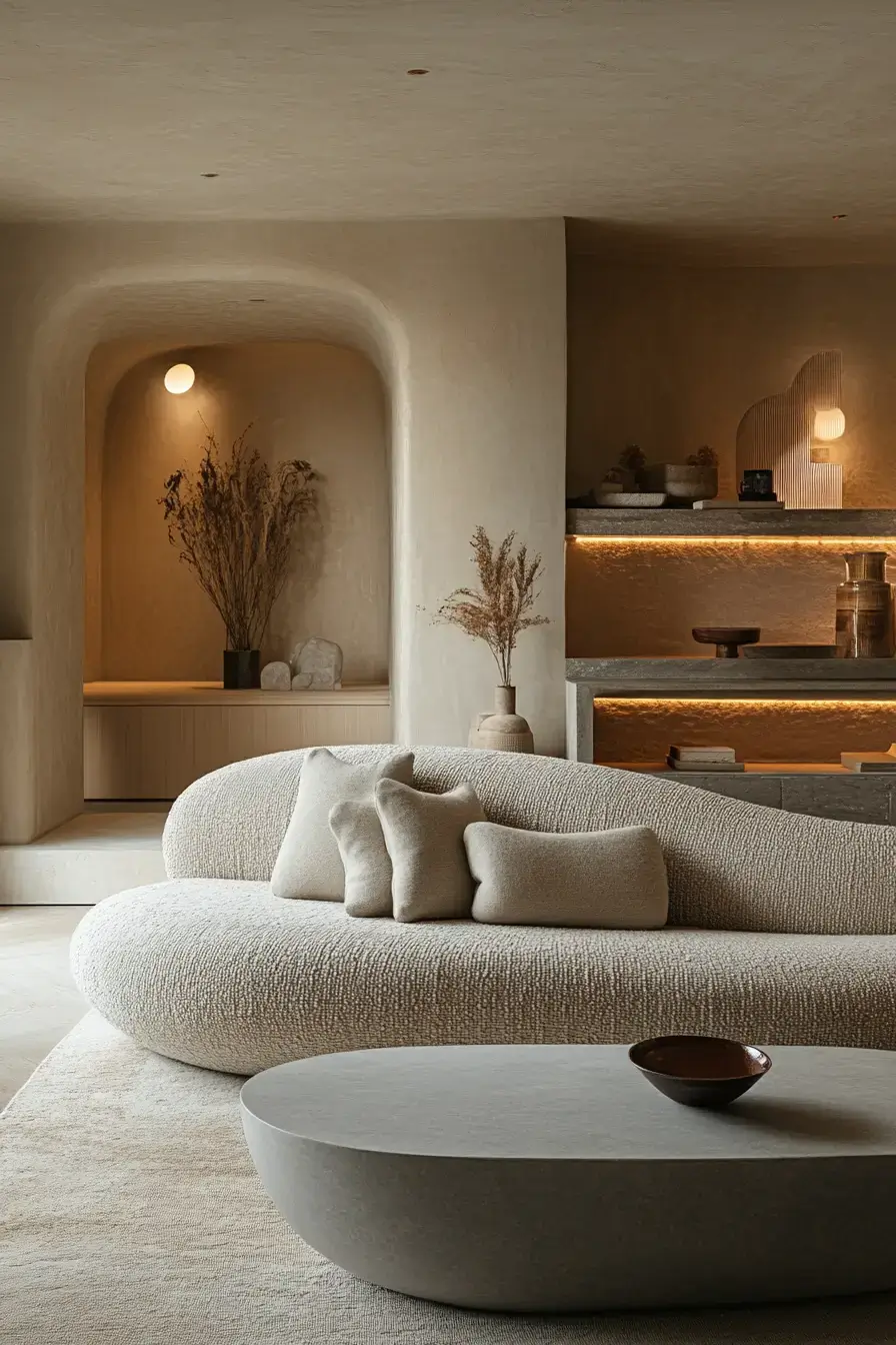
Sharp grey walls can read a little cold, so this room fights back with curves. A rounded sofa, an arched lamp, a chunky round ottoman — the soft shapes keep the grey from feeling clinical. Curves are the cheat code for warmth in an otherwise angular space. It’s a small move that changes the whole vibe.
4. Minimal Styling Restores Calm
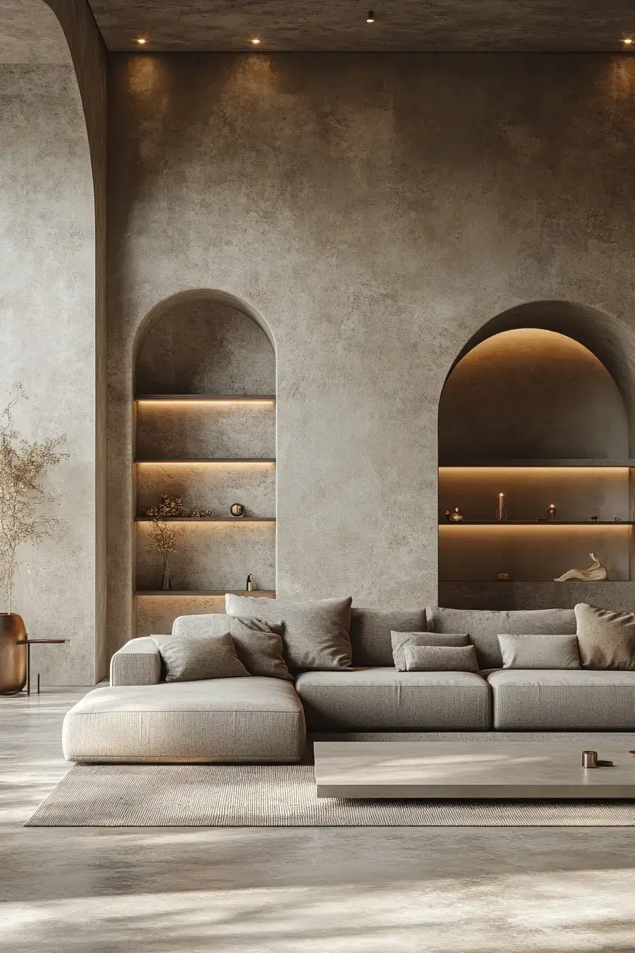
There’s a point where ‘styled’ tips into ‘staged,’ and this room stops just short of it. Bare surfaces, one or two hero pieces, and a beige-grey palette that doesn’t demand attention. Less stuff means more calm — your eye finally gets to rest. I’m convinced minimal is the antidote to a loud day.
5. Charcoal Contrast Feels Inviting
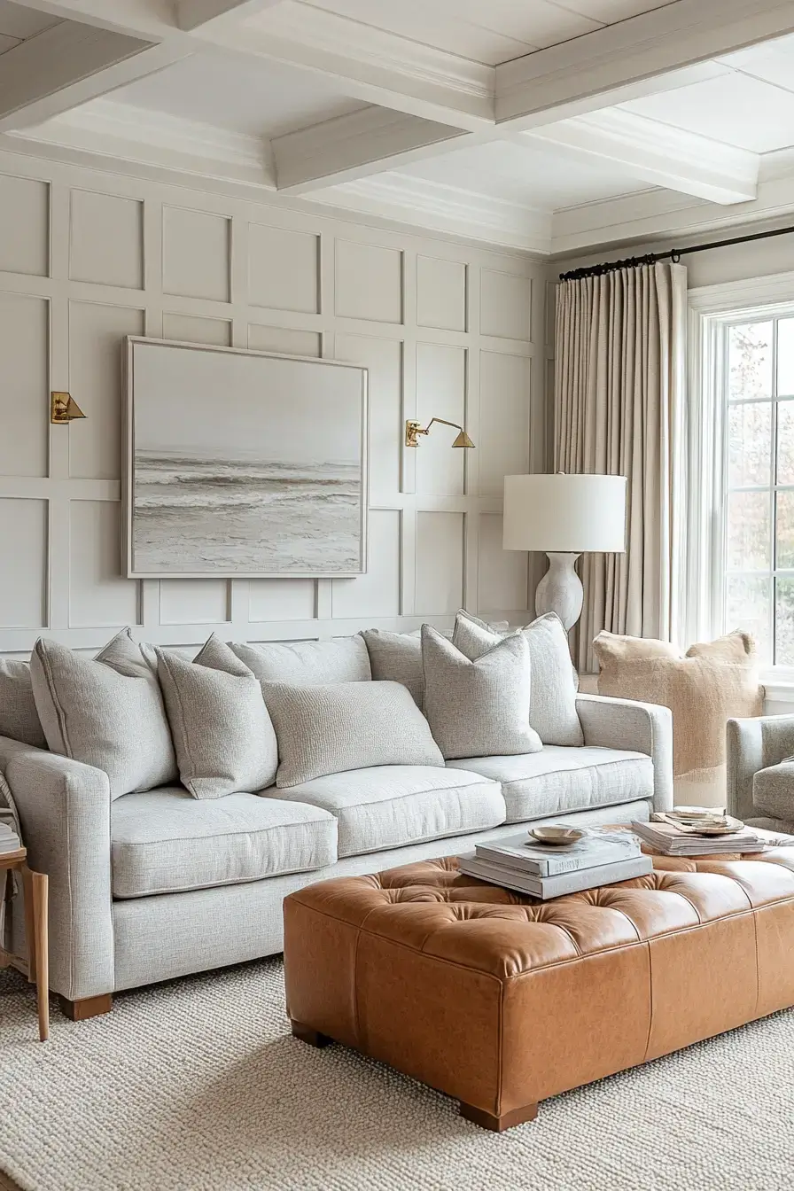
Charcoal is just grey with the volume turned up, and here it makes the beige pop instead of whisper. Use it on one wall or a big sectional and let the lighter tones do the breathing. A hit of charcoal invites you in rather than backing you out. Cozy and a little dramatic — my favorite combo.
6. Subtle Tones Create Serenity
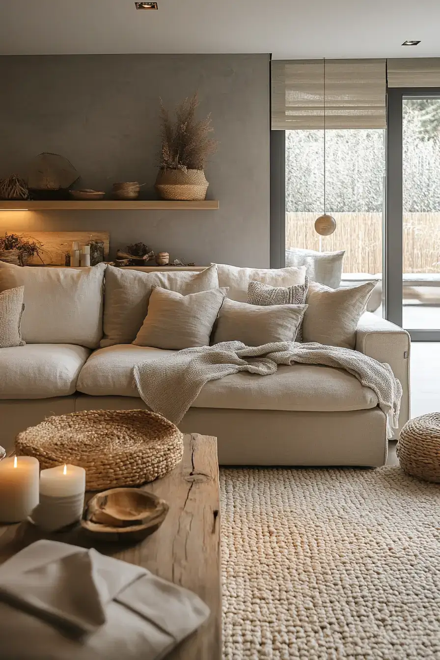
If you’re afraid of commitment, this is your lane. The greys and beiges here sit so close in value that the room reads as one long exhale. Quiet tones equal a quiet mind. It’s the kind of space that makes guests lower their voices without realizing why.
7. Refined Materials Radiate Luxury
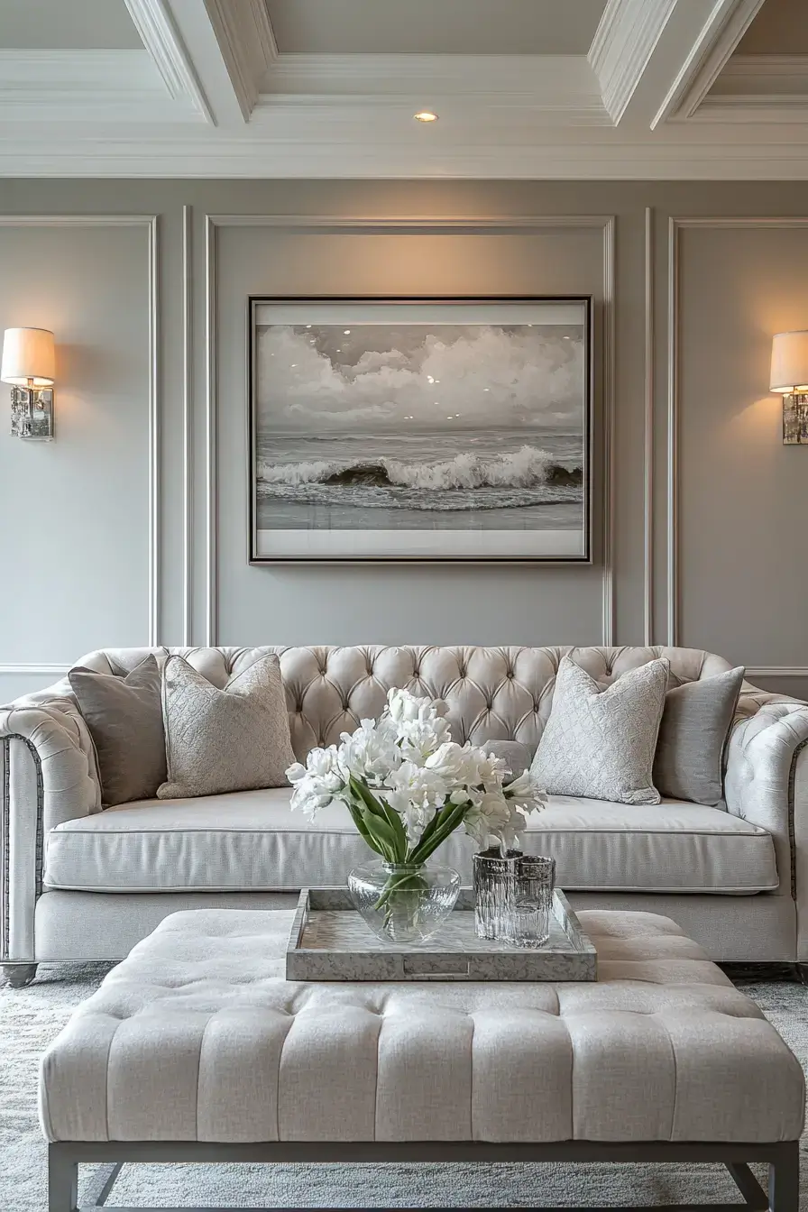
Luxury here isn’t gold leaf — it’s a nubby bouclé, a honed stone, a matte oak. The grey-and-beige base lets the materials do the talking, and good materials always win. Spend on touch, not on shine. Run your hand over the fabrics and you’ll get it instantly.
8. Urban Style Gains Warmth
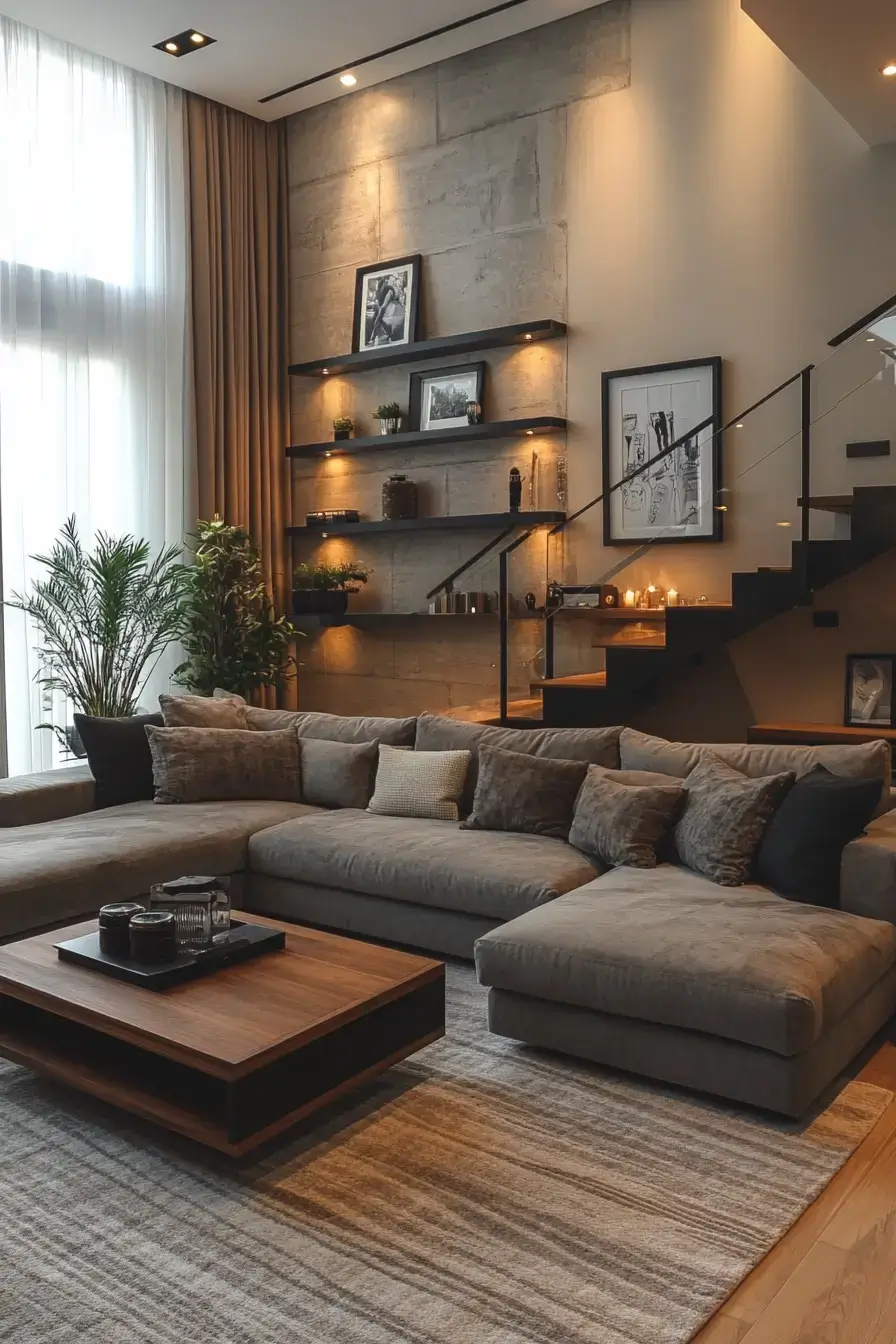
Loft spaces love grey, but on its own it can feel like a parking garage. Beige slips in — a wool rug, a leather pouf, warm wood — and the whole industrial shell softens up. Urban doesn’t have to mean cold. Proof that city bones and cozy can share a room.
9. Elevated Comfort Feels Sophisticated
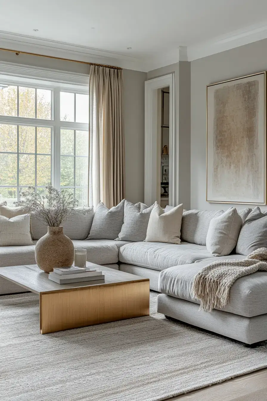
Comfort usually gets a bad rap for looking sloppy, but not here. Plush seating in muted greige tones looks intentional and feels like a hug. Sophisticated and sink-in soft aren’t enemies. This is the room you’ll actually live in, not just photograph.
10. Gentle Contrast Feels Dreamlike
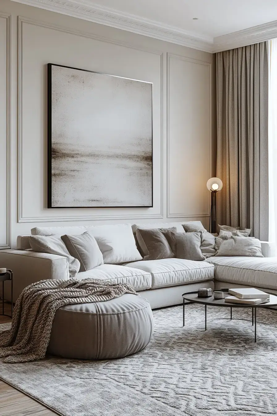
Instead of hard edges, this room plays light grey against cream and lets them blur. The contrast is there, just whispered, which gives the whole thing a half-awake, dreamy quality. Soft contrast is its own kind of drama. You sink in and the day melts off.
11. Elegant Balance Stays Timeless
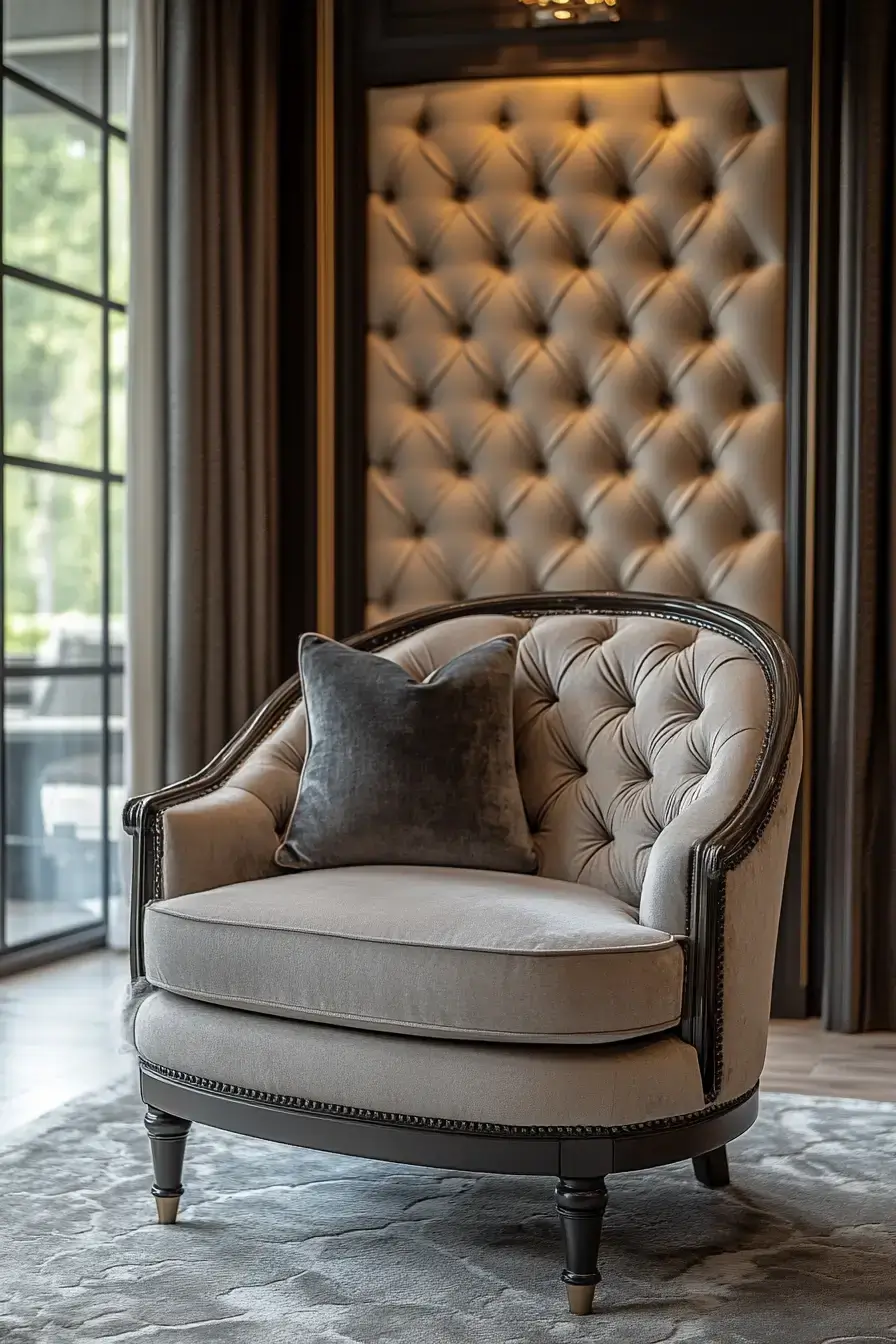
Trend-chasing is exhausting, so this room opts out. A steady grey-beige rhythm — wall, sofa, rug, repeat — never dates itself. Timeless beats trendy every time. Five years from now you’ll still like it, and that’s the real win.
12. Plush Layers Feel Irresistible
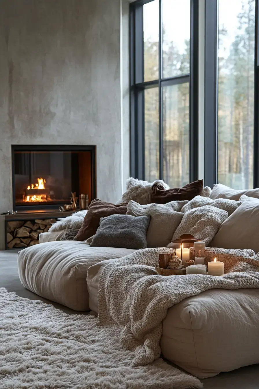
Layers are where beige earns its keep. A sheepskin throw, a chunky knit, a velvet cushion — pile them on the grey base and suddenly the room is edible (figuratively). Texture is what makes you reach out and touch. Bare grey is fine; layered is irresistible.
13. Cream Slate Creates Serenity
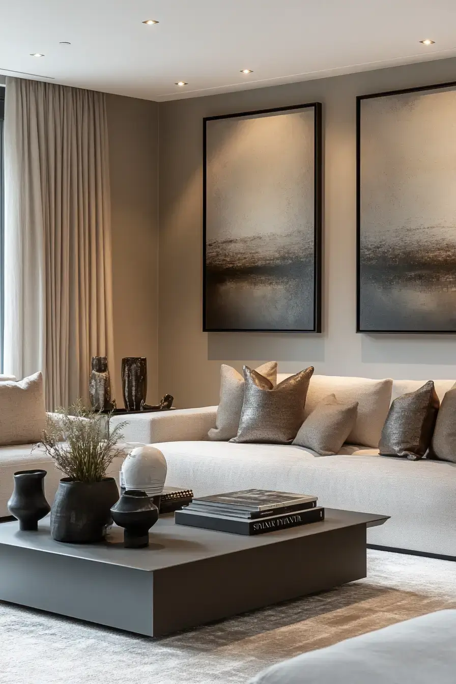
Cream and slate is grey-and-beige’s slightly moodier cousin. The slate grounds everything while the cream keeps it from getting heavy. This duo calms a room without putting it to sleep. Great pick if you want serene but not sterile.
14. Greige Layers Look Captivating
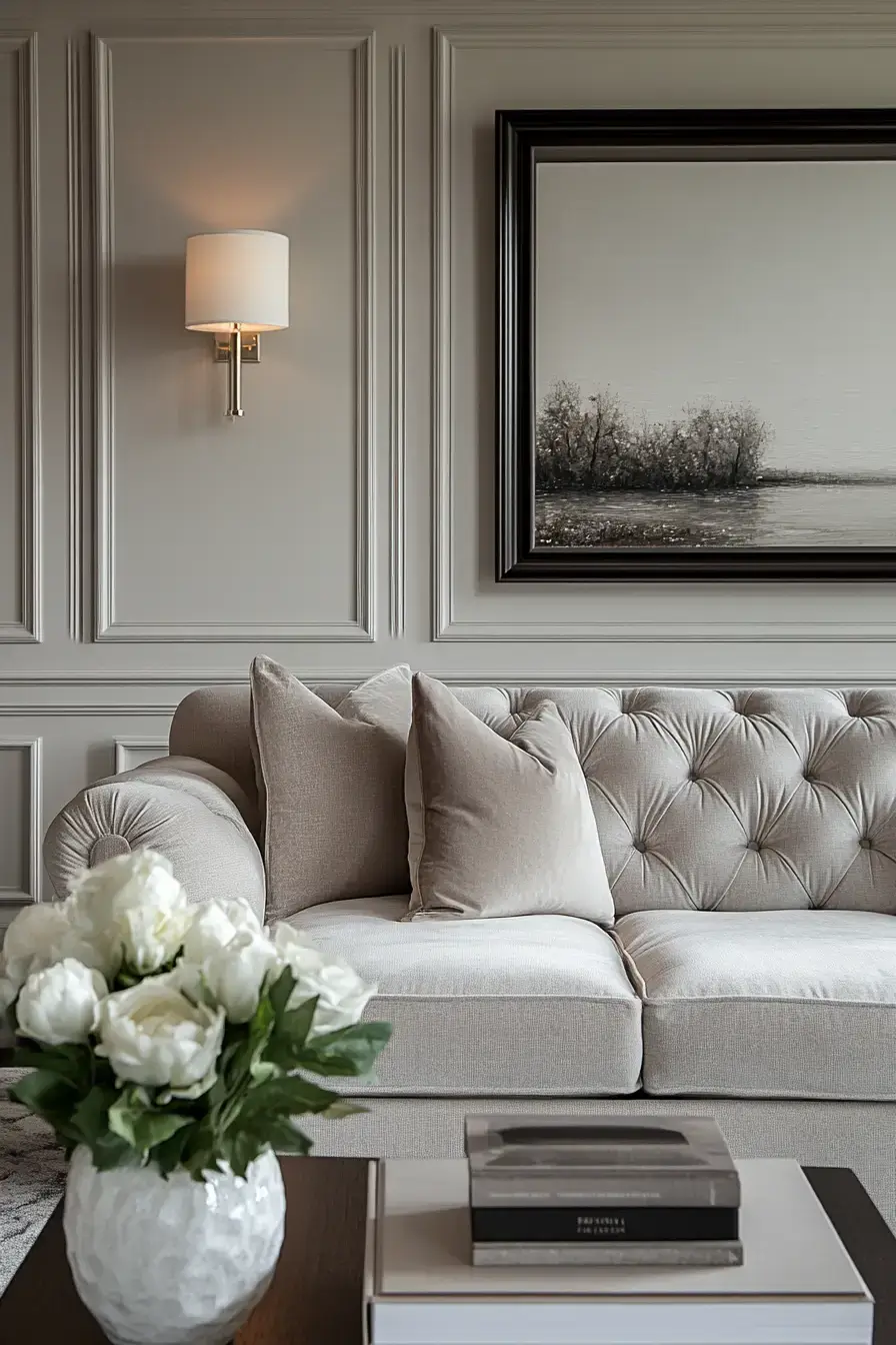
Greige — that perfect grey-beige mutant — does the heavy lifting in this one. Stack a few greige shades and the layering reads as rich instead of flat. Greige is the easy button for cohesion. Everything matches because it’s all basically the same color family.
15. Quiet Luxury Feels Powerful
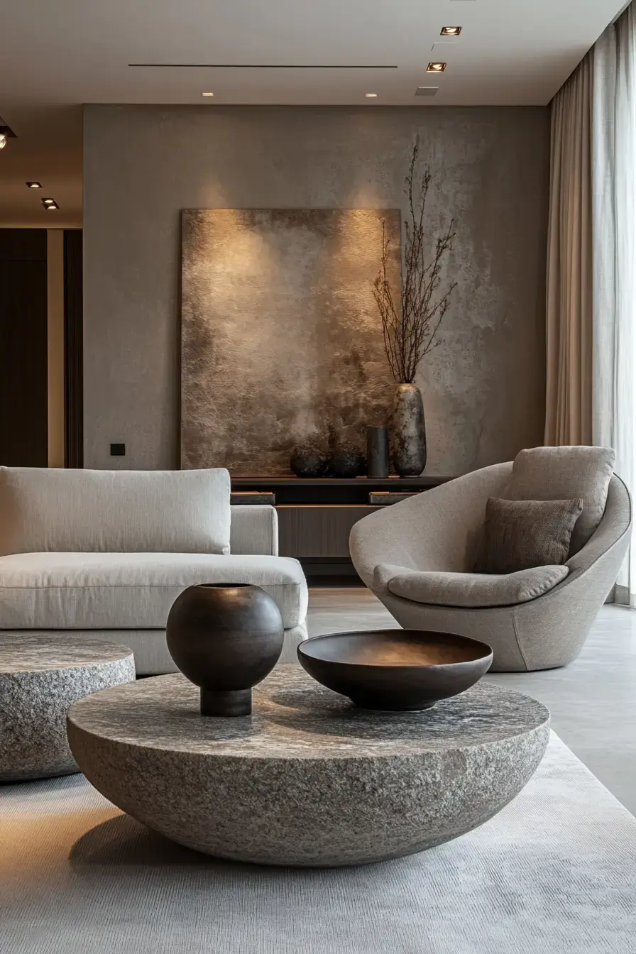
This is the ‘I have money but I’m not showing off’ look, and it’s powerful. Muted palette, impeccable proportions, zero logos. Restraint reads as confidence. The room says plenty by saying little.
Save this article
Enter your email and we’ll send it straight to your inbox.
16. Perfect Balance Feels Harmonious
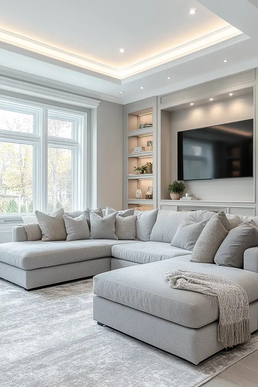
Harmony sounds woo-woo until you sit in a room that has it. Equal grey and beige weight, nothing fighting for the spotlight. When nothing’s screaming, everything works. It just feels… right, and you can’t always explain why.
17. Sleek Structure Commands Attention
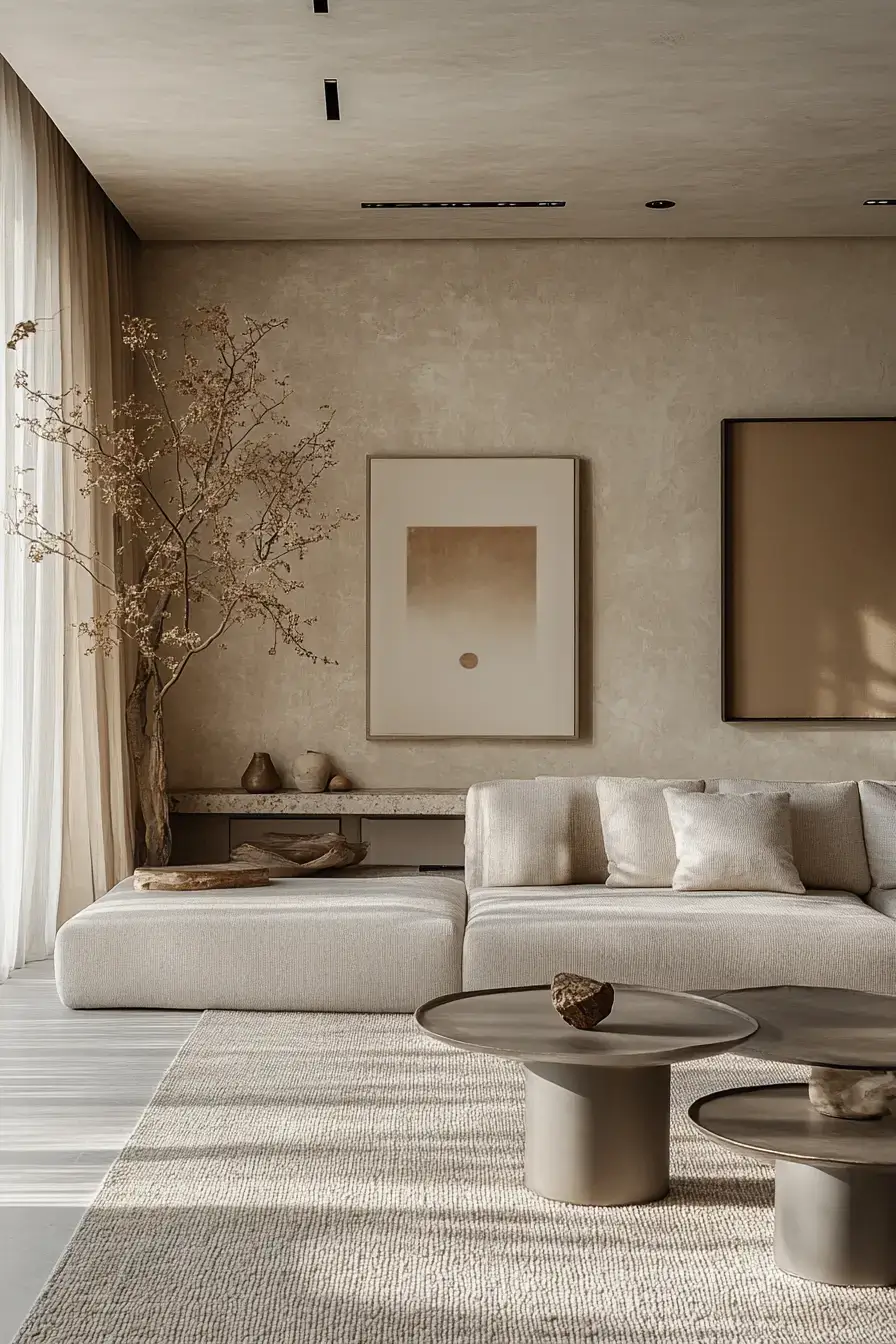
Some rooms whisper; this one speaks. Strong grey architecture — a built-in, a grid of windows — gets a beige counterweight so it commands the room without bullying it. Structure wants a soft foil. Give it one and you’ve got presence.
18. Velvety Textures Feel Futuristic
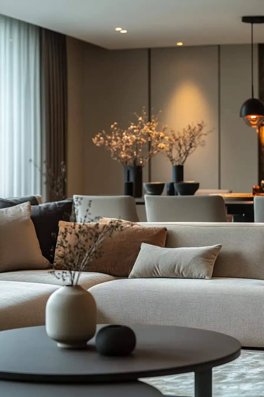
Velvet in grey reads oddly sci-fi — sleek, light-catching, a little otherworldly. Pair it with beige and the future feels hospitable. Velvet is the fastest way to ‘wow.’ One velvet piece and the room upgrades a full tier.
19. Charcoal Contrast Creates Drama
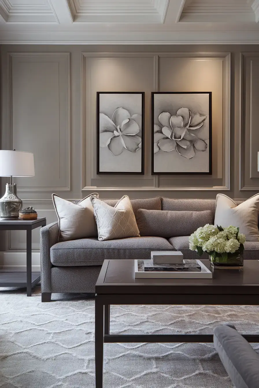
Same charcoal trick as earlier, dialed up for theater. Deep charcoal against warm beige is basically chiaroscuro for your living room. Drama lives in the contrast. If your space feels shy, this is the volume knob.
20. Fresh Light Lifts Neutrals
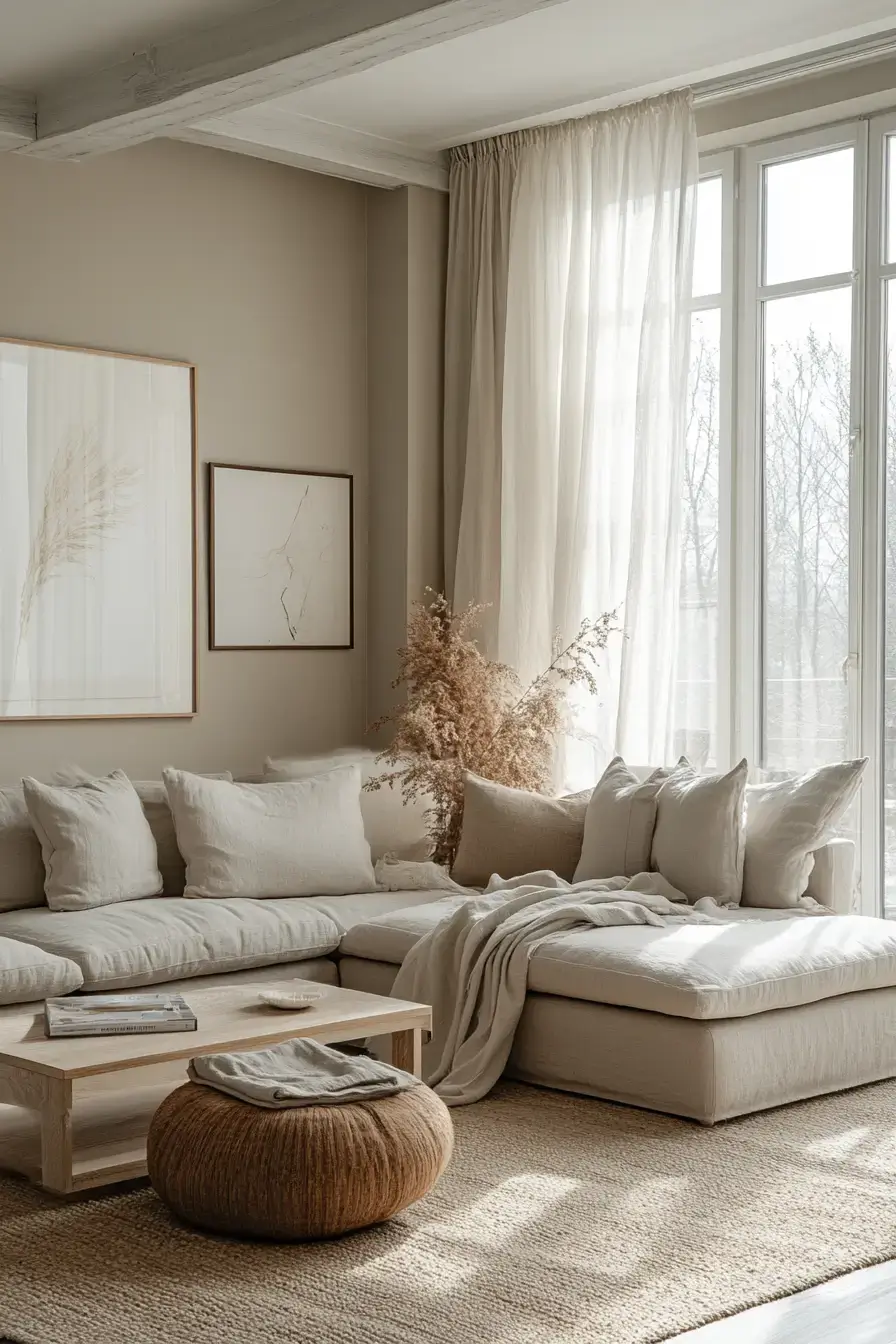
Grey and beige can get muddy without light, so this room invites the sun in. Sheer curtains, pale surfaces, a mirror or two to bounce it around. Light is the cheapest upgrade there is. It lifts the whole neutral scheme off the floor.
21. Graphic Shapes Spark Excitement
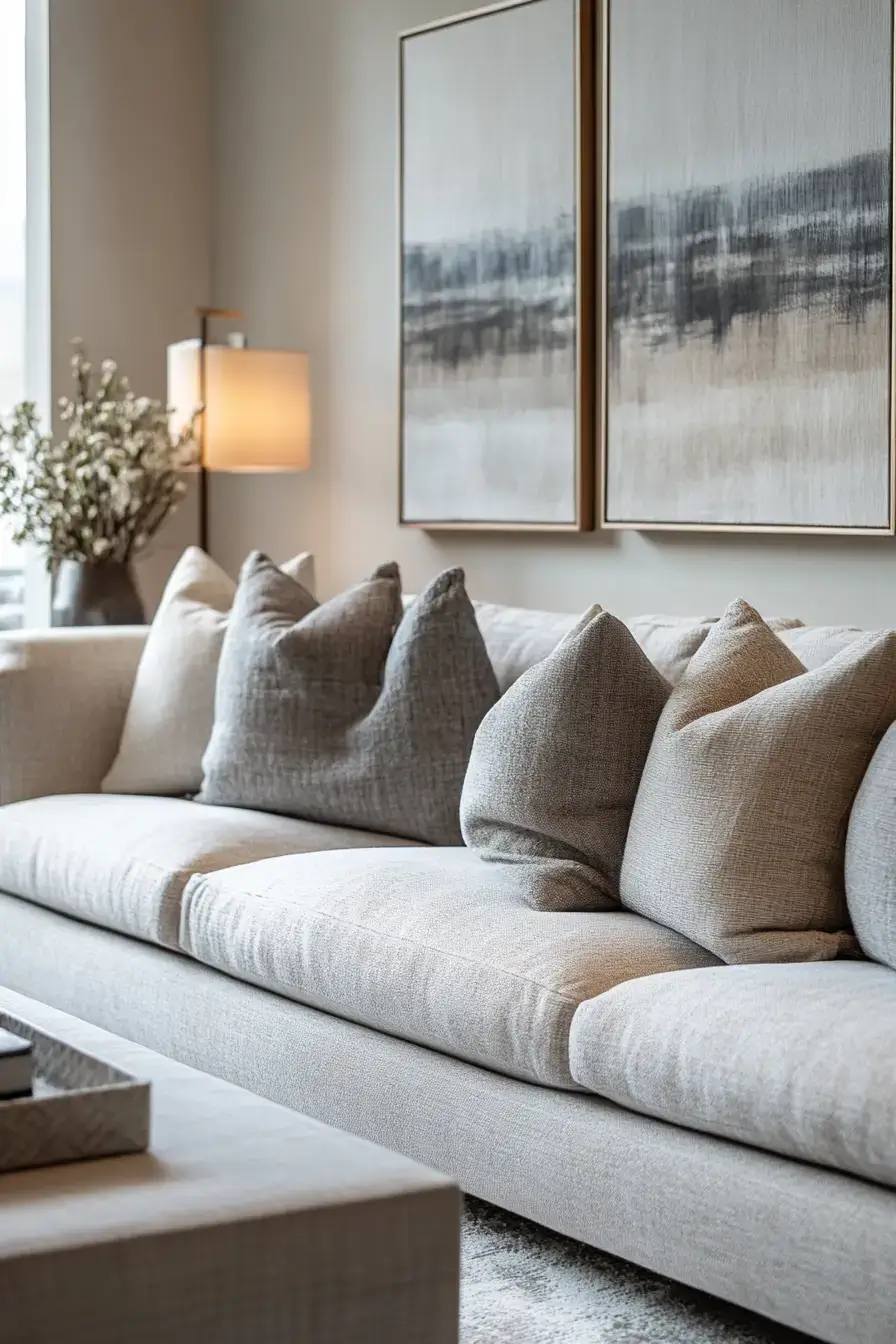
Neutrals don’t have to be boring — throw in a graphic rug or a bold-patterned pillow and the grey-beige base becomes the calm that lets the pattern pop. Let neutral be the straight man. The shapes get to be the funny one.
22. Whispered Contrast Feels Sophisticated
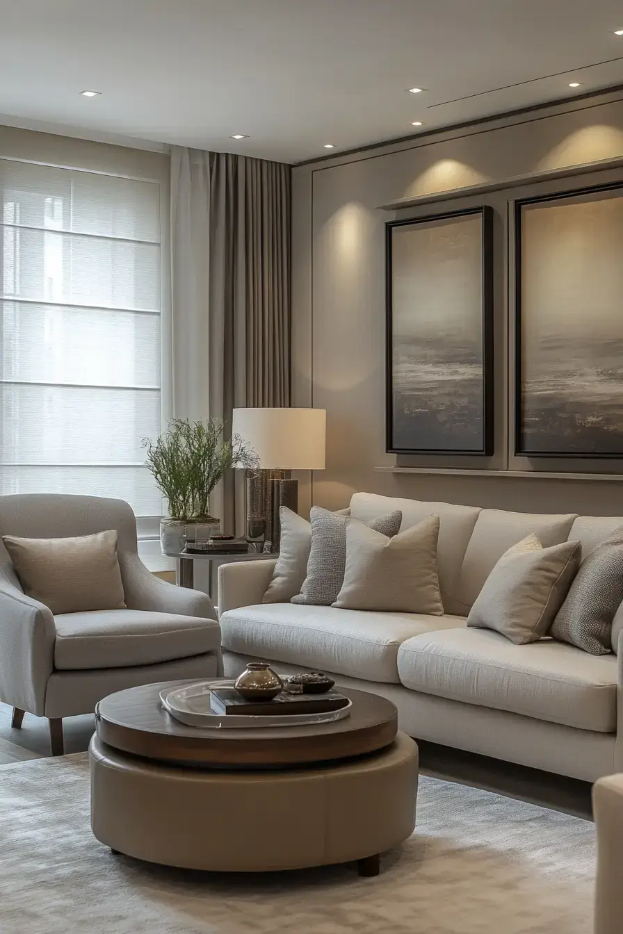
Tiny value shifts — a slightly darker cushion, a warmer throw — do the work here. It’s contrast you feel more than see. Sophistication hides in the details. Most people won’t name it; they’ll just feel the room is ‘nice.’ Mission accomplished.
23. Intentional Details Radiate Refinement
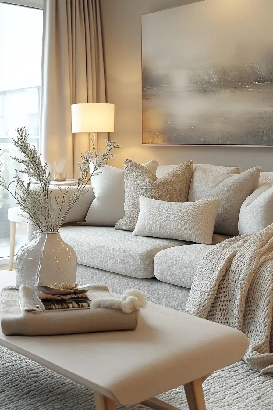
Every object in this room looks chosen, not accumulated. A considered book stack, a single sculptural vase, deliberate greige tones. Intent beats quantity, always. Refinement is just decision-making you can see.
24. Symmetrical Styling Looks Glamorous
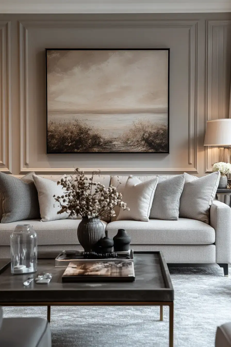
Symmetry reads as formal, and formal reads as glam. Two matching lamps, two pillows, a centered sofa — boom, instant polish. Mirror-image styling equals easy elegance. It’s the decorator’s oldest trick because it works.
25. Modern Statements Steal Attention
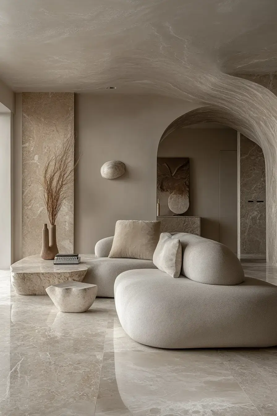
One big modern piece — a sculptural chair, an oversized art canvas — hijacks the room, and the grey-beige backdrop lets it shine. A statement needs a quiet stage. Don’t compete with it; frame it.
26. Polished Proportions Flow Beautifully
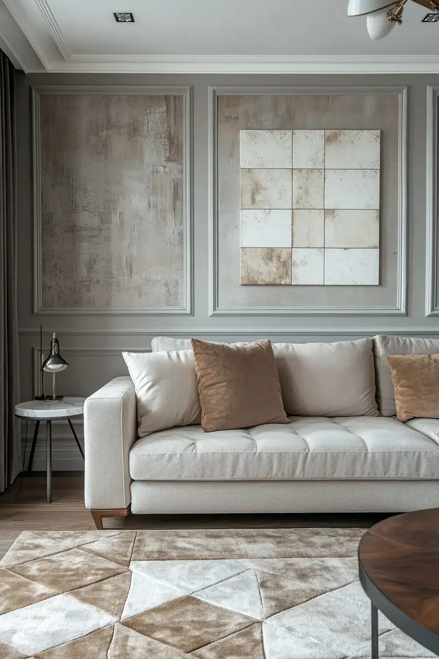
Scale is the unsung hero here. Right-size the furniture for the room and the grey-beige palette flows instead of crowding. Good proportions feel effortless. You notice the calm long before you notice the color.
27. Subtle Sophistication Feels Memorable
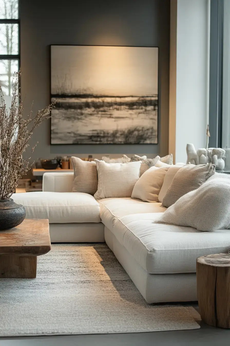
This room doesn’t shout, but you remember it. Restrained grey-beige, one or two perfect accents, nothing extra. Memorable doesn’t mean loud. It means everything that’s there earns its place.
28. Smart Design Simplifies Living
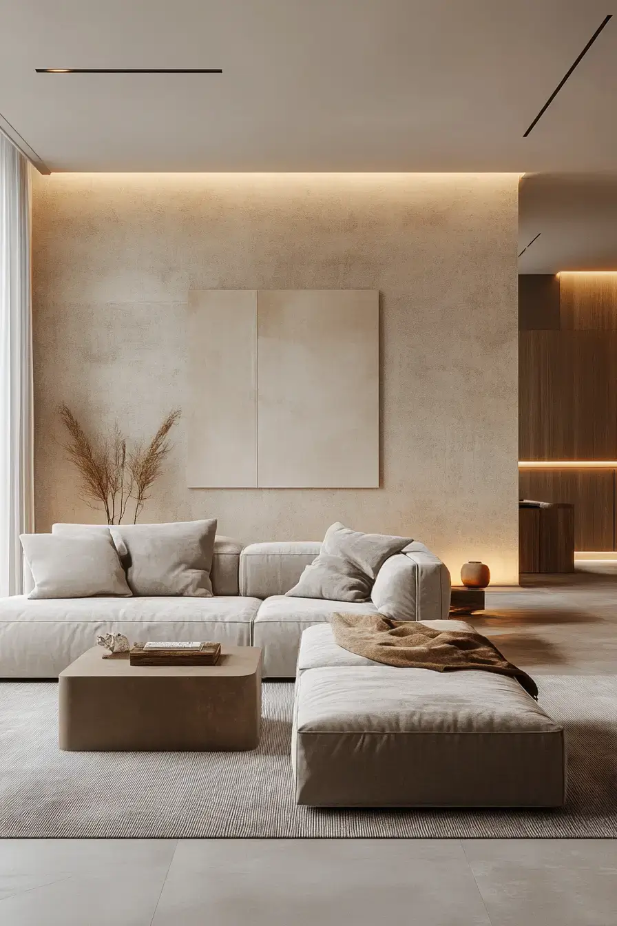
Design that helps you live — hidden storage, a wipeable rug, traffic paths that make sense — wrapped in calm grey-beige. Pretty that’s also practical wins. The room looks serene because it actually is easy to live in.
29. Touchably Textured Greige Luxury
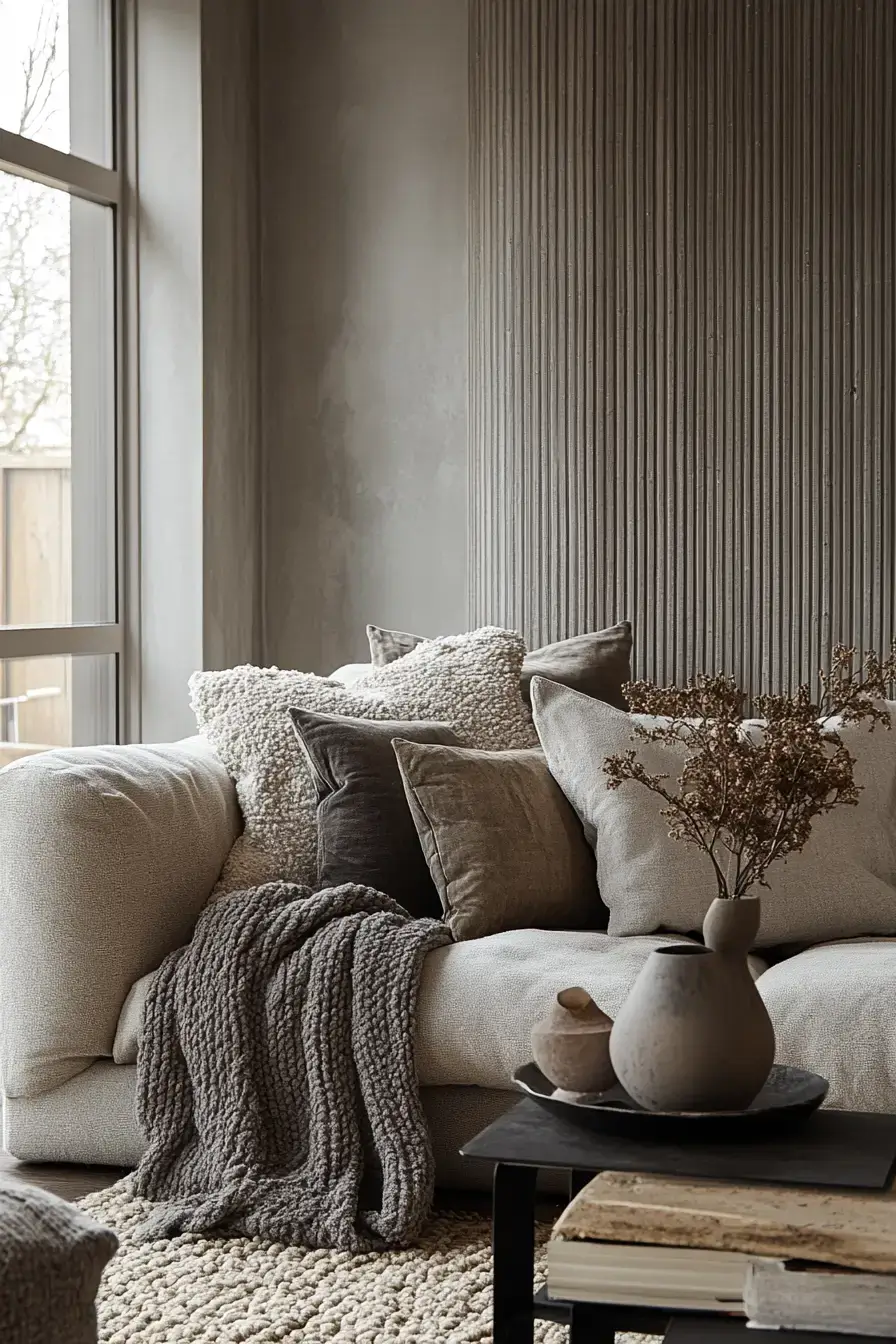
Last one, and it’s a love letter to texture. Greige everything, but every surface begs to be touched — bouclé, linen, travertine. Luxury you can feel beats luxury you can only see. Run your hands across this room and you’ll get why greige is the hero.
Wrapping It Up
So there it is — 29 ways to make grey and beige feel like a warm hug instead of a hospital wing. The throughline is simple: let grey bring the structure and beige bring the cozy, then pile on texture so it never goes flat. Pick the one that made you pause and start there — you don’t have to redo the whole room to feel the difference. Give it a shot 🙂 and tell me which space you’d steal first!
Save this article
We’ll email you the link so you can find it again later.