


There’s a reason “clay” and “terracotta” paint chips keep flying off the shelf. After years of stark white walls and gray-everything homes, people want color that looks like it came from real dirt and stone. A warm earthy living room leans into those tones and mixes them with linen, timber, and rattan so the space feels lived-in instead of staged. That’s the whole trick: real materials, real warmth.
1. Clay Linen Feels Effortless
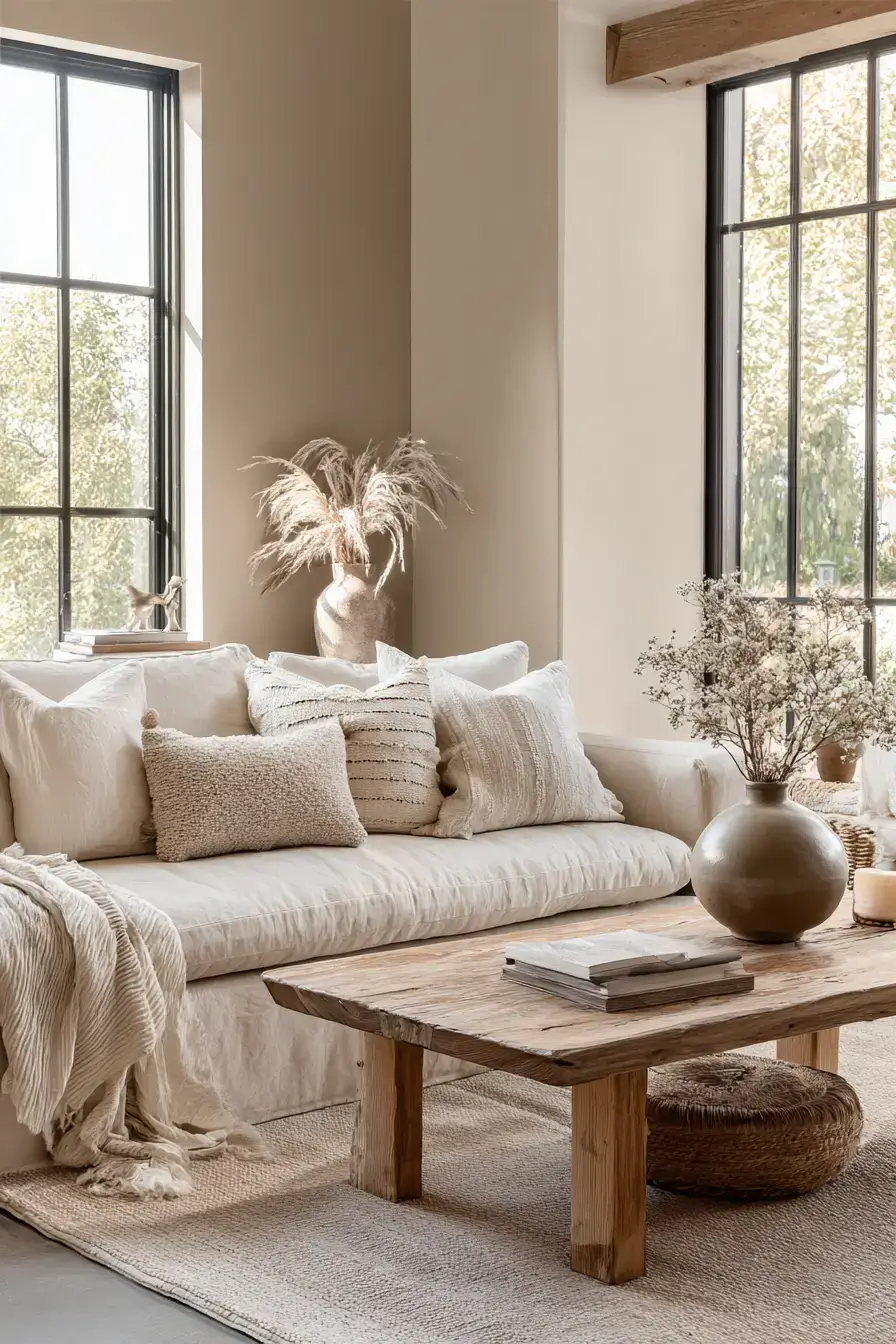
Clay and linen just work together. Muted clay walls set a calm, warm foundation for your living room, and linen upholstery softens everything so the richer colors never feel heavy. Natural fibers add texture and give the space a casual elegance that works year-round. Throw in warm light and you’ll pull the rosy undertones right out of the clay — suddenly those neutral fabrics feel like an invite to sit down. Linen is the secret that keeps clay from feeling like a cave.
2. Modern Boho Meets Earth
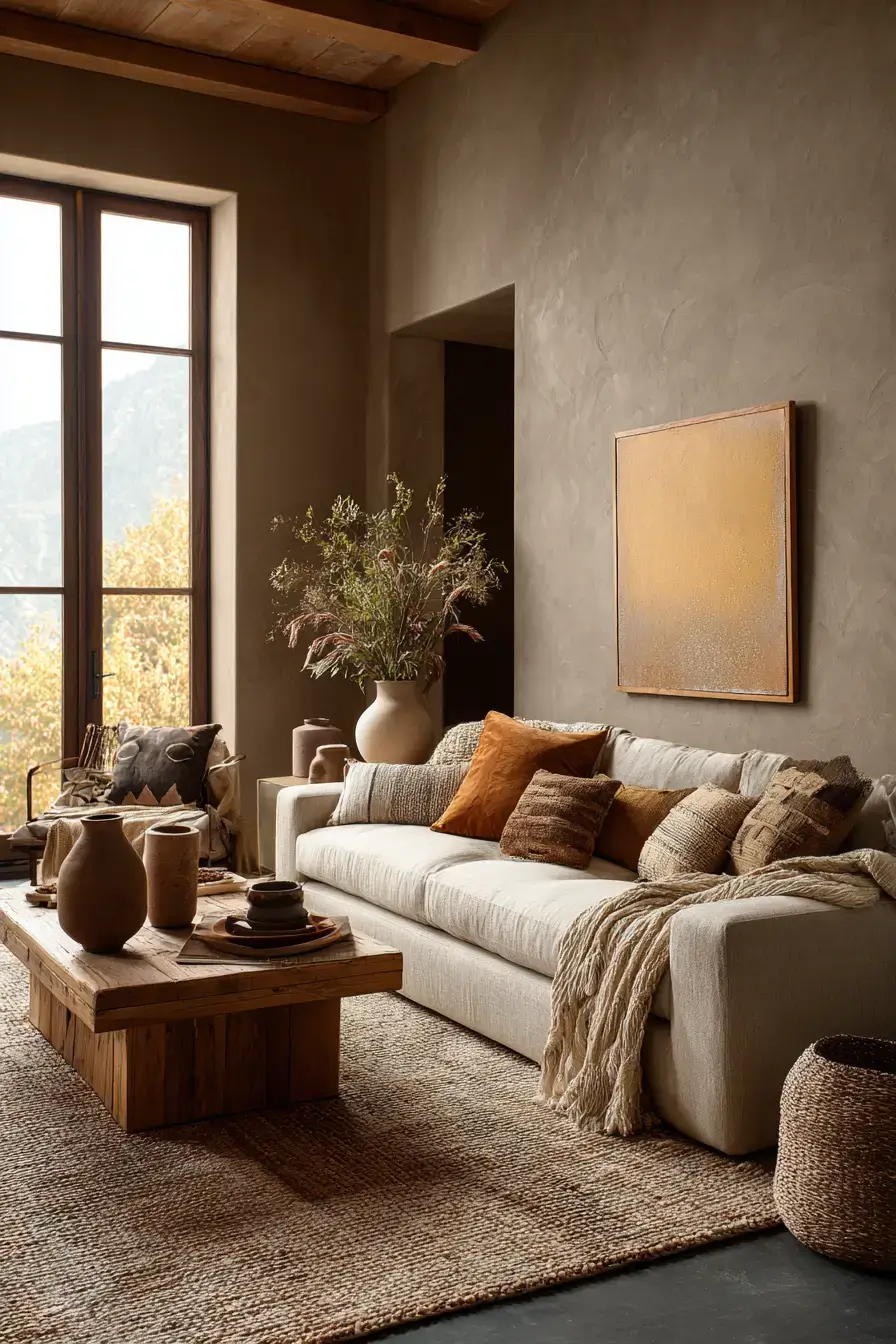
Take boho’s free spirit and ground it with clean, simple shapes. Warm brown, creamy beige, and muted terracotta build an earthy palette, while streamlined furniture keeps the layered look from tipping into clutter. Woven accessories, timber details, and soft textiles do the heavy lifting for personality. Keep patterns subtle and let the natural materials stay the star. Peek at more modern boho living room ideas if you want a cozy, free-spirited gathering spot.
3. Desert Warmth Feels Peaceful
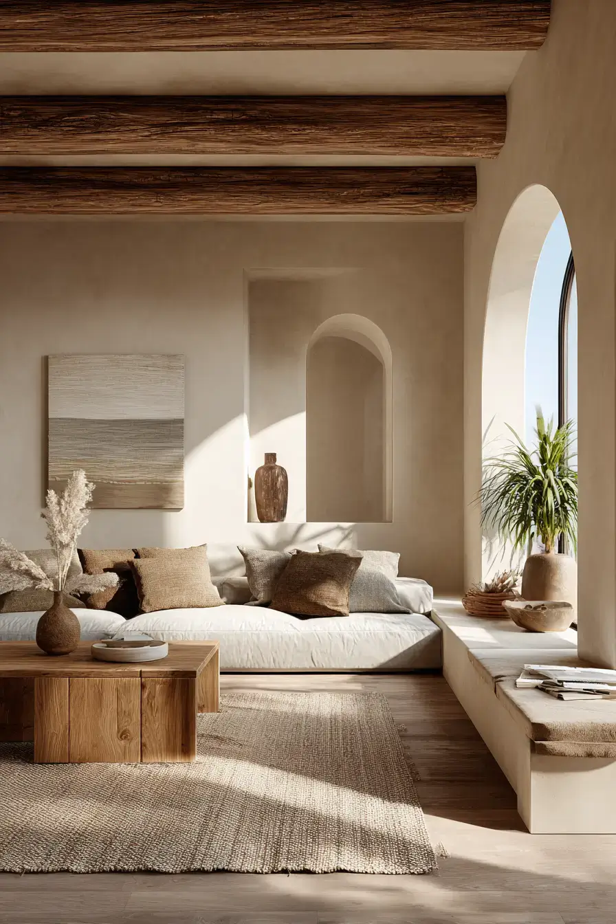
Sunbaked desert colors turn a living room into a calm, natural retreat. Sandy neutrals, soft clay, and earthy brown set the warm base, and deep, cushy furniture makes it the spot you actually lounge. Woven fabrics and layered textiles add touch without drowning the soothing color story. Organic accessories and raw finishes finish the landscape look with quiet character. Desert palettes forgive a lot — they just feel relaxed.
4. Terracotta Makes Rooms Glow
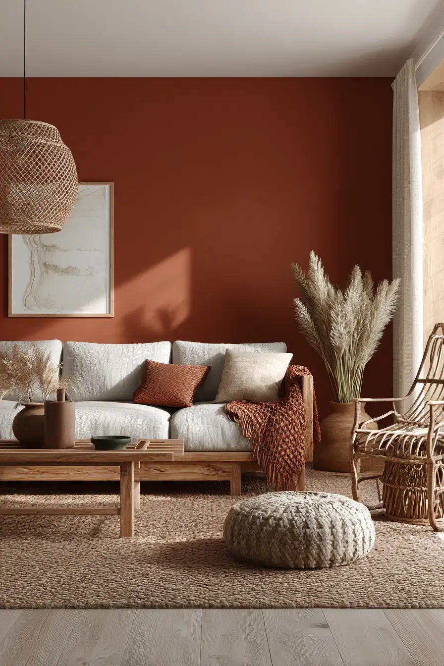
Terracotta brings a burst of earthy color that warms a room and gives it personality without losing sophistication. Those sunbaked orange-reds energize the space, while creamy upholstery and neutral walls soften the punch. Natural wood and tactile fabrics help the stronger color blend right in. Gentle light plays up the terracotta undertones and gives the whole room an evening glow. Lean into terracotta when you want cozy, not beige.
5. Wood Neutrals Feel Natural
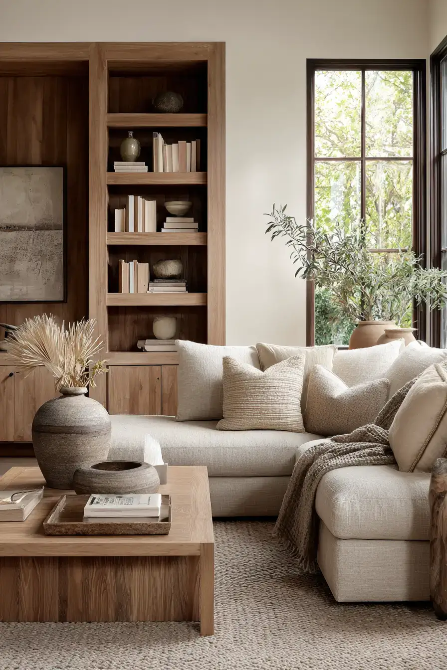
Let real wood do the talking against creamy neutrals — it’s a combo that never dates. Rich timber gives the room depth, and beige or ivory fabrics keep it luminous and relaxed. Woven rugs and textured cushions add layers so the restrained palette stays lively. Soft golden light shows off the grain and casts a gentle glow on every natural surface. Wood plus cream is the easiest warm look you’ll ever pull off.
6. Taupe Tones Create Serenity
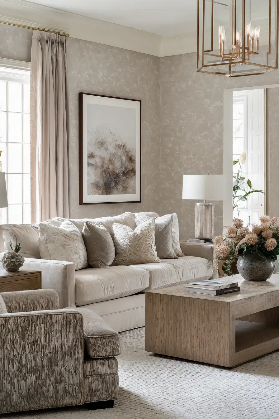
Build the room around taupe and you get a neutral palette that’s soothing and genuinely easy to live with. Warm gray-brown shades set the base, and plush upholstery plus woven textiles keep the tonal design from going flat. Natural timber adds contrast and more warmth against the softer surfaces. Layer textures for depth without breaking the room’s quiet mood. Taupe is the chill older sibling of gray. 😉
7. Rust Rattan Brings Character
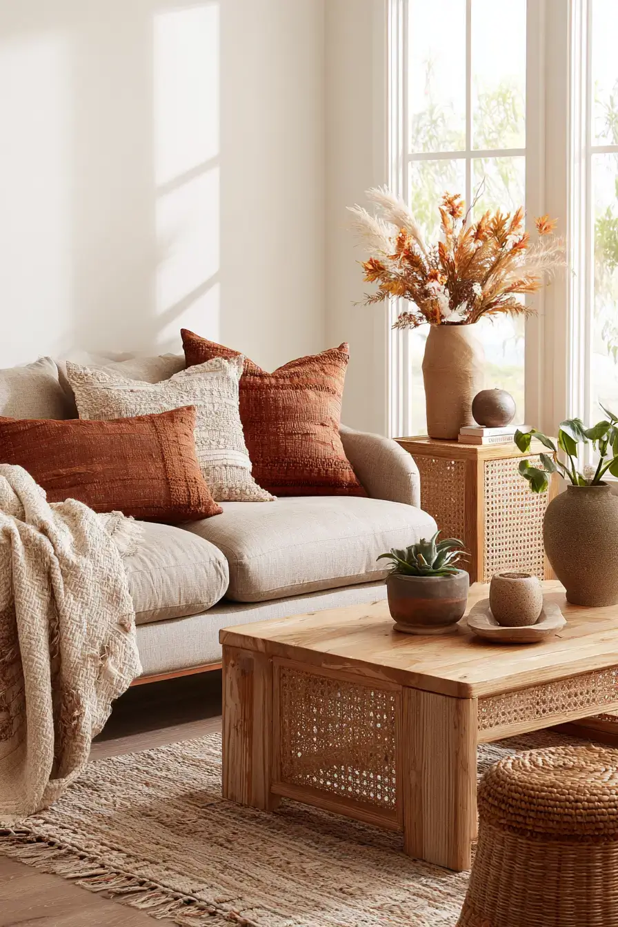
Rust and rattan make a lively pair — rich color meets woven texture and the room instantly feels more welcoming. Burnt-orange accents bring depth, and rattan furniture adds a lighter, relaxed natural element. Cream upholstery and neutral walls give both materials room to breathe. Warm lamps catch the weave and make the rust look especially rich after sunset. Rattan is the texture that stops rust from feeling like a fire hazard.
8. Japandi Meets Earthy Comfort
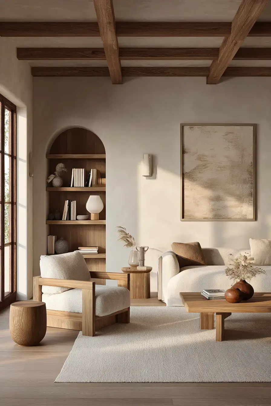
Soften Japandi’s minimalism with earth colors and you get a room that’s clean, intentional, and actually comfortable. Taupe, beige, and warm brown set the base; low furniture and clear surfaces keep the calm. Natural timber, handmade ceramics, and textured fabrics add character without piling on decor. Every piece earns its place and adds to the room’s harmony. Japandi stops feeling cold the moment you warm the palette.
9. Organic Modern Feels Natural
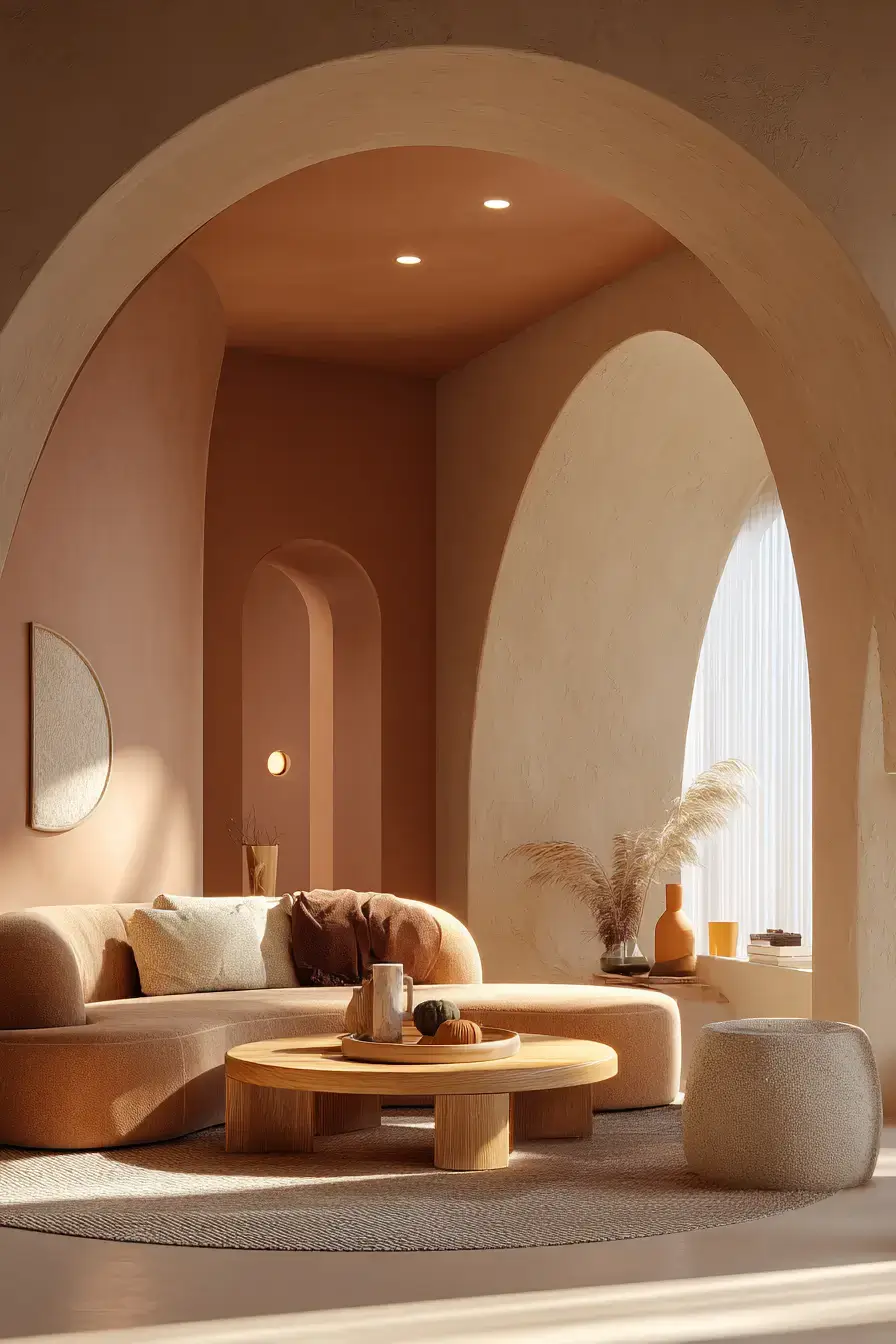
Blend modern polish with nature-made materials and the room feels current yet welcoming. Clay, warm brown, and muted green bring organic color; clean-lined furniture keeps a contemporary base. Timber, woven fabrics, and tactile surfaces soften the sharper shapes and add depth. Sculptural accessories add personality while keeping things streamlined. Organic modern is ‘designer’ you can actually live in.
10. Clay Tones Create Harmony
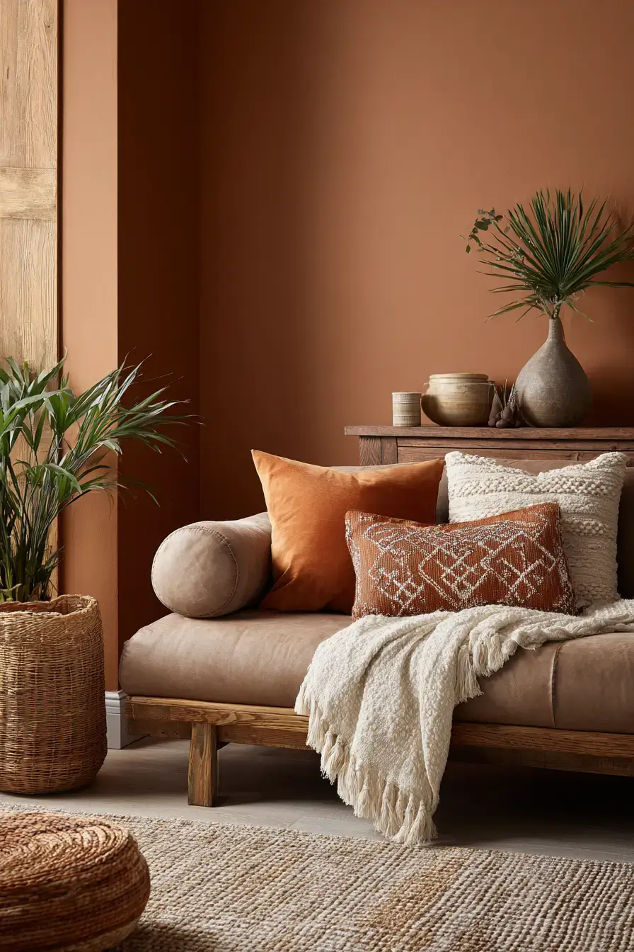
Wrap the room in gentle clay hues for a tonal look that’s warm without getting dark. Muted earthy color gives a comforting base, and creamy textiles add brightness and softness. Natural timber in contrasting shades adds dimension so the palette doesn’t read as one flat blob. Plush upholstery and quiet accessories finish the relaxed, cohesive look. Tonal clay is the safe way to go bold-ish.
11. Layered Textures Feel Luxurious
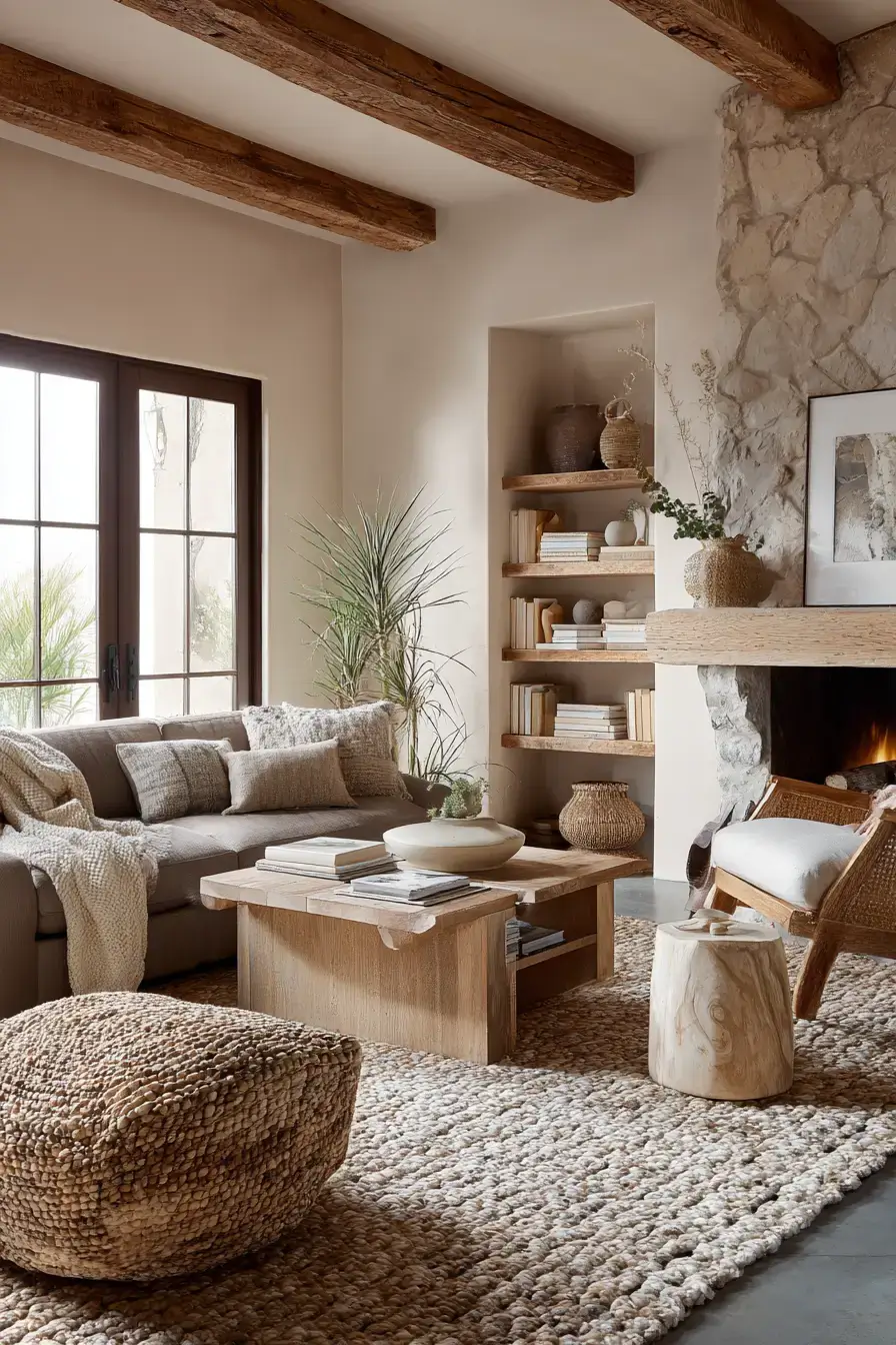
Layer natural textures through the room for depth and comfort without leaning on dramatic color. Raw timber, woven rugs, and soft upholstery turn the space into a tactile retreat while cohesive neutrals keep it all connected. Rattan, linen, and handmade accessories add variation and give the room a collected personality. Soft light throws shadows across the surfaces and makes every texture richer. Texture is what makes a neutral room feel expensive.
12. Modern Rustic Feels Inviting
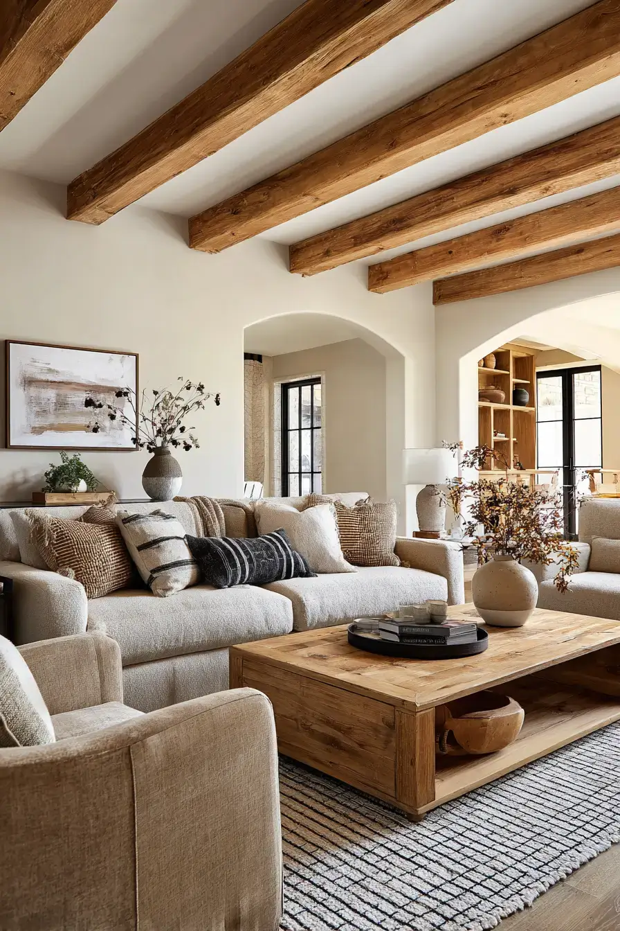
Refresh rustic decor with a softer palette and comfy fabrics so it reads authentic, not old-fashioned. Weathered wood brings natural character, and plush seating with creamy textiles balances the rough surfaces. Earthy brown and muted clay deepen the palette without weighing it down. Warm lamps and a few well-chosen accessories make the rustic bits look cleaner and intentional. Modern rustic is grandma’s cabin with better lighting.
13. Wabi Sabi Brings Calm
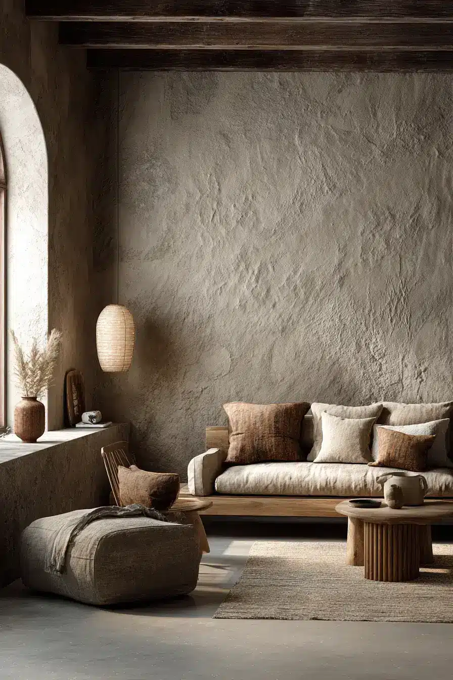
Wabi-Sabi celebrates the quiet beauty of imperfection, so lean into organic materials and understated forms. Earthy neutrals set a serene base; irregular ceramics, raw timber, and textured surfaces bring real character. Simple shapes and restrained decor let the handcrafted details shine. The uncluttered approach keeps the room peaceful while still warm. Imperfection is the point — stop fixing the wobble.
14. Sunset Shades Bring Energy
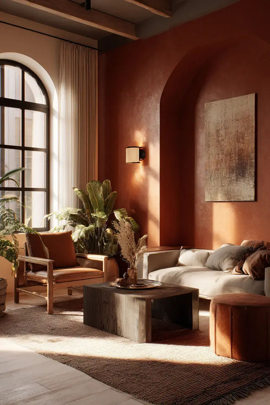
Recreate sunset with earthy oranges, muted reds, and warm browns layered through the room. Those glowing colors bring uplifting energy, and cream or beige accents stop the palette from overwhelming. Timber furniture and tactile textiles tie the richer shades to nature and add softness. Golden light amps the sunset effect for cozy evenings. Sunset shades are happy-hour for your walls.
15. Terra Timber Grounds Beautifully
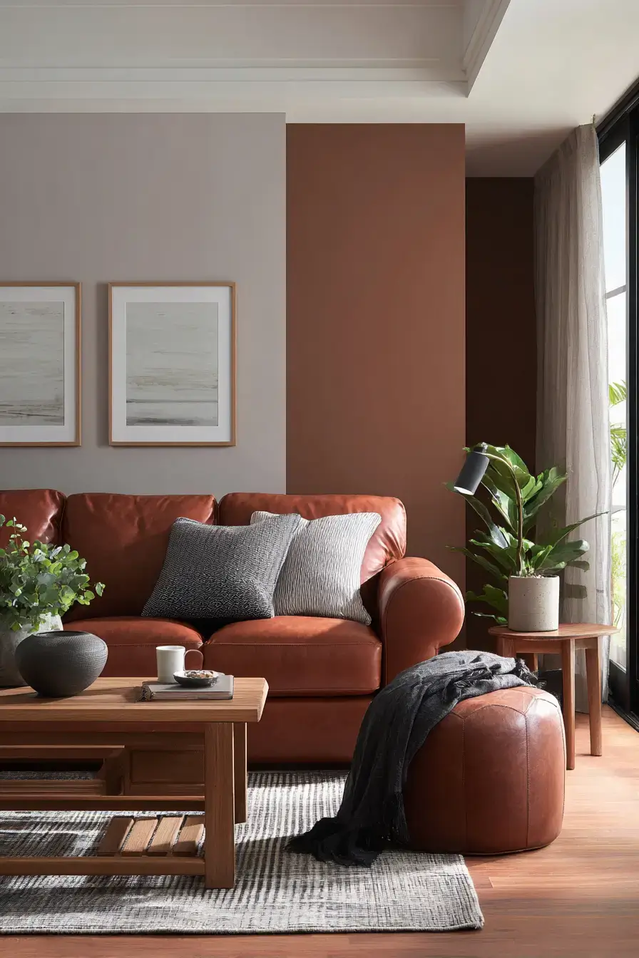
Pair earthy terra hues with beautifully grained timber for a room that feels naturally rich. Warm clay-inspired color adds depth, and wood furniture brings organic texture and timeless character. Cream upholstery and tactile fabrics soften the stronger tones and keep things relaxed. Ambient light plays up the reddish earth shades and gives the wood a gorgeous glow. Terra and timber is grounding you can see.
Save this article
Enter your email and we’ll send it straight to your inbox.
16. Caramel Sand Creates Warmth
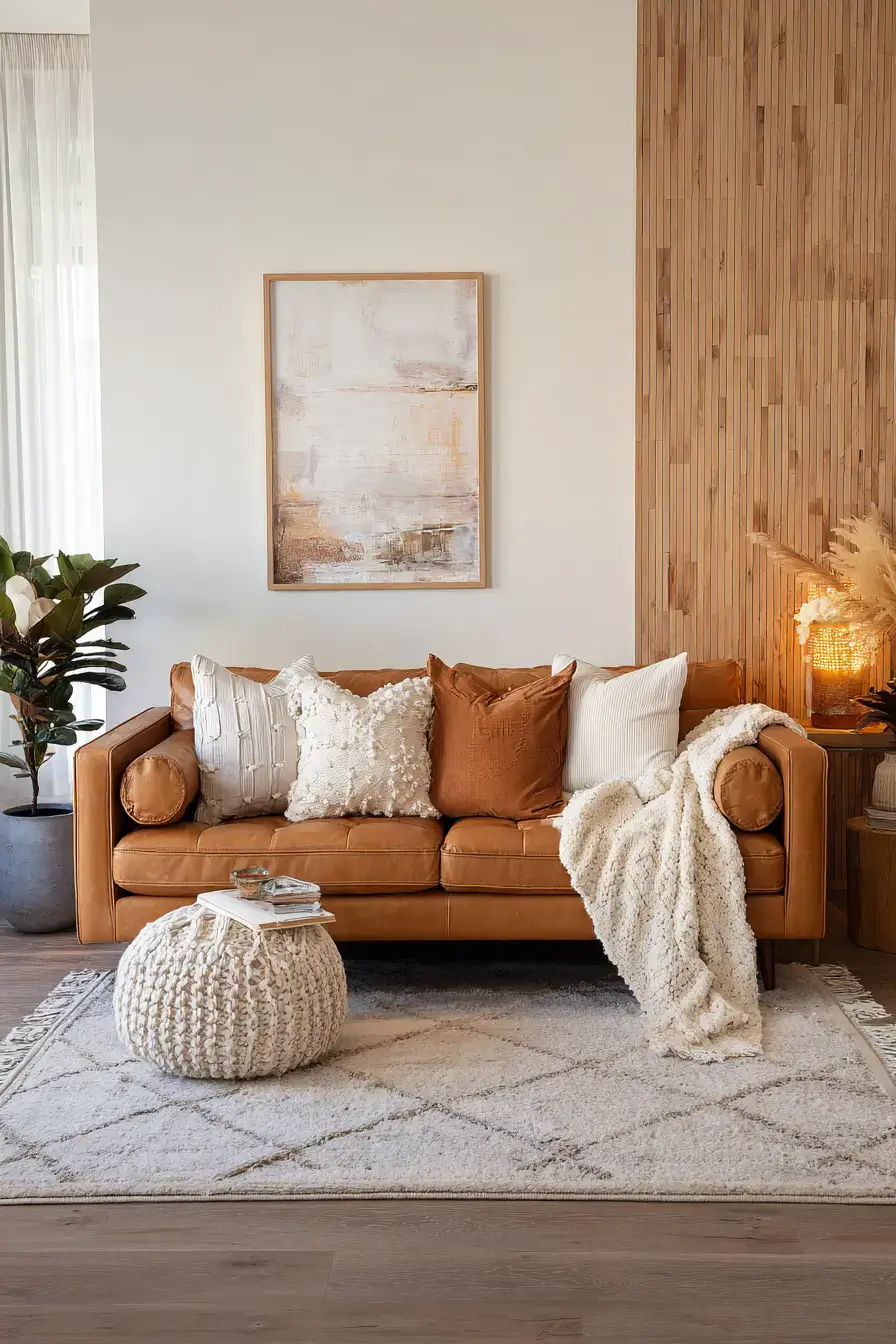
Layer caramel and sandy neutrals for a room that’s warm, luminous, and effortlessly refined. Rich golden-brown details add dimension, and pale sand sets a light, soothing base. Soft furnishings and woven textures make the tonal palette feel plush rather than plain. Natural wood and subtle metallic accents add another layer of warmth without disturbing the calm. Caramel tones feel like the room gave you a hug.
17. Butterscotch Burl Adds Character
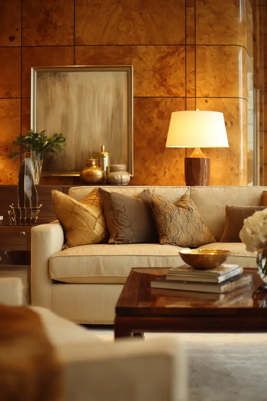
Pour a golden butterscotch glow into the room by pairing it with the dramatic grain of burl wood. Warm yellow-brown tones make the space feel cheerful, and the distinctive timber surfaces add natural artistry and depth. Soft cream upholstery balances the richer shades and keeps things fresh. Textured fabrics and gentle light show off both the golden palette and the wood’s wild patterns. Burl wood is nature’s own abstract art.
18. Ochre Accents Brighten Neutrals
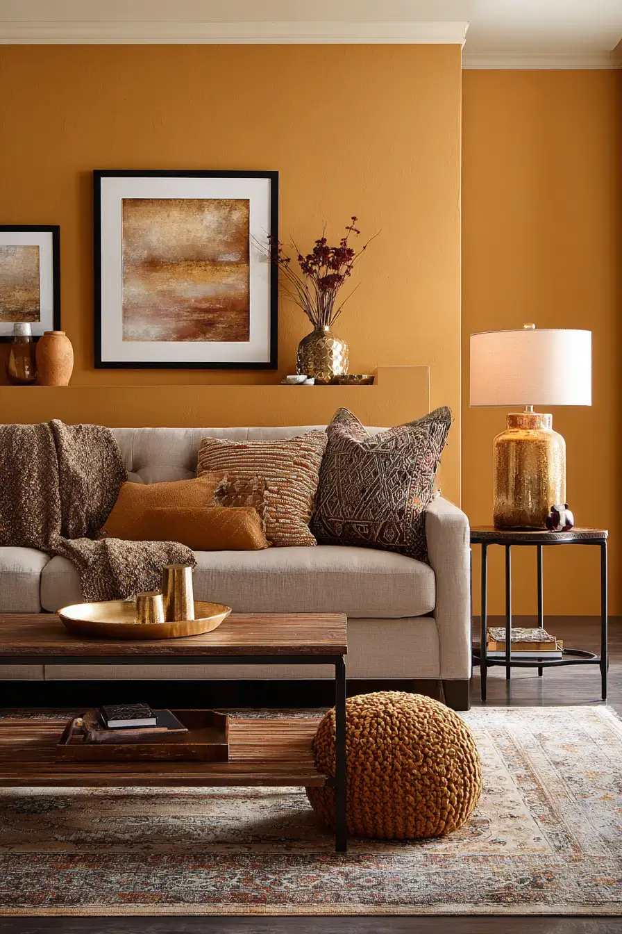
Wake up a neutral room with ochre accents that bring bold color while staying grounded. Golden mustard tones add uplifting energy, and cream or taupe gives a sophisticated backdrop. Drop the color into an accent chair, cushions, or artwork for a striking look that never feels like too much. Natural wood and woven textiles tie the brighter shade back to the room’s organic materials. Ochre is the wink in an otherwise calm room.
19. Sage Earth Brings Calm
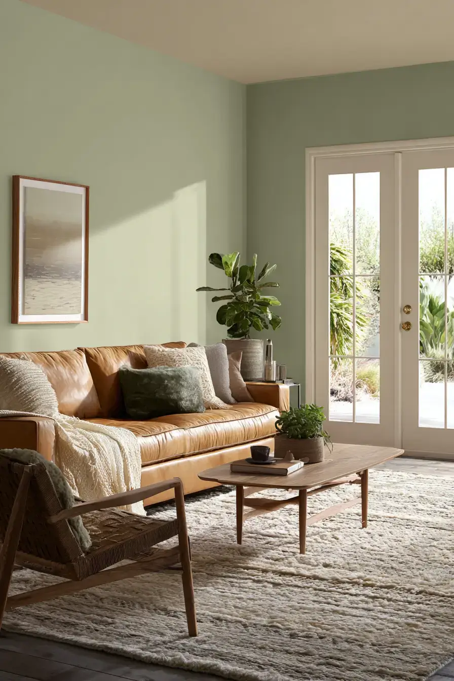
Pair botanical sage with soil-inspired neutrals and the room feels calm and connected to nature fast. Dusty green brings freshness, and taupe, brown, and beige build a grounded supporting palette. Natural timber and woven accessories add tactile dimension and reinforce the organic mood. Cream textiles brighten the deeper colors and give the whole space a soft, breathable feel. Sage is the exhale your living room didn’t know it needed.
20. Midcentury Earth Gets Cozier
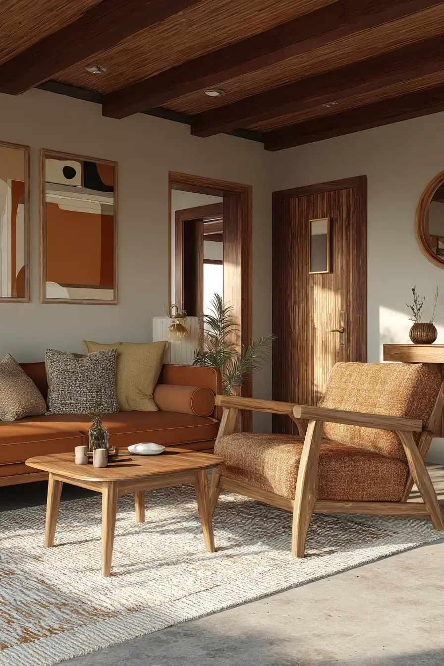
Warm up mid-century design with earthy color and rich timber for a fresh take on retro style. Walnut furniture gives a warm earthy room depth, and rust, tan, and muted olive soften those clean vintage silhouettes. Textured upholstery and plush rugs make the streamlined furniture feel approachable. Warm lamps show off the grain and cast a nostalgic glow without dating the room. Walnut is what makes mid-century feel like home.
21. Earthy Minimalism Warms Spaces
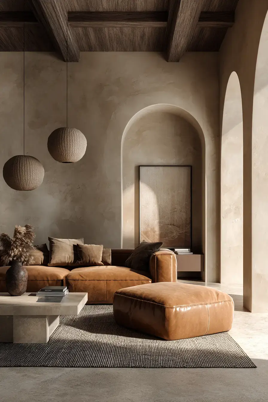
Strip the clutter but keep the warmth with a minimalist palette built on natural earth tones. Beige, cream, and soft brown make the room peaceful instead of stark or empty. Linen upholstery, timber furniture, and woven accents add just enough texture to keep the simplicity interesting. Carefully chosen decor lets each material stand out while the space stays calm. Minimalism doesn’t have to mean cold — just edit well.
22. Beige Clay Balances Beautifully
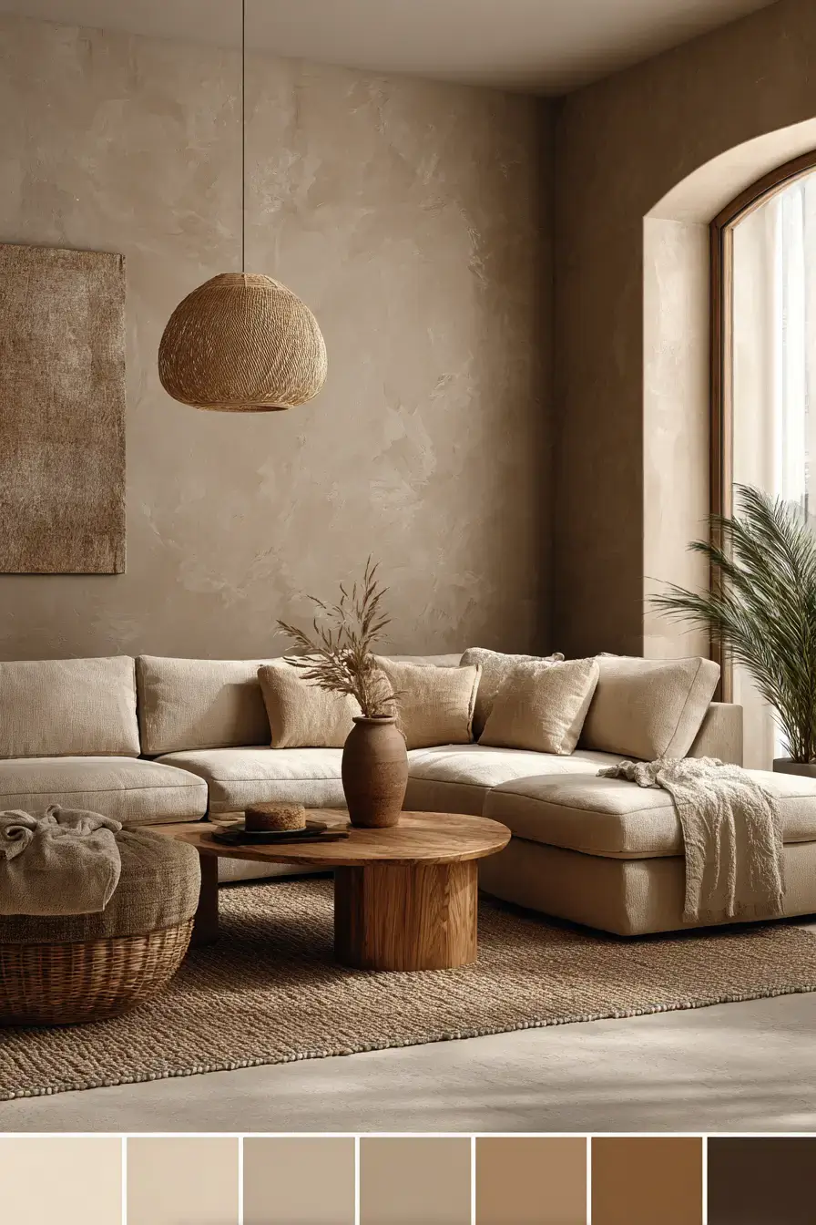
Balance light beige with muted clay for a subtle combo that makes the room feel warm and effortlessly polished. Creamy neutrals set the foundation, and terracotta-inspired accents add just enough contrast for personality. Timber furniture and woven textiles connect the two shades through their warm undertones. Soft light plays up the clay while keeping the beige luminous. Beige and clay is the quiet-confidence palette.
23. Terracotta Timber Glows Naturally
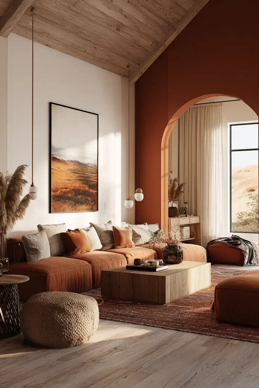
Celebrate natural warmth by pairing rich terracotta with timber that shows off its grain. Sunbaked color brings vibrancy, and wood furniture keeps the palette grounded and timeless. Cream textiles and plush upholstery soften the richer materials into a comfortable balance. Ambient light highlights both the reddish clay and the wood’s natural variation. Terracotta and timber are basically best friends.
24. Olive Cream Looks Sophisticated
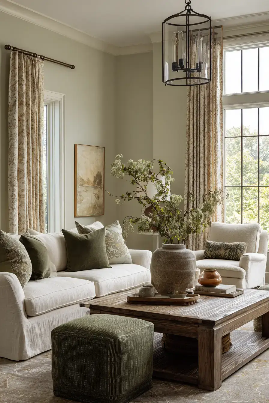
Put earthy olive with luminous cream for a palette that feels sophisticated, soothing, and natural. Muted green adds depth, and creamy upholstery stops the richer shade from darkening the space. Warm timber and woven textures add organic character that complements the botanical color. Gentle light softens everything and connects the contrasting shades. Olive and cream reads expensive without trying.
25. Canyon Layers Add Drama
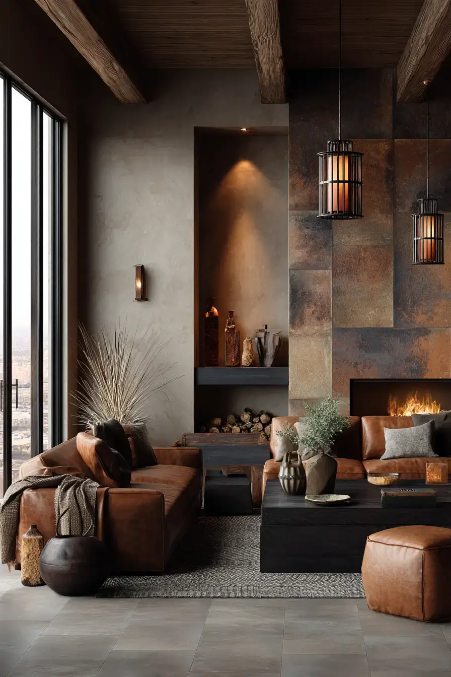
Channel dramatic canyon scenery with layered desert shades and rugged textures that bring the outdoors in. Warm rust, tan, and deep brown set the base, and stone-inspired finishes add striking natural dimension. Plush upholstery and soft fabrics balance the rugged surfaces so the room feels comfortable, not harsh. Timber accents and warm light reinforce the sunbaked palette with an atmospheric glow. Canyon layers are drama you can actually relax in.
26. Mushroom Mahogany Looks Refined
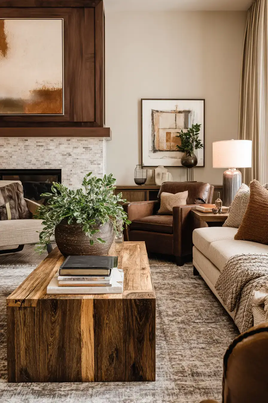
Pair soft mushroom shades with deep mahogany for a palette full of earthy contrast. Brown-gray neutrals set a calming base, and reddish timber brings richness and visual weight. Cream fabrics and plush textures soften the darker wood so the room doesn’t feel too formal. Warm light shows off the mahogany grain and adds a luxe glow to the quiet neutrals. Mushroom and mahogany is moody in the best way.
27. Burnt Sienna Sparks Energy
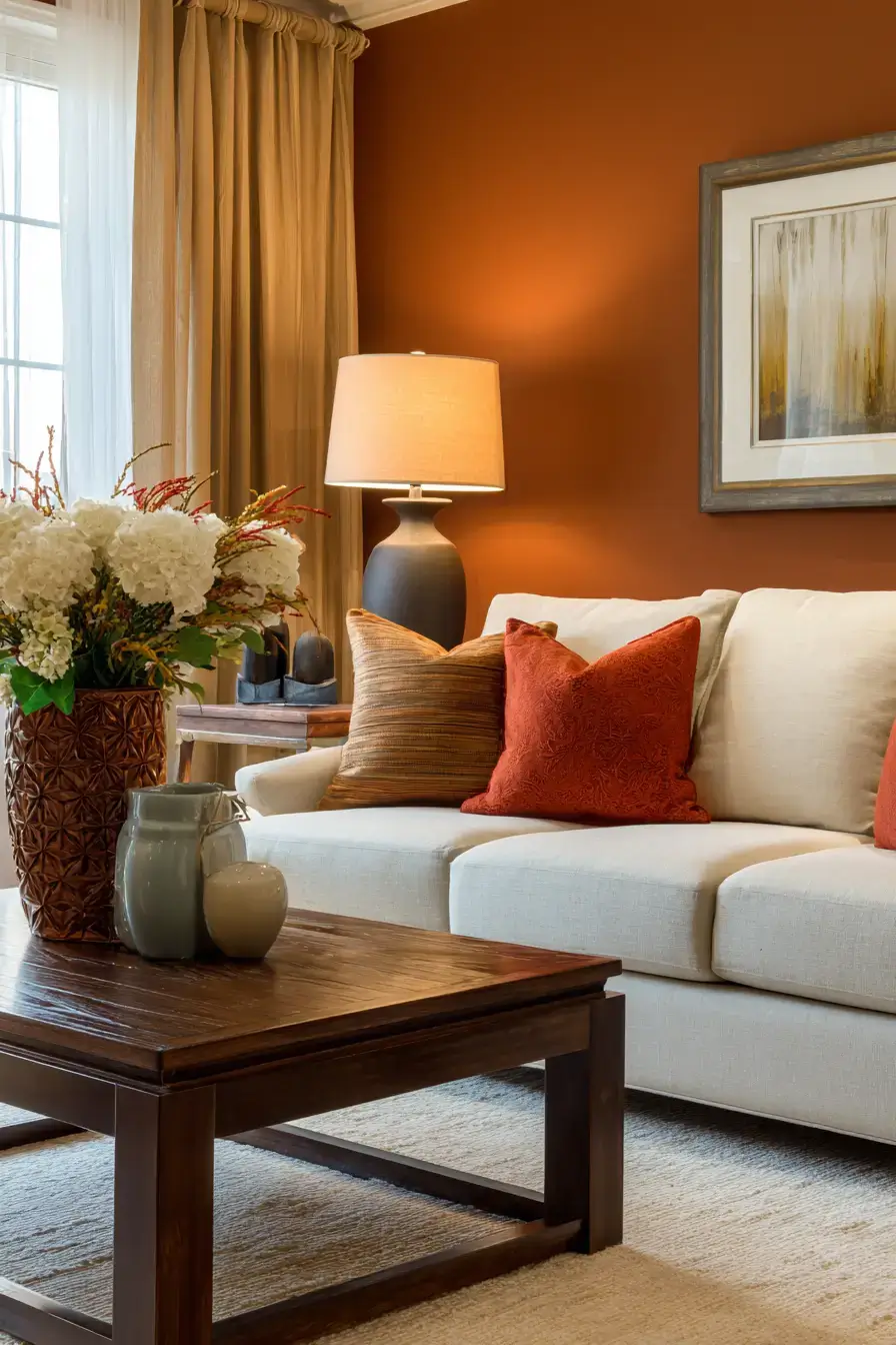
Make burnt sienna your signature shade for a room that feels confident, vibrant, and warm. Rich reddish-orange details add depth, and creamy neutrals keep the dramatic color balanced. Natural wood and tactile textiles boost the organic character so the hue feels comfortable, not overpowering. Golden light intensifies the sienna and sets a cozy-evening glow. Burnt sienna is the extrovert of earth tones.
28. Earthy Florals Soften Rooms
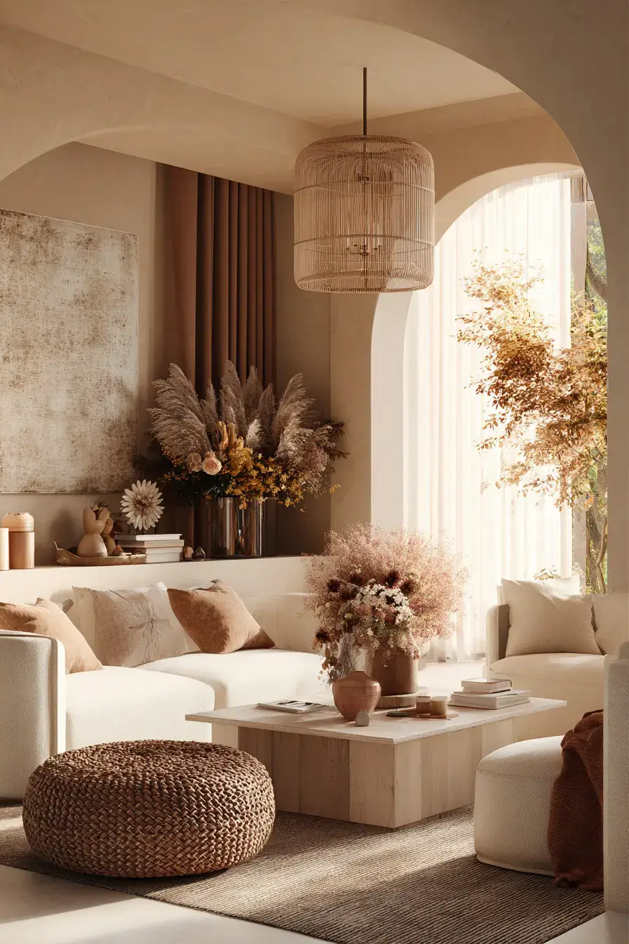
Add the faded beauty of dried florals for a palette that feels delicate, organic, and modern. Dusty rose, muted clay, and warm beige give soft color while keeping a grounded, natural mood. Linen textiles, pale timber, and dried botanicals add texture and reinforce the nature-inspired look. Cream accents keep the muted floral shades fresh instead of overly tonal. Dried flowers are the low-maintenance soul of the room.
29. Honey Hues Radiate Warmth
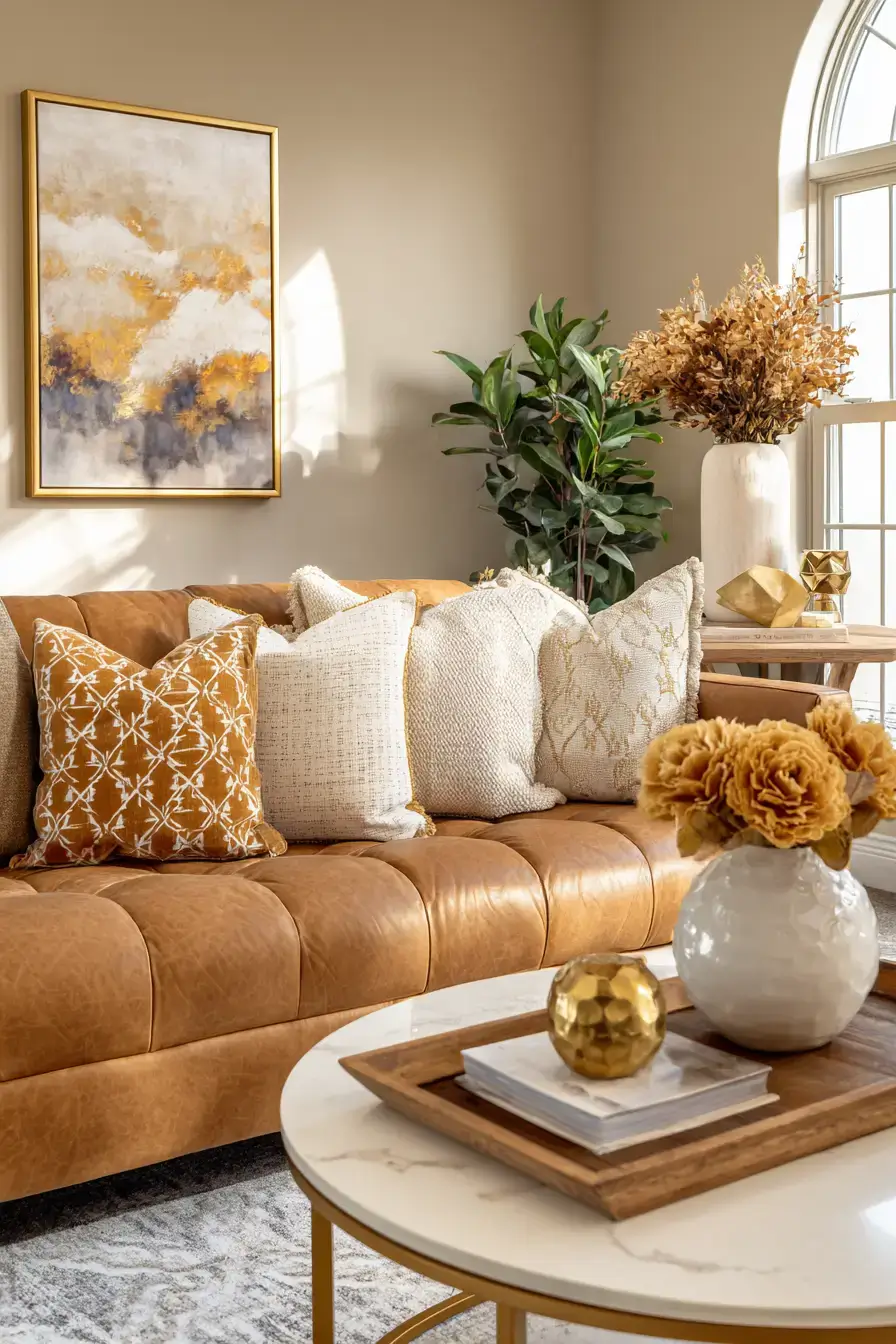
Wrap the room in honeyed shades that catch sunlight and create a cheerful mood on contact. Golden brown and soft amber bring radiant depth, and creamy neutrals keep the palette balanced and relaxed. Natural timber and woven fabrics complement the honey tones with layers of organic texture. Soft lamps amplify the golden undertones so the room feels extra cozy as daylight fades. Honey hues are basically bottled afternoon light.
Wrapping It Up
So there you have it — 29 ways to make a living room feel warm, grounded, and real. The through-line is simple: pick one honest material, whether that’s terracotta, rattan, or visible wood, and build the rest of the palette around it. Let a plant be your green and keep the light soft and afternoon-ish. A single ceramic vase can tie the whole thing together. Start with one idea from this list and see where it takes you — give it a shot! What’s your favorite earthy shade?
Save this article
We’ll email you the link so you can find it again later.


