As we step into the fresh vibrancy of 2024, my lens as an interior design enthusiast sharpens to focus on the latest interior design color trends that promise to drench our living spaces with soul-stirring vigor. Exploring the rich tapestry of colors forecasted for the upcoming year, I’m drawn to the magnetic pull of how color psychology in interior design orchestrates our moods and environments. It’s not just about aesthetics; it’s about incorporating color in interior design to evoke an experience, to create rooms that reverberate with life’s rhythm and hues.
In observing these trends, I uncover a narrative of colors that balance serenity with exuberance, each palette infused with intention and purpose. Reds that pulse with energy, blues that soothe the spirit, and a medley of greens and yellows that echo the earth and the sun—it’s a spectrum that’s diverse yet harmonious, and I’m here to share how these shades can transform your familiar spaces into reflections of your inner vitality.
Key Takeaways
- Embrace the 2024 interior design color trends that blend vibrancy with tranquility.
- Understand the significance of color psychology in interior design for mood enhancement.
- Discover the power behind purposefully incorporating color in interior design.
- Behold the interplay between bold color statements and subtle harmonies in interiors.
- Prepare for color trends that promise to create a restorative and dynamic living experience.
Embracing the Elegance of Deep Color Schemes
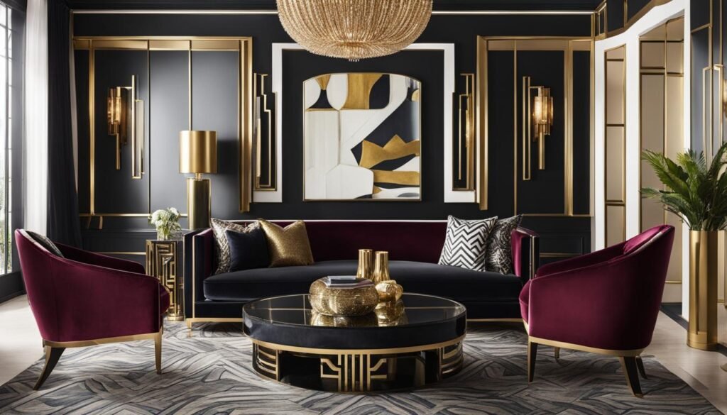
As I dive deep into the world of interior design for the upcoming year, I can’t help but notice the distinguished presence of deep color schemes set to dominate our living spaces. Renowned design experts, including Erin Little and Wadden, have foreseen a striking trend that effortlessly marries vibrant shades with more profound tones, such as chocolate browns and striking blacks — perfect for providing a captivating contrast within a luxurious decor.
Behr’s impeccable selection of Cracked Pepper, alongside York Wallcoverings’ choice of Bay Brown, are testaments to the sophisticated elegance that deep, warm shades exude. There’s a reason these colors have been chosen as the stars of the year; they possess an inviting, timeless allure that I find utterly compelling.
- Using colors to enhance interior design is more than a mere choice; it’s an art form that calls for thoughtful color coordination in interior design. Deep hues offer an outstanding backdrop for bold furnishings, allowing for a space that is both cohesive and refined.
- Choosing paint colors for interior design is a decision that should be made with intentionality—and 2024’s inclination toward rich, dark shades provides a perfect foundation for creating an atmosphere of grounded opulence.
- Color schemes house interior decisions are pivotal in cultivating an environment that both calms and astonishes. The balance achieved through combining dark and vibrant tones results in an interior that’s not merely a place to reside but a realm to relish.
The undeniable charm of deep color schemes in our house interiors paves the way for a new kind of serene sophistication. As the new year approaches, I eagerly anticipate the transformative potential these palettes will introduce to homes around the country.
The Serenity of Blues in Home Interiors
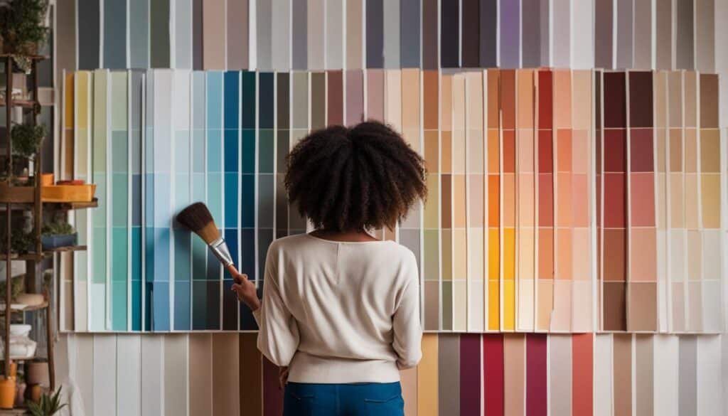
In my exploration of popular interior design colors, I’ve noted a pronounced shift towards a tranquil palette, with various shades of blue gaining prominence in creating peaceful home interiors. The preference for light, denim-inspired hues and aquatic blues is shaping the color trends in interior design for the forthcoming year. Acknowledging the long-lauded connection between color and mood, these shades promise to infuse spaces with a calming ambiance, holding fast to their reputation as best colors for home interiors.
From Denim-Inspired Hues to Aquatic Blues
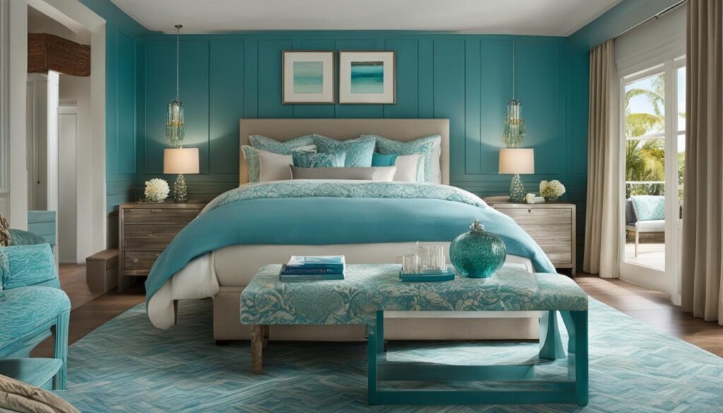
Renowned paint companies such as Sherwin-Williams and Benjamin Moore have embraced these serene tones, with the former naming Upward—a cozy denim blue with gentle gray undertones—their color of the year. This hue is emblematic of the growing trend to establish areas of tranquility within the home, fostering respite from the bustling world outside. Benjamin Moore’s Blue Nova, a captivating mix of blue with a subtle violet whisper, is similarly aligned with celestial inspirations, intended to launch inhabitants into a realm of both adventure and elevated everyday living.
The Rise of Teals and Aquas in Decor
Lately, my focus has expanded to include the burgeoning interest in teals and aquas, colors that lend a vibrant yet restful energy to interior spaces. With an increased societal emphasis on wellness and biophilic design, I find the enthusiasm for these colors well-founded. Valspar’s Renew Blue, a sprightly midtone straddling the line between blue and green, and C2 Paint’s Thermal, a refreshing aqua, encapsulate this tilt towards playful sophistication. Optimal interior design color schemes often involve the coupling of these colors with compatible, herbal greens to breathe life into any interior—this combination strikes an idyllic balance between revitalization and serene composure.
- Integrating calming blues to inspire tranquility
- Implementing vibrant teals and aquas for a refreshing aesthetic
- Harmonizing with natural greens to complement and enhance
As I look ahead, I am eager to witness the continuing evolution of interior design color schemes, particularly how they reflect our collective yearning for calm and happiness in our homes amid the flux of outside life. Color combinations in interiors are not just a trend but a testament to our ongoing dialogue with our environments, and I anticipate the dialogue in 2024 to be painted in the most harmonious shades of blue.
Utilizing Purples for Depth and Experimentation
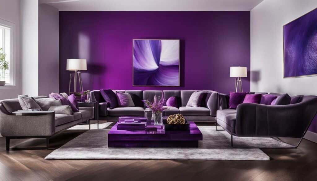
As I delve into the art of choosing colors for interior design, I’m captivated by the potential that purples hold. These hues are not just visually striking but imbued with a versatility that can elevate the overall aesthetic of a space. The year 2024 sees a daring yet sophisticated use of this color, with a particular emphasis on muted and softer purples, championed by renowned brands like Benjamin Moore with their Hazy Lilac—a testament to the enriching quality of purples.
The Versatility of Muted and Softer Purples
It’s fascinating how muted purples can introduce an empowering richness to interiors. These hues serve as a perfect medium for experimentation, allowing designers to craft spaces that reflect personal style while still maintaining an air of finesse. My approach integrates these subdued purple shades into the interior design color palette to add a layer of depth that is both bold and understated, providing a unique character to every room.
Combining Purples with Complementary Hues
In my experience, purples possess an inherent flexibility when paired with complementary hues, encouraging an inclusivity within color schemes for different rooms. Harmonizing purples with pinks, blues, or greens can dramatically enhance the vibrancy or sophistication of a space. I advocate for the judicious use of these combinations to foster a vibrant yet cohesive interior design color scheme that resonates with the desired atmosphere of a room.
The Heartfelt Allure of Pinks and Reds
As I delve into the exploration of emerging color trends in interior design for 2024, I find that the emotional pull of pinks and reds is irrefutable. Leading paint companies, such as Sherwin-Williams and Little Greene, have reintroduced us to the soft, meditative hues of colors like Masquerade and to the vibrant, energetic tones recognized in the Barbiecore movement. These selections, steeped in nostalgia, are shifting the narrative to one that encompasses both optimism and a yearning for the past – all while aligning with the latest popular interior design colors.
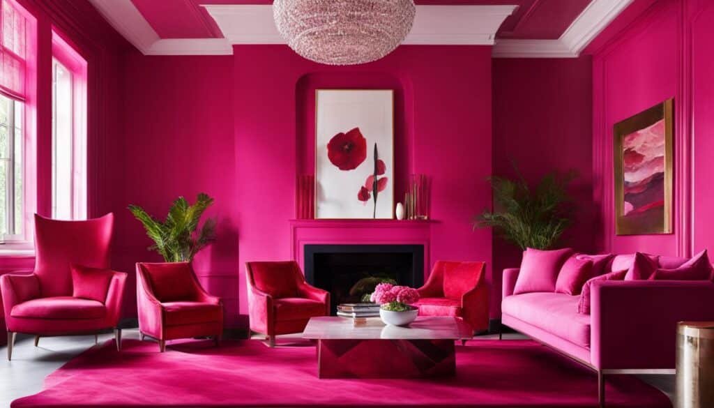
Nostalgic Influences in Choosing Paint Colors for Interior Design
Reminiscent and emotive, the use of pinks and reds demonstrates an affinity for memories, guiding choices in paint colors with a fond reverence. When I consider utilizing these colors in an interior, I am using color theory in interior design as a tool to evoke certain feelings – soft pinks for serenity, and vibrant reds for energy. Together, they transform spaces into sanctuaries that do not just appeal to the eyes but also to the soul, thereby enhancing the overall experience through using colors to enhance interior design.
Integrating Terracotta and Warm Reds into your Palette
Anticipating a return to favor in 2024, terracotta and warm reds bring forth an earthy vigor within any space they grace. Employing these hues, designers like Sue Wadden and brands such as Benjamin Moore spotlight the important role these shades will play in shaping the forthcoming year’s color trends in interior design. It is not just about the color itself, but how using these terracottas and warm reds can create a sense of warmth and welcome, traits highly sought after in contemporary design practices. These expressive colors craft an invitation into spaces meant for living fully and joyfully.
Luminous Yellows and Oranges: Reflecting Happiness
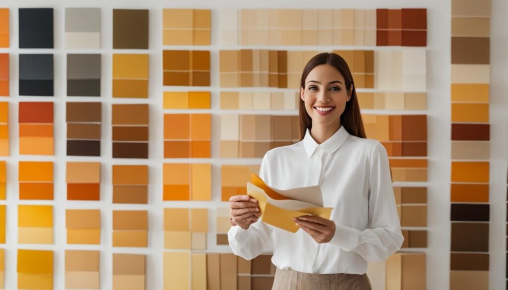
As an enthusiast in choosing colors for interior design, I’ve observed the rising popularity of radiant yellows and vivacious oranges. These hues are icons of joy, symbolizing the epitome of cheerfulness and comfort in interior spaces. Reflecting on VERANDA’s Color of the Year, Electric Amber, its captivating allure is undeniable, pulsating with energy and warmth that enlivens any environment.
When it comes to choosing paint colors for interior design, these luminous shades are not just a trend but also reflect a deeper psychological influence. They have an innate ability to elevate one’s mood—orange, with its close ties to creativity and enthusiasm, and yellow, often associated with happiness and optimism.
- Electric Amber – A beacon of vibrancy fusing golden hues with a touch of the sun’s energy
- Persimmon by HGTV Home – A lively orange that injects a sense of revitalization
- Apricot Crush – A fashion-inspired tone bridging the gap between softness and vitality
Integrating these shades into interior design projects has become an expression of one’s desire for spaces imbued with life and excitement. Imagine the effervescent glow of dusk or the first light of dawn each time you step into a room; this is the enchanting promise that these colors offer. It’s truly a joy to bring such light into my clients’ homes, reminding them of the endless possibilities for positivity and comfort through smart color choices.
Earthy Greens: A Nod to Nature within Our Spaces
As I explore the realms of color combinations for interiors, I’m continually drawn to the best colors for home interiors, which for the year 2024, undoubtedly includes earthy greens. These shades are not just colors; they represent a lifestyle, a shift towards integrating nature’s own palette into our personal spaces. Reflecting both freshness and sophistication, these hues have an innate ability to induce calm, evoking a nurturing vibe that is the essence of a serene home environment.
Save this article
Enter your email and we'll send it straight to your inbox.
The appeal of earthy greens lies in their versatility. Famed names in the color industry, like Graham & Brown with their Viridis shade, and Dutch Boy’s Ironside, showcase a spectrum that ranges from the approachable and muted to the deep and elegant. It is this variety that promises a color for every mood and setting, reaffirming the soothing connection to the natural world in various facets of interior design.
I believe that the ability to utilize color to achieve a desired emotional response in home design is paramount. Earthy greens do just that by aligning aesthetic appeal with the subconscious comfort that only colors inspired by nature can provide. By harnessing this power, I am able to create living spaces that are not only visually stunning but also emotionally grounding.
- Stepping into a room painted in the soft tranquility of sage can wash away the stress of the day.
- Designing a workspace with olive green touches can offer a sense of stability and focus.
- Accentuating a living area with emerald accents brings about an air of regal elegance while maintaining a deeply comforting vibe.
Incorporating earthy greens tailors our interiors towards a balance of being at once refreshing and serene. As an ever-present backdrop or as strategic splashes of vibrancy, these are the colors that will define living spaces with their timeless nod to nature and well-being in the year to come.
Warming Neutrals: Creating Calm and Comfort
As I delve into the world of interior design color palette creation, I’ve discovered that warming neutrals have cemented their place as essential components for cultivating spaces of serenity and snugness. Through my explorations, it has become abundantly clear that in 2024, these hues will define the foundation of diverse color coordination in interior design.
Pioneers of color like Sherwin-Williams and Glidden are setting the pace, introducing an array of honey-forward shades that breathe energy and relaxation into any room. My preference leans towards selecting warm off-whites and buttery tones which not only present a cozy ambience but also act as a counterfoil to the crispness of LED lighting, ensuring the environment remains balanced yet dynamic.
- Limitless: A hue that captures a sense of infinite possibilities.
- Calming Cream: This shade engenders a serene and inviting backdrop.
- Buttery Beige: I find this color enhances the coziness of a well-lit room.
- Soft Cashmere: A tone that weaves comfort into the very fabric of the space.
Amalgamating wisdom from industry giants with my own design philosophy, I’m convinced that these warming neutrals will forge environments that are grounded, yet brimming with vitality. In embracing these colors, I see a canvas that allows for boundless creative expression within the calm comfort of our live and work spaces.
Colors Interior Design
As a passionate advocate for using color theory in interior design, I’ve always believed in the transformative power of a well-chosen palette. The science of how colors interact and the emotional responses they evoke is a cornerstone in crafting spaces that are visually stunning and emotionally resonant. With 2024 on the horizon, I am thrilled to see how color psychology in interior design continues to play an essential role in creating environments that genuinely reflect an individual’s personality and style.
Using Color Theory in Interior Design for Cohesion
Incorporating popular interior design colors into a home is more than just following trends; it’s about curating spaces that feel coherent and connected. Whether deploying complementary colors to inject a space with energy, or selecting analogous hues for their serene vibes, applying color theory ensures that every color choice is intentional and contributes to a harmonious design narrative.
Color Schemes for Different Rooms
The magic unfolds when I adapt color schemes for different rooms, considering each setting’s unique ambience and functionality. No two rooms are the same; the vibrancy sought in an entertainment area differs starkly from the serenity of a bedroom retreat. As we tailor our spaces in 2024, it will be the year of personalization, with bold, dramatic colors for some and light, airy tones for others, all meticulously chosen to foster the perfect atmosphere for every interior.
Conclusion
As I cast my gaze towards the horizon of 2024, the vista is a kaleidoscope of dynamic color trends in interior design. Deep, resonant color schemes emerge to infuse elegance into every corner, harmoniously juxtaposed against the tranquil palette of blues and greens—each a testament to the serenity of nature. I am moved by the playful interlude of nostalgic pinks and reds, which dance through spaces with an air of whimsy and warmth, beckoning to days of yore with modern flair. Bright and radiant, the luminous yellows and oranges inject an infectious zest for life, permeating interiors with rays of happiness.
The earthy allure of green tones extends an invitation to comfort, a quiet nod to the organic tapestry that envelops our world, while warming neutrals are my foundation, cocooning rooms in a haven of calm and repose. In my quest to elevate spaces, I’m relentlessly reminded that each color, each hue I choose, is deliberate—a key to unlock the specific atmosphere and emotional resonance intended for a space. I’m ardent in incorporating color in interior design, a practice pivotal to the holistic experience of an interior, ensuring that both wellbeing and aesthetic style are in synchrony within the tapestry of home.
In embracing the color trends in interior design, I am guided by the principles of color theory and the intuitive insights of color psychology. This approach anchors my choices, not just in the pursuit of visual harmony, but also in the pursuit of creating spaces that resonate with the soul. 2024 holds a canvas brimming with potential for renewal and reinvention through color—each stroke, each splash of pigment, a gentle whisper of the intimate stories we choose to tell within our walls.
FAQ
What role does color psychology play in interior design trends for 2024?
Color psychology is integral to the interior design trends for 2024, as it helps to determine which colors evoke certain emotions and atmospheres within a space. The careful selection of colors based on their psychological effects ensures that each room provides the desired emotional response, whether that’s a feeling of energy, tranquility, or comfort. This approach underscores the trend towards creating environments that foster well-being and style.
How are deep color schemes being incorporated in interior design for 2024?
Deep color schemes are forecasted to bring elegance and a sense of grounded luxury to interior spaces in 2024. Contrasting vibrant shades with deep, rich tones like chocolate browns, striking blacks, and deep navies creates a harmonious and luxurious ambiance. Designers are using these deep colors to craft cohesively luxurious backdrops that allow for both striking contrasts and a sophisticated palette.
What is the significance of blues in the 2024 interior design color trends?
Blues continue to be a steadfast favorite for interior design due to their connection to nature and their ability to resonate comfort and tranquility. In 2024, there is a move toward light, denim-inspired hues and aquatic blues that promote tranquil spaces. Additionally, livelier shades of blues like teals and aquas are gaining popularity, influenced by our desire for nature and well-being.
Why are muted and softer purples gaining popularity in interior design?
Muted and softer purples are gaining popularity in interior design for their ability to add depth, richness, and versatility. These shades of purple allow for experimentation within interior spaces and can act as a complementary backdrop that enhances a variety of other hues. Designers are tapping into the empowering richness and flexible nature of purples to create bold yet subtle interiors.
How are pinks and reds being used in interior design for 2024?
Pinks and reds are being used to evoke a sense of nostalgia and optimism in interior design for 2024. These colors, ranging from soft pinks to vibrant reds, reflect a natural transition towards warm, earthy blush tones, contributing to interiors that offer tranquility and a contemporary flair. Additionally, terracotta and warm reds are predicted to surge in popularity, providing a method to inject vibrancy and warmth into spaces.
What impact do luminous yellows and oranges have in interior design?
Luminous yellows and oranges are forecasted to be prominent in 2024, bringing brightness, warmth, and happiness into interior spaces. These “it” shades, such as Electric Amber and Persimmon, are captivating and comfort-inducing, reflecting a trend towards joyous and invigorated interiors. These sunny shades are being celebrated for their ability to infuse spaces with an energizing yet pleasing atmosphere.
Why are earthy greens considered important for interior design in 2024?
Earthy greens are viewed as important for interior design in 2024 due to their ability to reconnect our spaces with natural elements and evoke sensations of calm and nurturing. Available in a variety of shades, such as muted greens or deep elegant tones, these colors serve as a comforting reminder of the outdoors, promising versatile and tranquil elements for any interior design scheme.
What are warming neutrals and how are they used in interior design for 2024?
Warming neutrals, including warm off-whites and buttery tones, are key elements in creating calming and comforting spaces for 2024. These colors are evolving as the new standard for interiors, offering an energized yet relaxed foundation for a variety of color palettes. Designers are incorporating these neutrals to counteract cool lighting and to establish a sense of grounded serenity in their designs.
How is color theory being used to create cohesive color schemes in interior design?
Color theory is being used to create cohesive color schemes by providing a systematic approach to selecting and pairing colors. It involves understanding the relationships between colors on the color wheel, the psychological effects of colors, and how they interact within a space. By applying principles such as complementary, analogous, and triadic color schemes, designers ensure spaces are aesthetically pleasing and harmonious.
How should color schemes be adapted for different rooms in a home?
Color schemes should be adapted for different rooms by considering the purpose and mood of each space. For instance, living areas may benefit from vibrant and energetic colors, while bedrooms might be suited to more tranquil and soothing hues. In 2024, personal preference plays a significant role, with designers crafting color schemes that meet the individual needs and goals of the occupants, ensuring that every room aligns with the desired ambiance and functionality.
Save this article
We'll email you the link so you can find it again later.