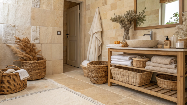


Gray gets a bad rap for being boring — but spend five minutes watching how it actually behaves in a bathroom and you’ll change your mind fast. A grey bathroom can go warm and soft like dove or greige, or full charcoal with brass for something moodier. Below are 29 takes that cover both ends and everything in between. Spoiler: cold gray is a choice, not a requirement.
1. Modern Calm Meets Luxury
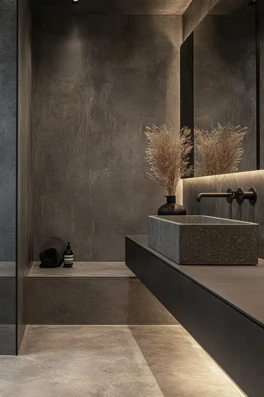
Floating vanities, frameless mirrors, and matte black hardware do most of the heavy lifting here. The gray stays soft, so the room reads calm instead of cold — and somehow still looks like a designer charged you a fortune. It’s the kind of space that makes you whisper “treat yourself” on the way to brush your teeth.
2. Peaceful Retreat Feels Heavenly
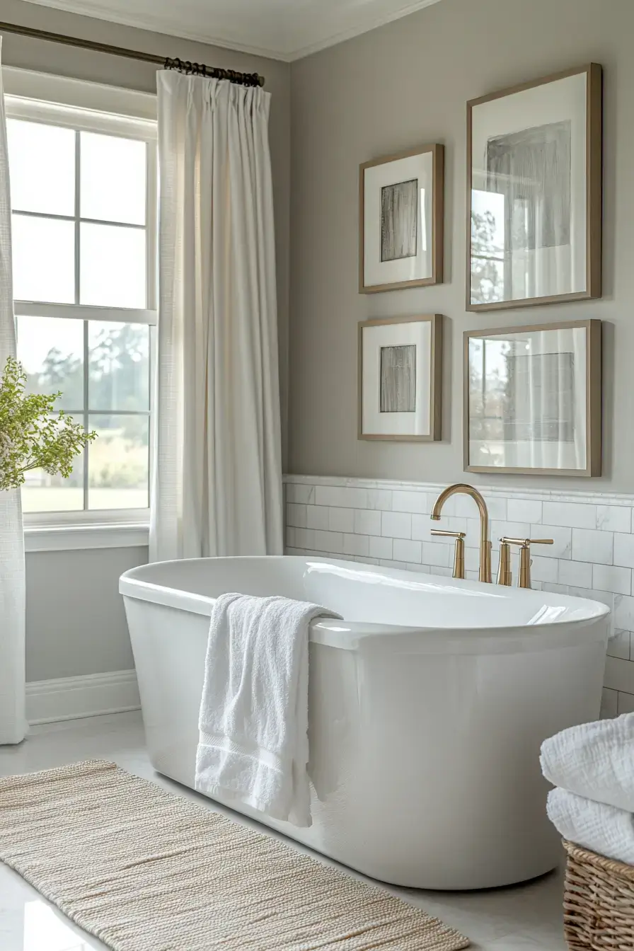
Pale gray walls and light stone flooring wrap the room in a spa-day calm that actually lasts past the first week. Airy fabrics and warm lighting keep it from feeling like a hospital. Want more where this came from? These grey bathroom ideas are worth a scroll.
3. Bold Concrete Beauty Beckons
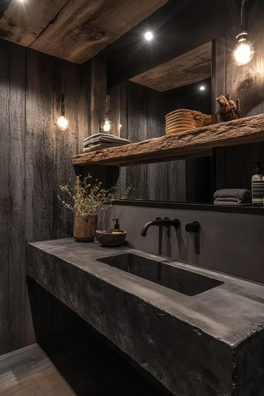
Concrete finishes sound cold until you pair them with warm wood and brushed metal — then they just look expensive. The trick is balance: let the texture be the star and keep everything else quiet. It’s bold without shouting, which is exactly the energy I want at 7 a.m.
4. Charcoal Charm Stands Proud
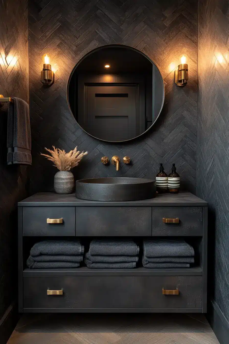
Charcoal walls with crisp white fixtures is a combo that just works. Throw in metallic accents and the whole room snaps into focus. Soft lighting stops it from getting cave-like, so you get drama without the doom. Honestly? A smarter move than all-white ever was.
5. Slate Serenity Flows Effortlessly
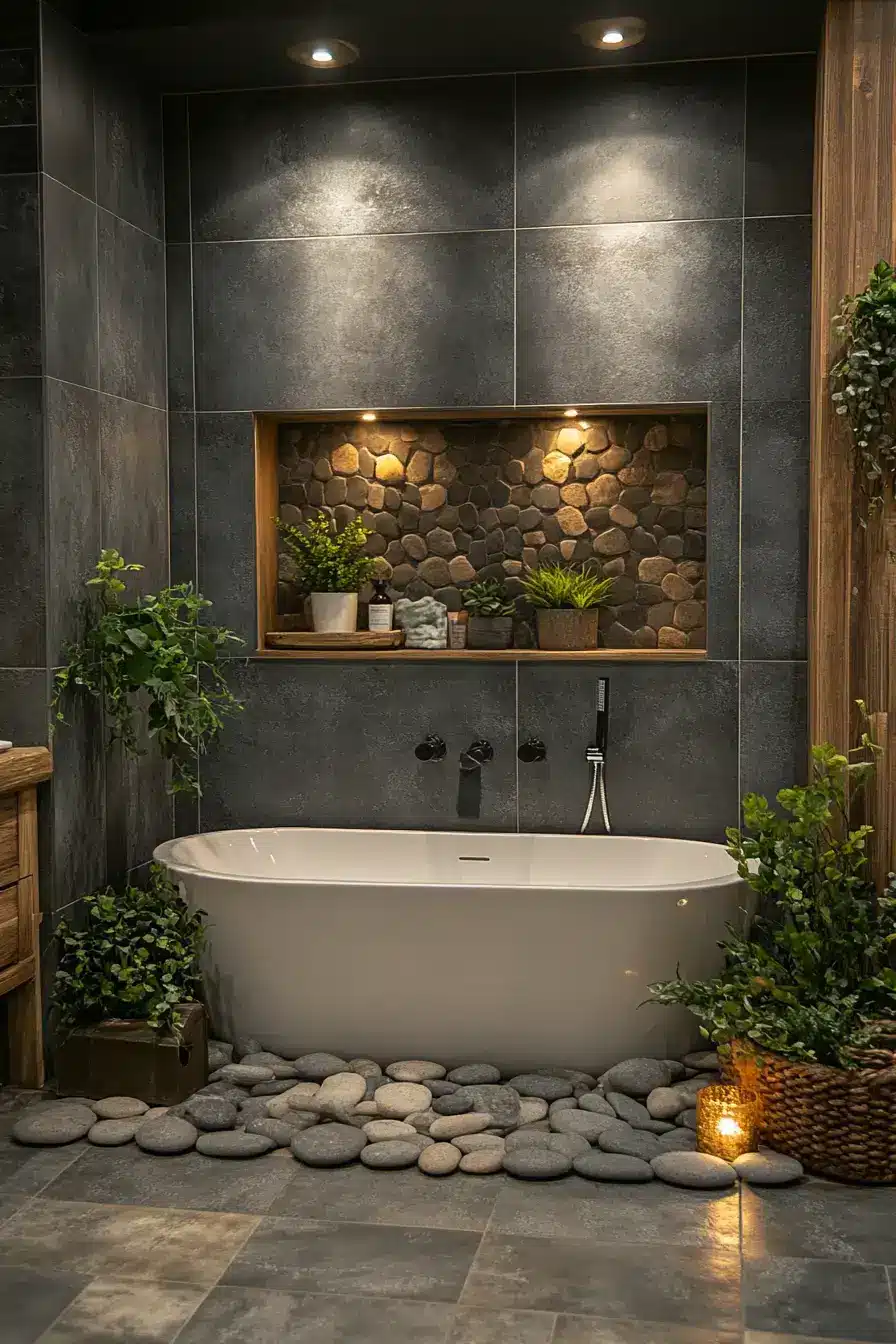
Slate tones, wood texture, and a little greenery turn this into a proper retreat. Bring the same calm into your home and suddenly the rest of the house feels loud. It’s the spa-day feeling — minus the towel robe you’ll never actually wear.
6. Airy Dove Delight Awaits
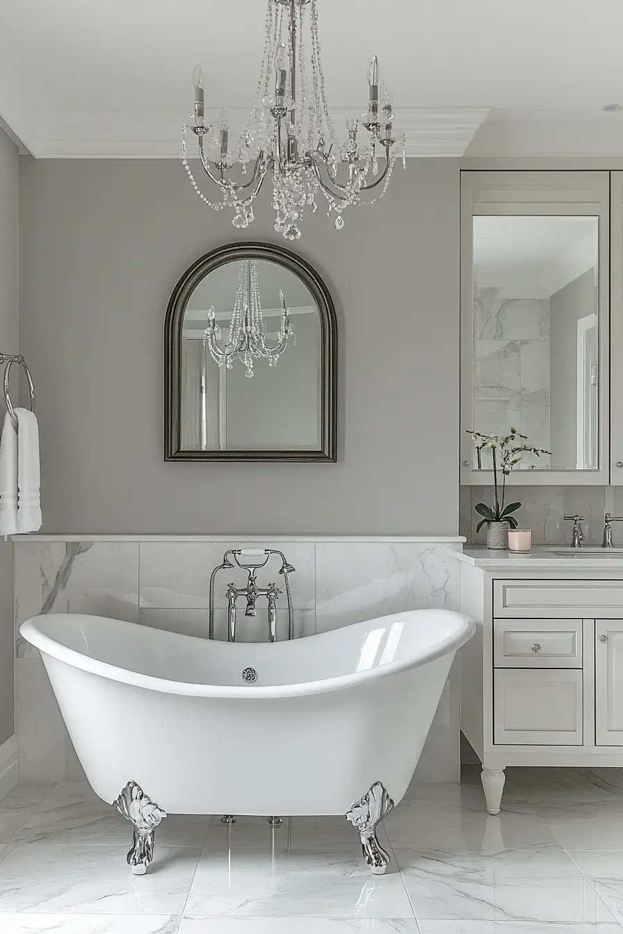
Dove gray is the cheat code for “bright but not sterile.” Marble accents and ambient lighting add the quiet polish. The room feels bigger and somehow cozier at the same time — IMO the best of both worlds.
7. Dramatic Graphite Captivates Instantly
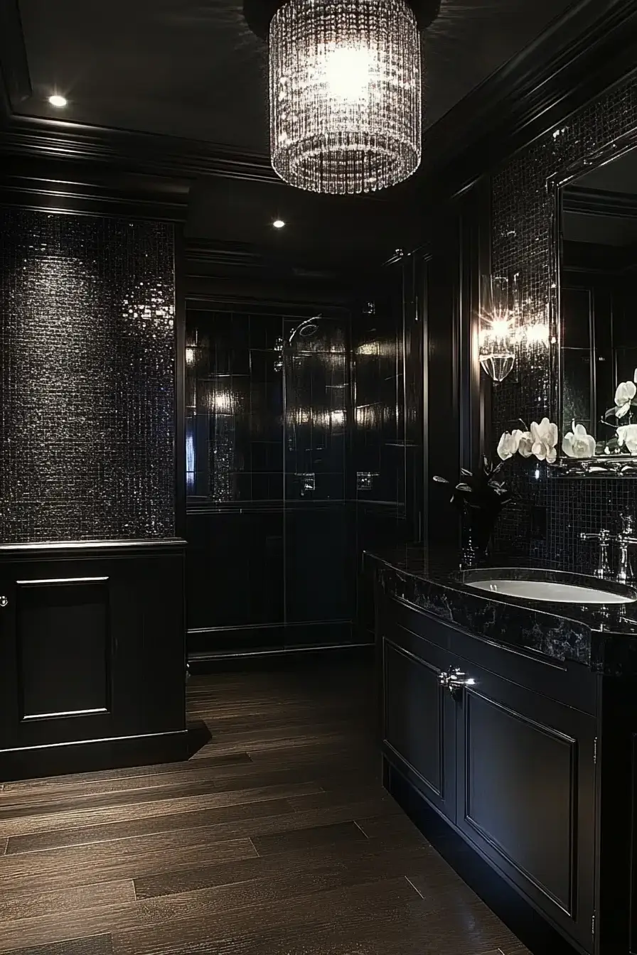
Graphite is for when you want guests to stop mid-sentence. Reflective finishes and statement lighting do the glamming-up; smoky tones keep it grounded. It’s moody in the good, hotel-suite way — not the “I forgot to pay the electric bill” way 🙂
8. Marble Magic Feels Timeless
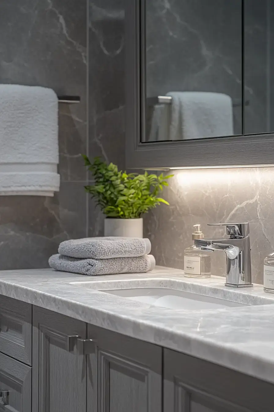
Marble and cool gray are a match made somewhere expensive. Brushed nickel and sleek surfaces keep it contemporary instead of fussy. Let soft light catch the veins and the whole vanity becomes the artwork. Timeless, but make it now.
9. Fresh Mist Inspires Stillness
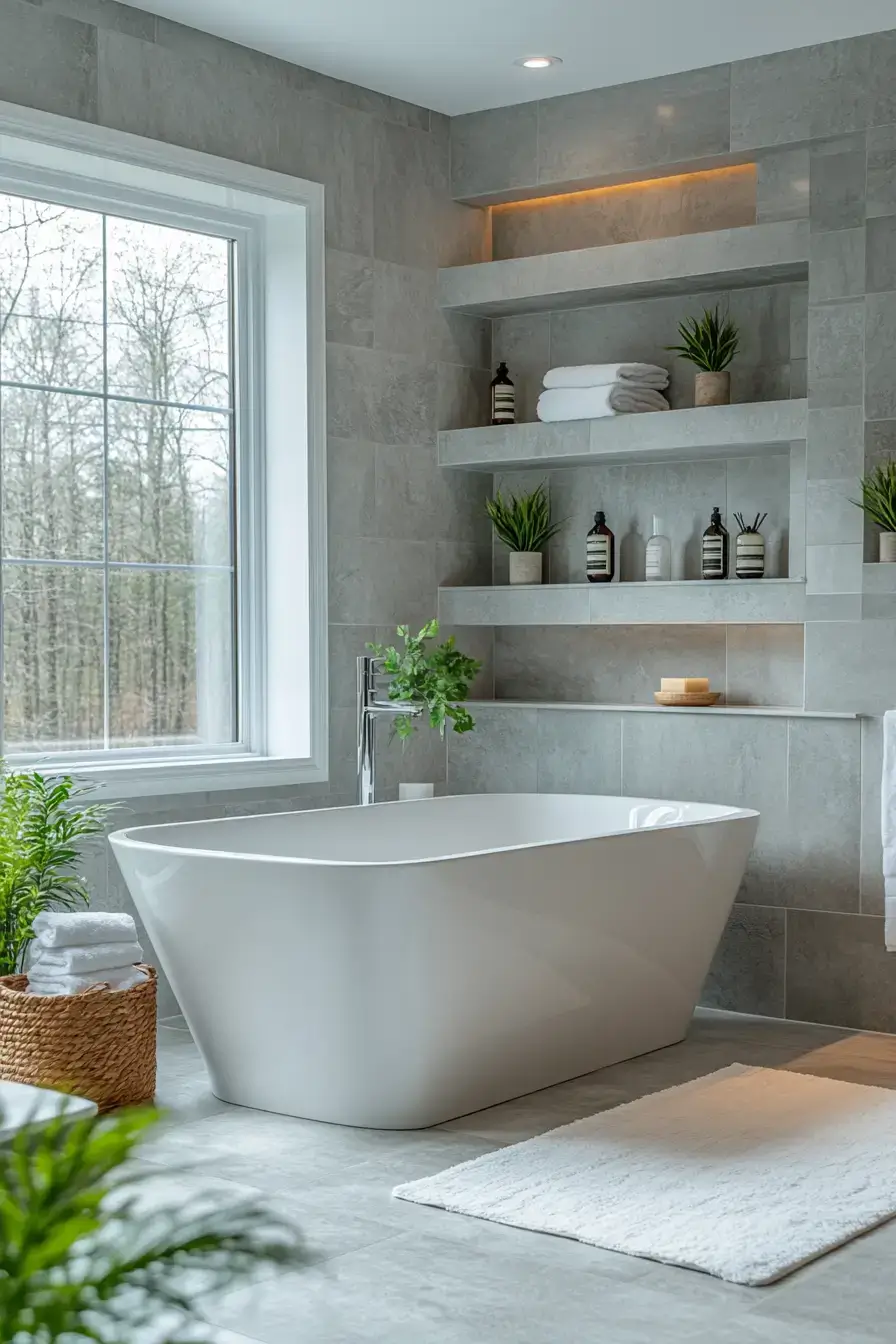
Misty gray feels like a foggy morning — in the relaxing, not-the-flight-got-cancelled way. Frosted glass and cozy textiles soften everything. Natural light is the real MVP here, so don’t bury the window behind a cabinet.
10. Industrial Sophistication Comes Alive
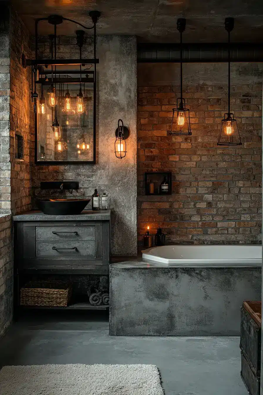
Concrete, steel, matte fixtures, and a little warm wood — industrial done right, not construction-site wrong. The hard lines soften once you layer in the materials. It’s confident and a little rugged, which is a fun personality for a bathroom to have.
11. Shimmering Slate Elevates Spaces
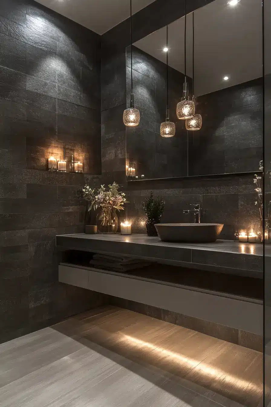
Silver slate tile adds texture without yelling for attention. Open shelving and modern lighting keep the look light and edited. Layered gray shades = depth you can’t fake with one flat coat of paint.
12. Elegant Layers Build Depth
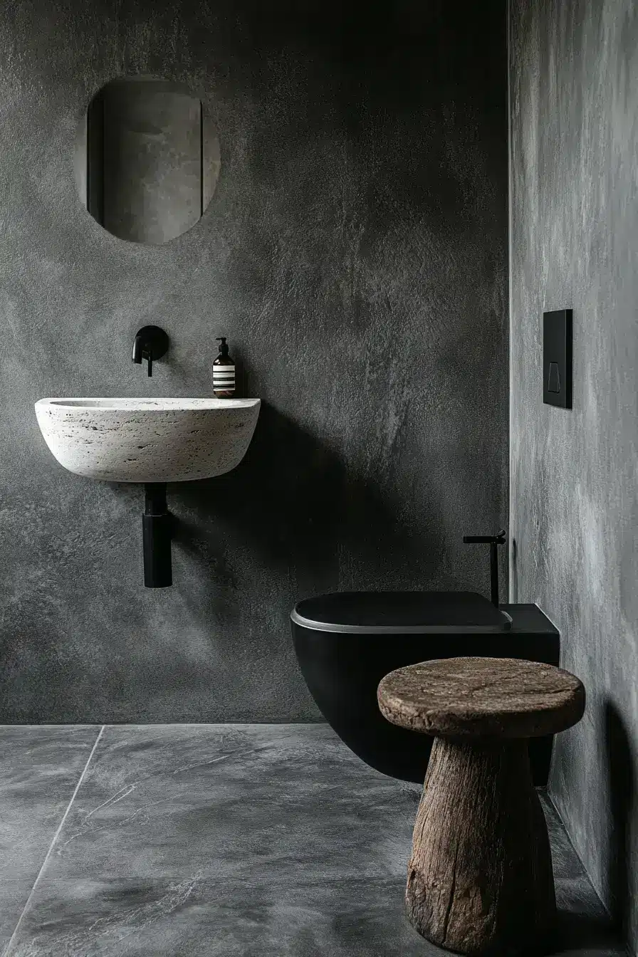
Stack light, medium, and dark gray and the room gains real depth — no bold color required. It’s the greyscale-on-greyscale trick that interior folks love. Every finish you add just makes the calm feel more intentional. Subtle, but it sticks with you.
13. Airy Grays Shine Brightly
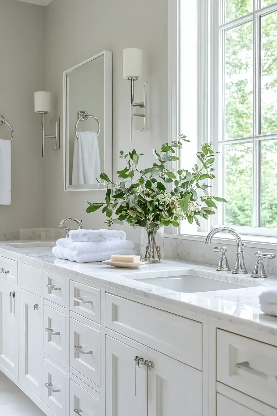
Light gray, blonde wood, and a hit of metal — bright without being bland. Warm lighting is what keeps it welcoming past sunset. This is the “fresh and timeless” combo that ages better than trendier palettes.
14. Mixed Textures Spark Interest
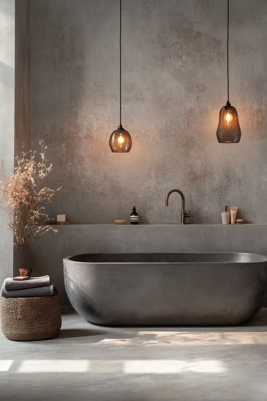
Mix matte, gloss, and natural stuff and plain gray suddenly has a story. Black hardware ties the whole thing together like punctuation. It’s proof you don’t need color to make a room feel designed — just contrast.
15. Dark Elegance Feels Inviting
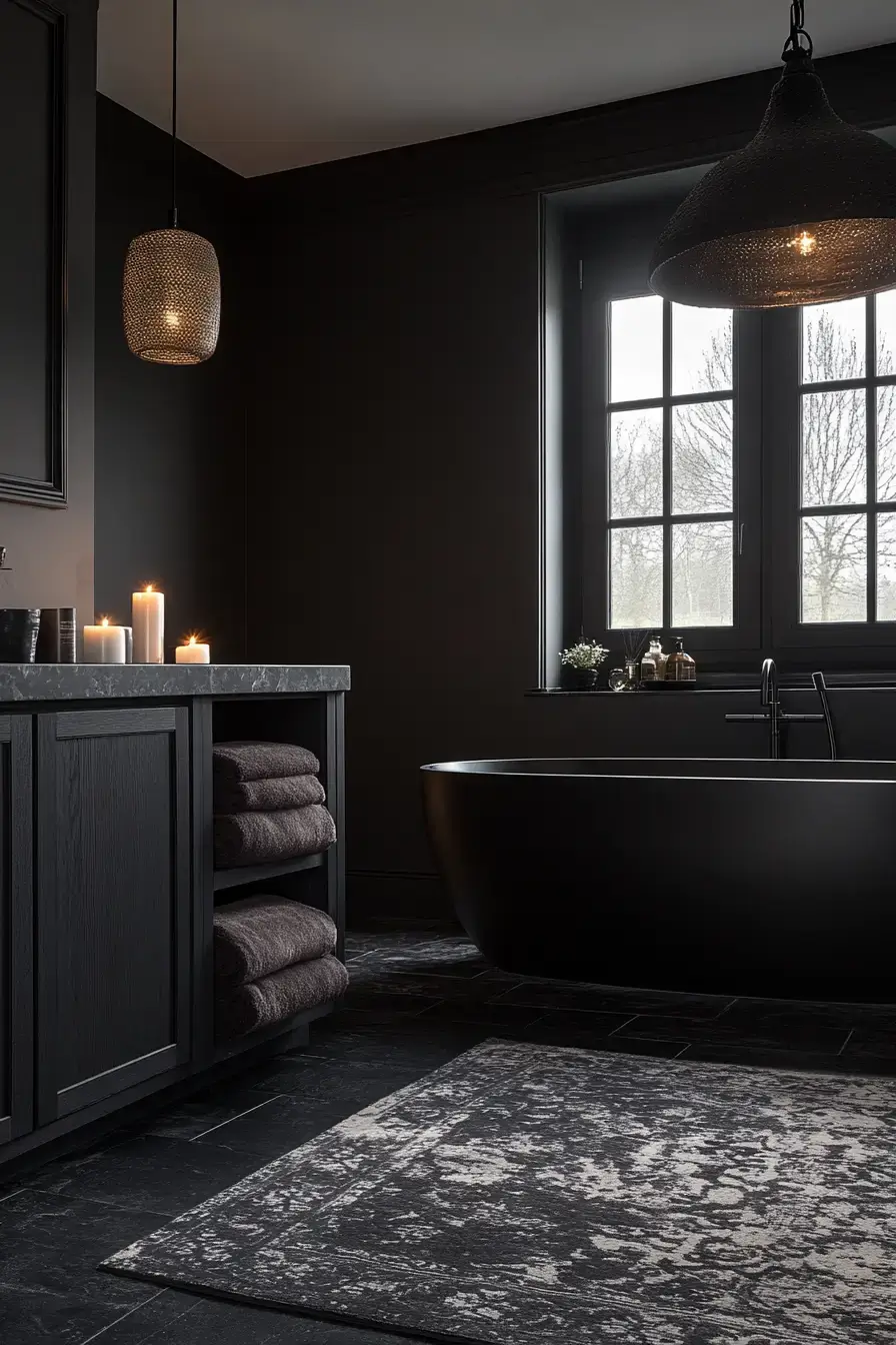
Moody gray + brass fixtures = cozy luxury, not dungeon. Soft lighting melts the dramatic edges so it stays inviting. Dark can absolutely be warm — this is the counterexample people forget exists.
Save this article
Enter your email and we’ll send it straight to your inbox.
16. Natural Calm Lasts Forever
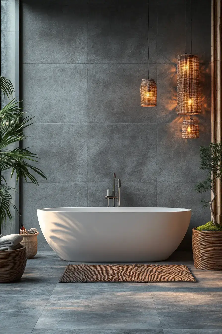
Warm wood, smooth stone, and minimal styling make this the calmest room on the list. It’s spa-inspired without the bamboo flute clichés. Bright, balanced, and quiet from your first coffee to your last shower — my kind of sanctuary.
17. Refined Ash Warms Spaces
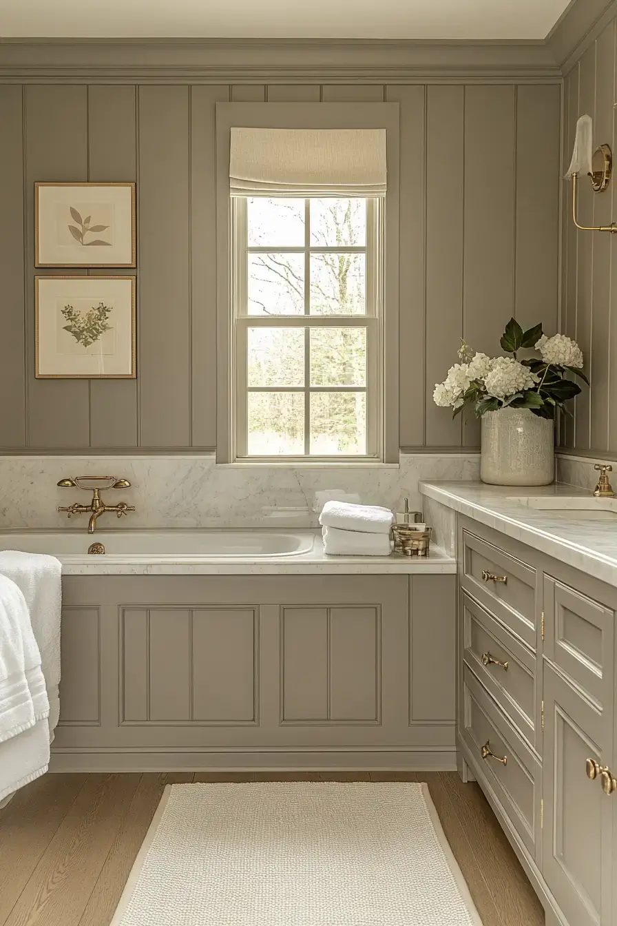
Ash gray sneaks in warmth while staying clean and modern. Ivory, brass, and textured fabric keep it from feeling flat. Layered finishes = interest without breaking the peaceful spell. A sleeper favorite, IMO.
18. Pale Perfection Glows Softly
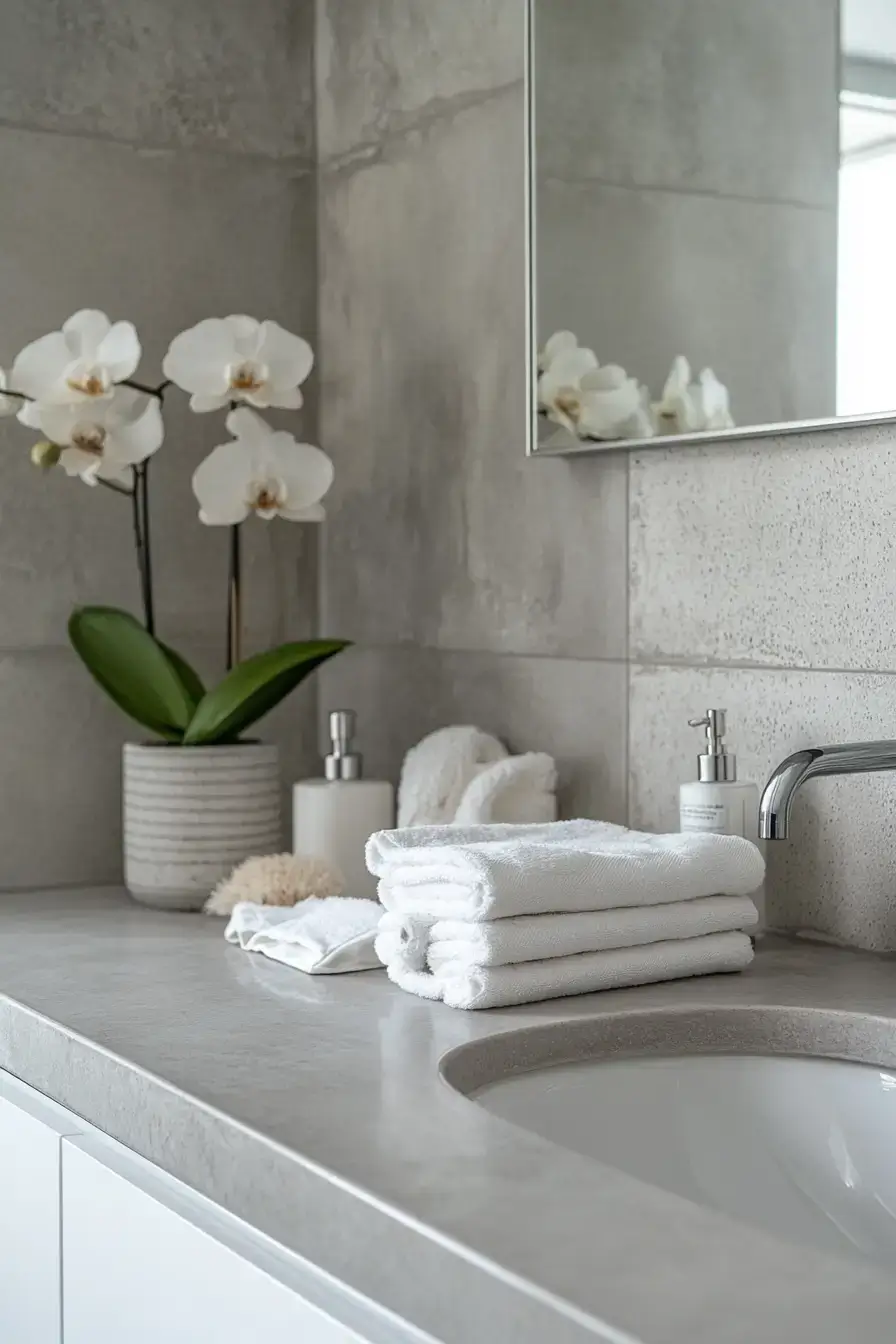
Pale gray is the perfect blank canvas — chrome, white marble, and glass do the talking. Natural light makes the space feel even bigger than it is. It’s understated luxury that never tries too hard. Refreshing, honestly.
19. Pebbled Beauty Feels Organic
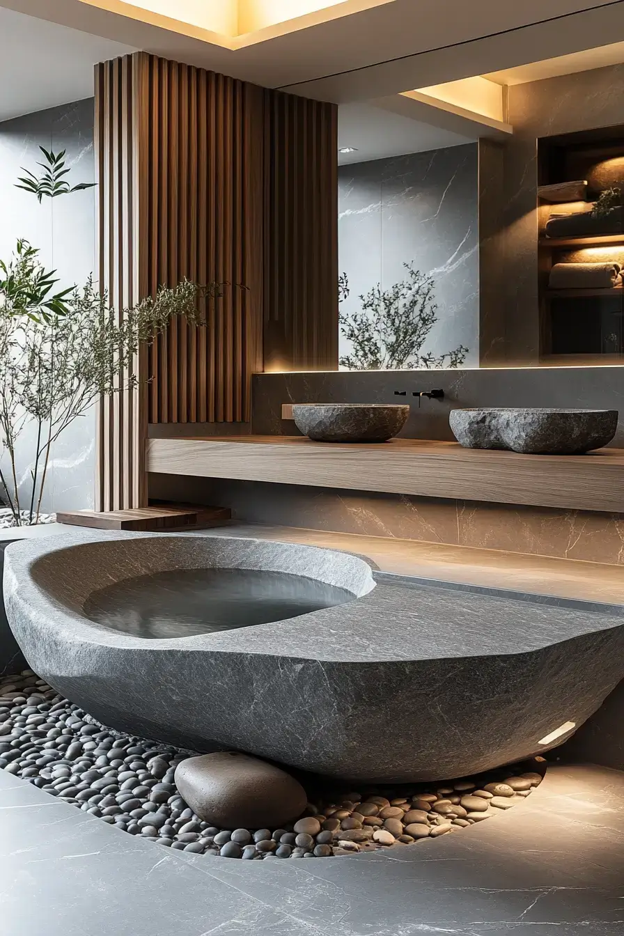
Pebble textures bring the outdoors in without a single houseplant you’ll forget to water. Crisp white and greenery finish the spa look. Natural finishes + soft light = the relaxing mood you actually want at night.
20. Chrome Contrast Looks Stunning
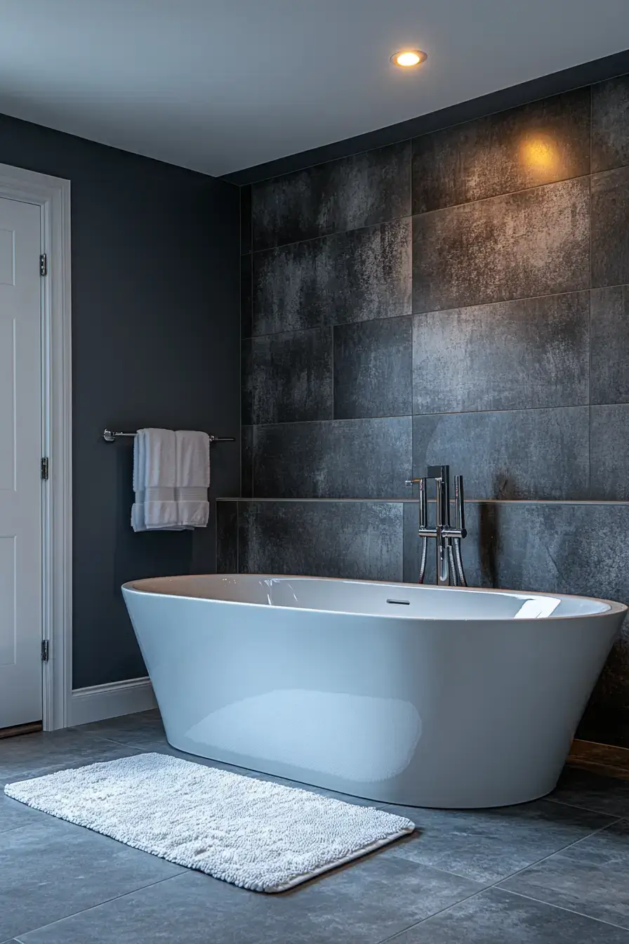
Charcoal walls against polished chrome is the high-contrast look that photographs like a magazine. Light stone flooring keeps it from tipping into heavy. Bold and elegant at once — bookmark this one before the renovation impulse hits 🙂
21. Soft Clouds Drift Gracefully
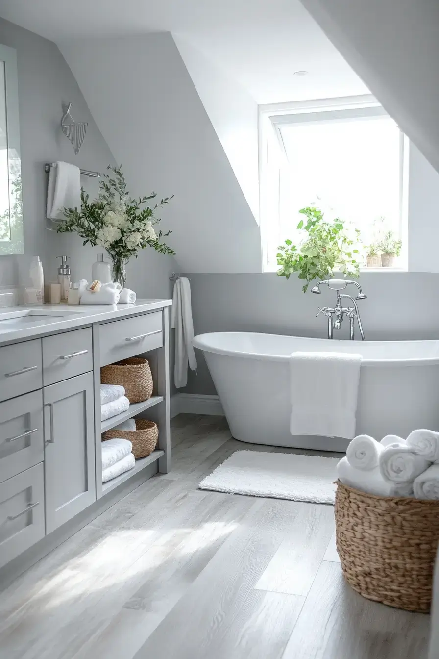
Cloud-gray walls and floating vanities make the whole room feel like it’s barely touching the floor. Frameless glass and creamy finishes keep it airy. Natural light does the heavy lifting here, so lean into those windows.
22. Golden Glow Elevates Everything
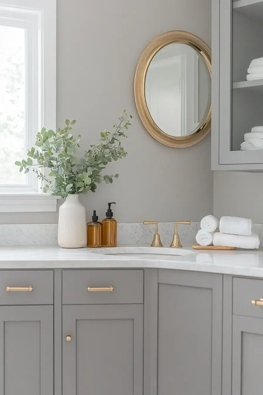
Warm gold against soft gray is the glow-up this palette didn’t know it needed. White tile and polished stone keep it refined, not flashy. Metallic fixtures catch the light and suddenly the whole space feels lit by candlelight.
23. Slate Luxury Feels Relaxing
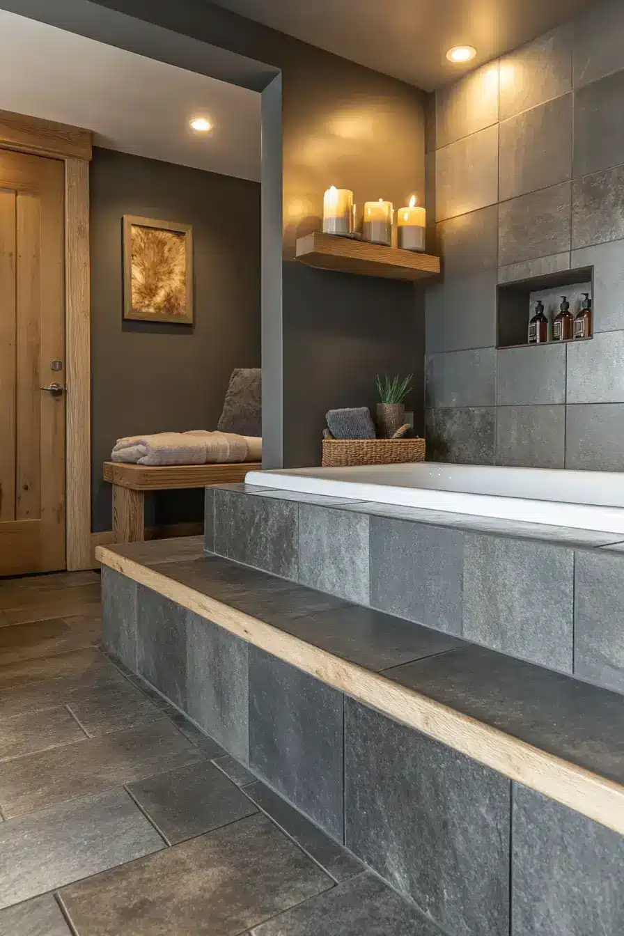
Slate tile and minimalist cabinetry read effortless but feel premium. Warm ambient lighting turns it into a low-key spa. Layered tones add depth while the mood stays peaceful — exactly the brief.
24. City Chic Inspires Confidence
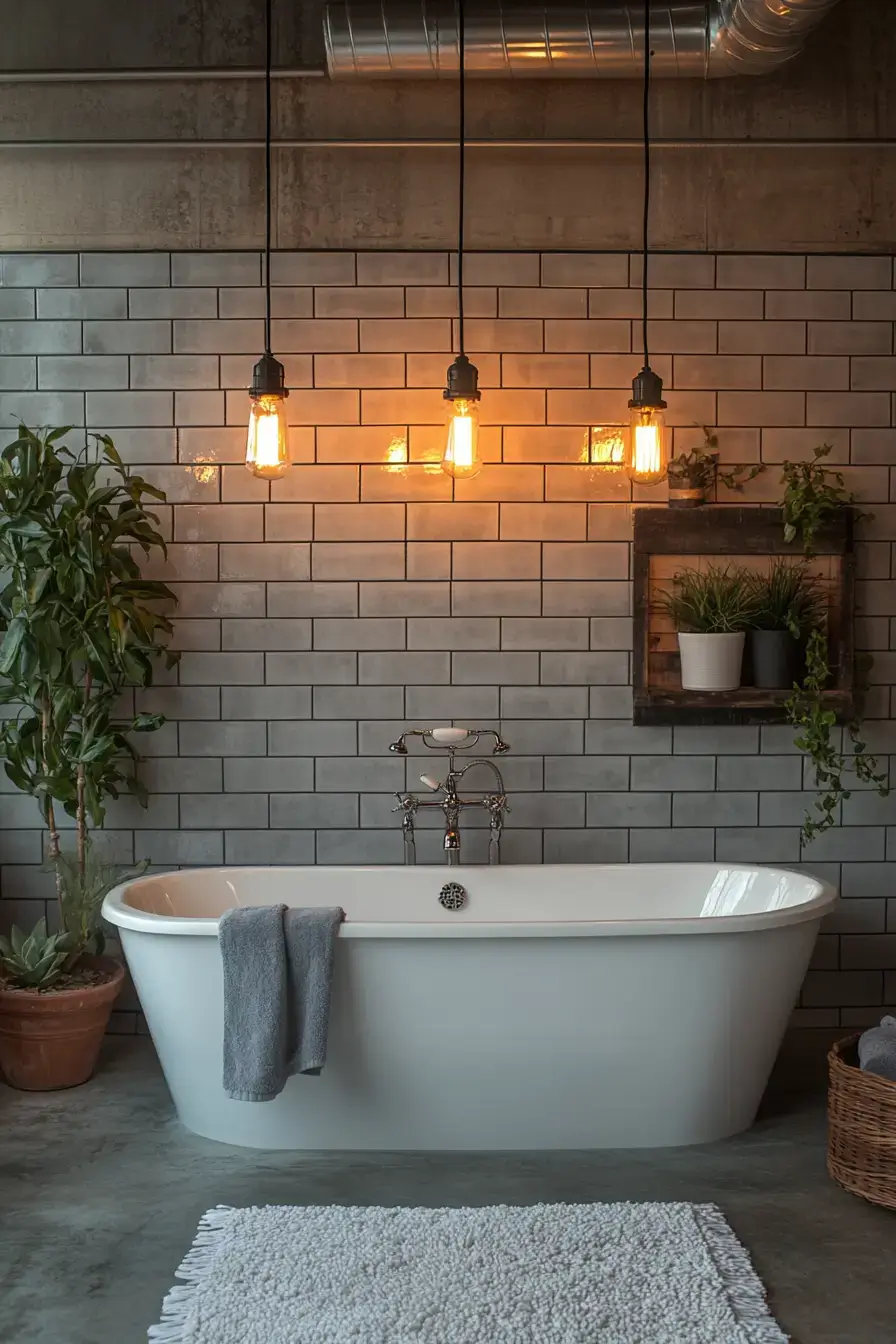
Concrete, matte hardware, glass, and floating shelves — urban without the rent. Industrial character meets modern polish and somehow stays functional. Stylish, cool, and actually usable. My kind of city apartment energy.
25. Graphite Grandeur Turns Heads
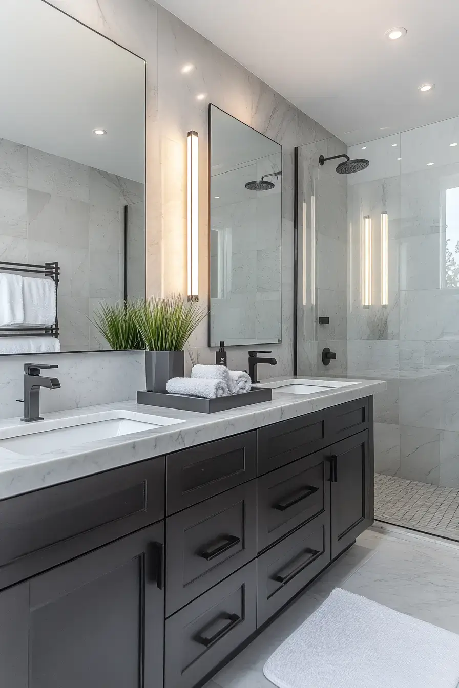
Graphite cabinetry is the centerpiece that makes everything else fall into line. Marble counters and illuminated mirrors push it luxe. Rich gray adds depth while bright finishes keep it open. Save this for the dream-space folder.
26. Tonal Beauty Flows Seamlessly
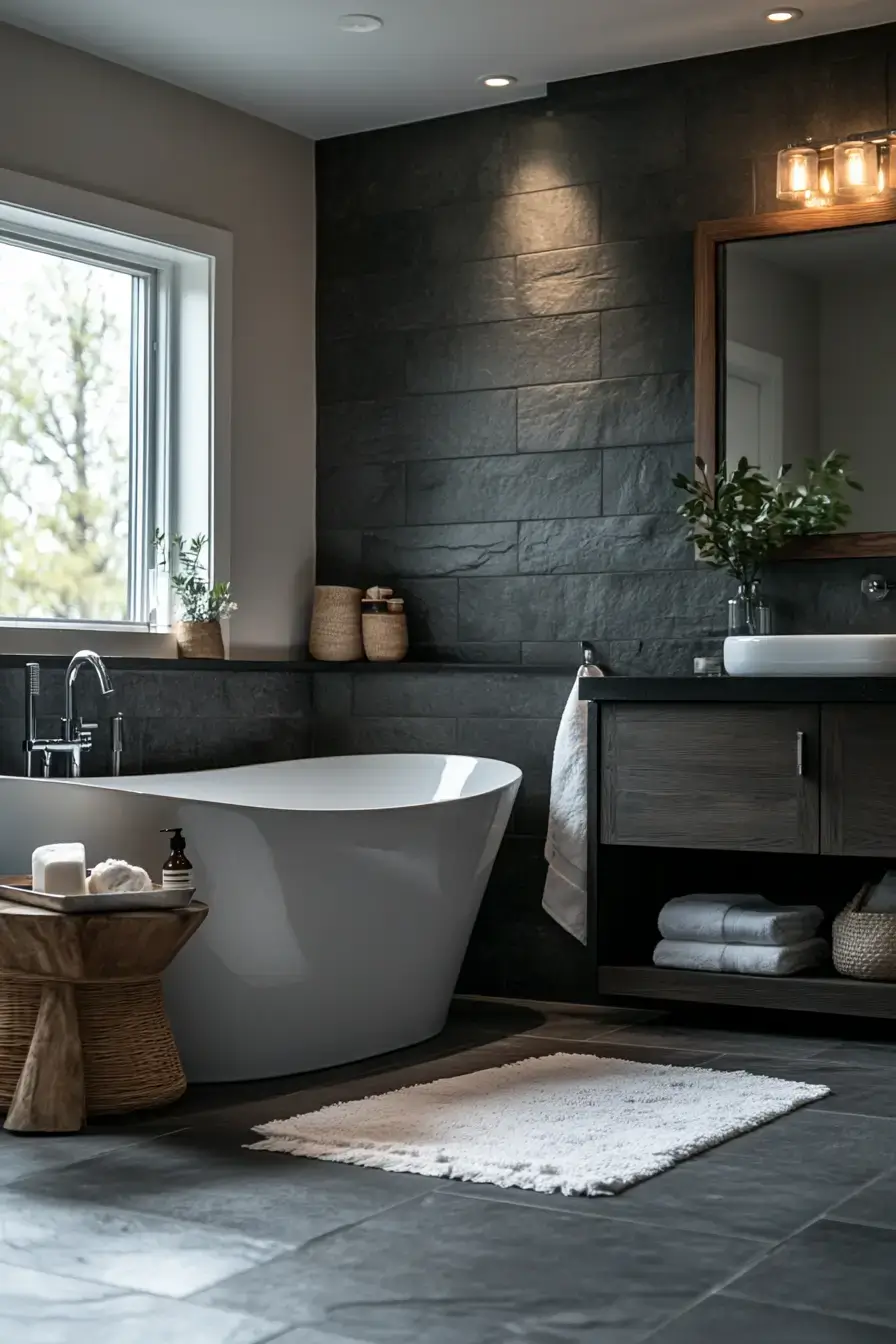
Layer light walls, medium cabinets, and darker accents and the palette just flows. A little greenery softens all that cool gray with something alive. Cohesion is the whole point — when the shades agree, the room feels expensive.
27. Greige Harmony Feels Effortless
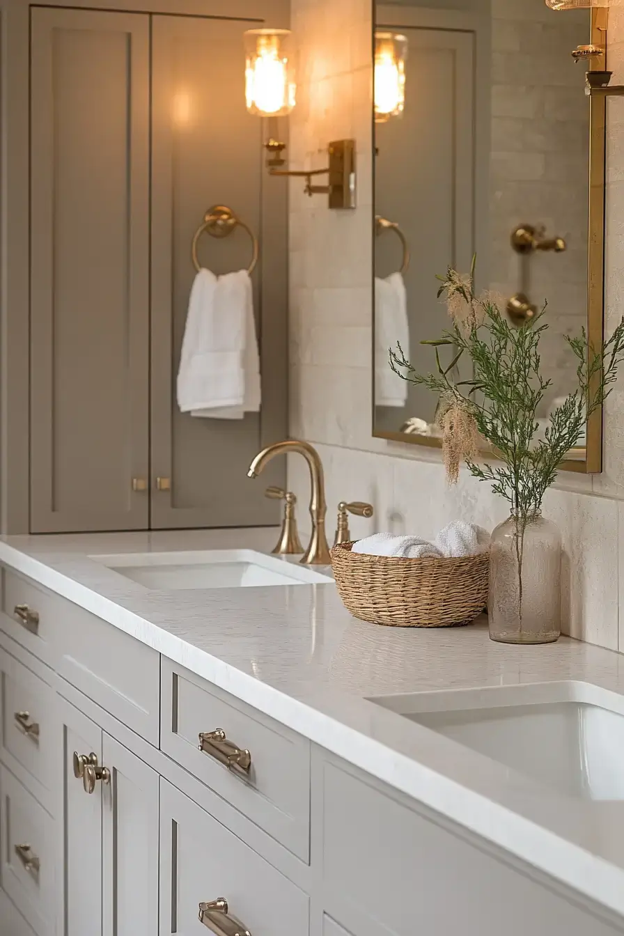
Greige is beige’s smarter, colder-weather cousin — warm but not dated. Wood, black hardware, and clean finishes keep it effortless. Cozy and modern at once — the combo people chase and rarely land. This one lands.
28. Matte Sophistication Wins Hearts
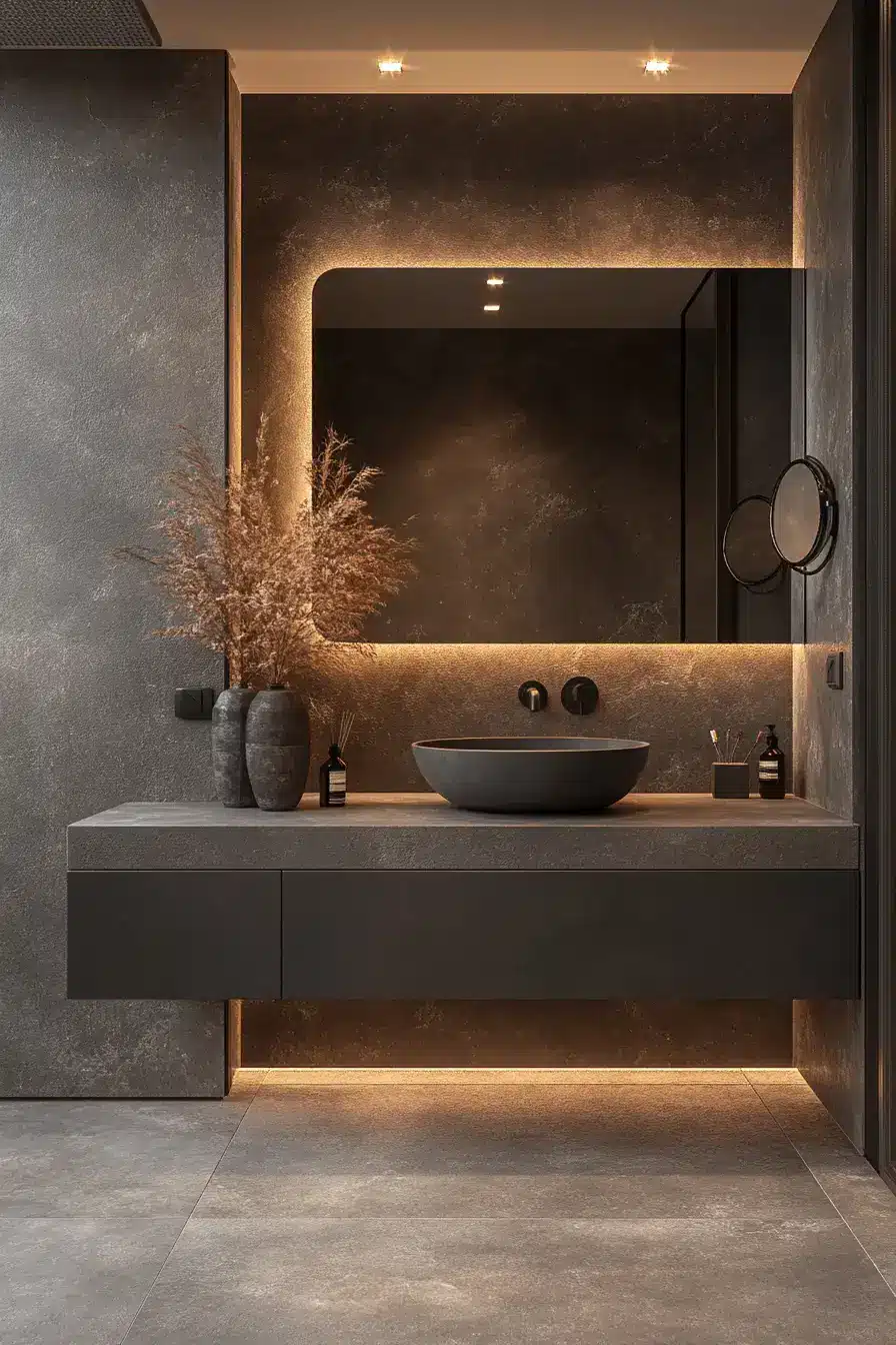
Matte gray is the anti-gloss statement: modern, calm, and quietly confident. Black trim against white accents does the visual work. Luxurious without overwhelming — the kind of restraint that reads as taste.
29. Whispered Elegance Lives Here
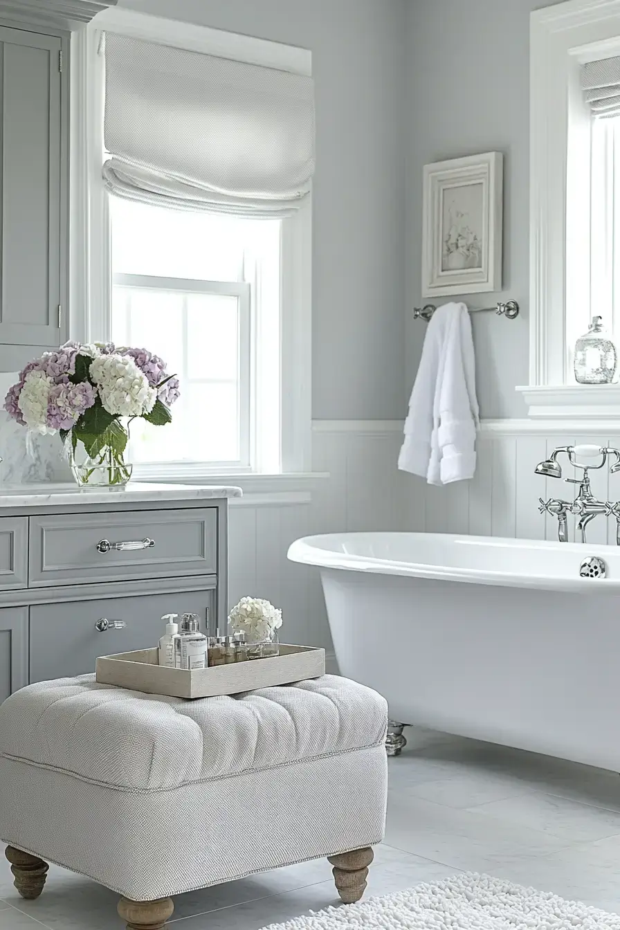
The tone should match how you actually use the space — soft greige for a calm start to the day, deeper charcoal if you want it to feel like a quiet pause. The examples above show how paint, tile, and fixtures all pull the same direction. Pick the feeling first; the gray will follow.
Wrapping It Up
So there you have it — 29 ways to do gray without a single cold, soulless corner in sight. The through-line is simple: pick the feeling first, then let the shade, tile, and fixtures do the talking. Warm wood, brass, gold, or a little greenery are all you need to keep gray soft. Found one that fits your space? Give it a shot — and tell me which gray won your heart 🙂
Save this article
We’ll email you the link so you can find it again later.