


Sage is quietly taking over bathroom remodels, and I get why — it behaves like a neutral but still carries enough color to feel like a real choice, especially against white tile or warm brass. If your Pinterest board is a pile of sage green bathroom ideas and you’re stuck on which direction actually works, the 29 spaces below run the gamut from misty pale walls to deeper, smoky cabinetry.
\n
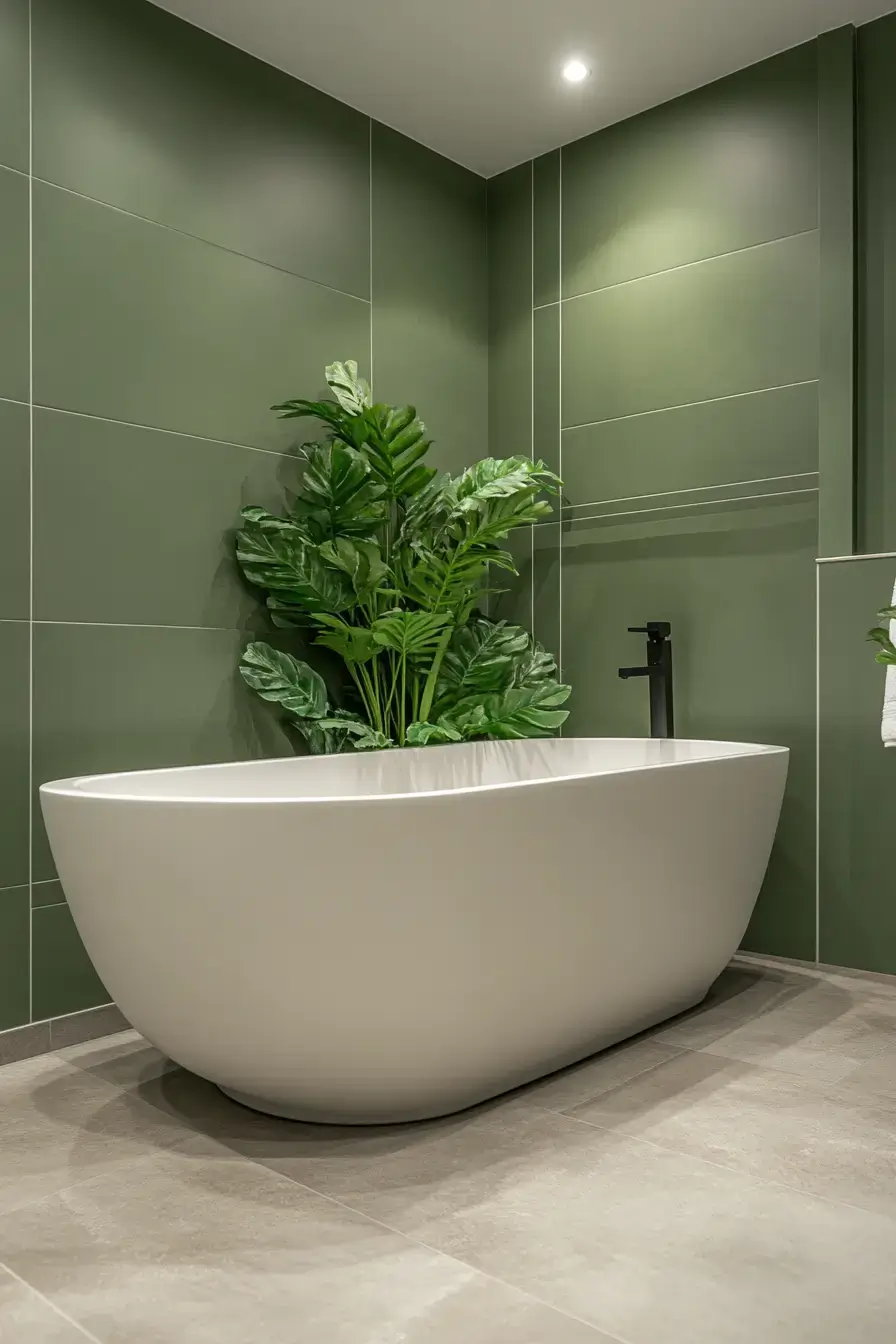
1. Sage Serenity Feels Peaceful
\n
\n
Sage serenity is my favorite kind of calm — it doesn’t try too hard. This space wraps muted green walls around crisp white finishes and warm light, and somehow it feels like a spa without the robes and cucumber water. The trick is restraint: let the color do the talking and skip the clutter.
\n
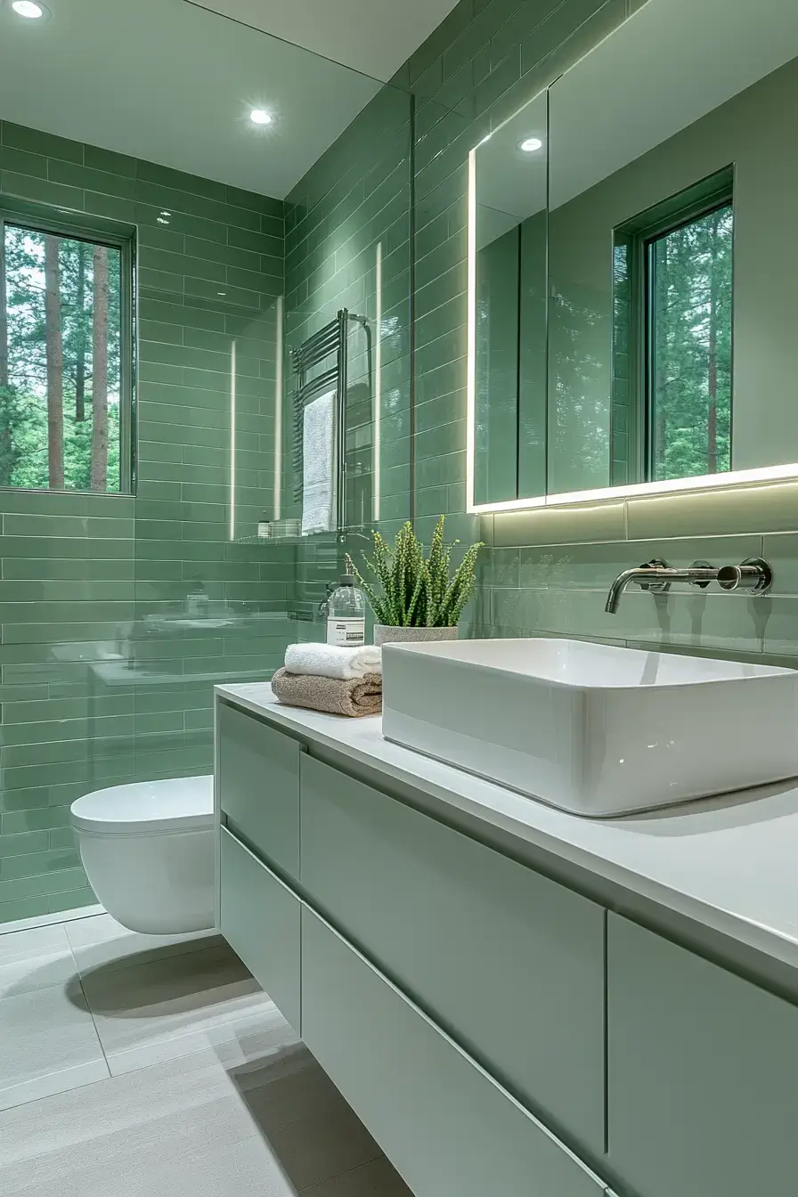
2. Glowing Sage Feels Elegant
\n
\n
Here’s a bathroom that glows without a single candle. Quartz counters, glass shower walls, and accent lighting turn soft green into something genuinely fancy. IMO this is what “everyday luxury” should mean — quiet, not loud.
\n
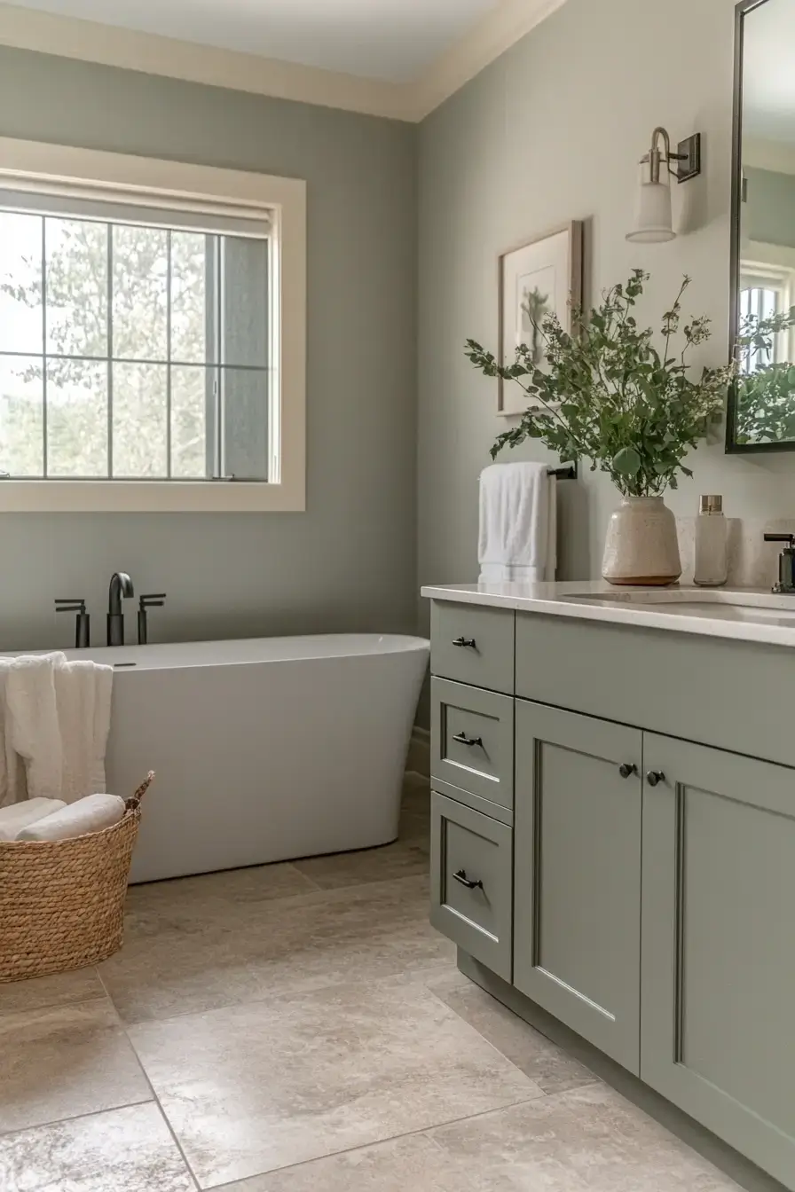
3. Muted Sage Brings Calm
\n
\n
Powder-soft sage is the sleepy cousin of bold green, and I mean that as a compliment. Matte tile and stone flooring keep things grounded while metallic accents add just enough shine. It’s the kind of room that lowers your blood pressure on sight.
\n
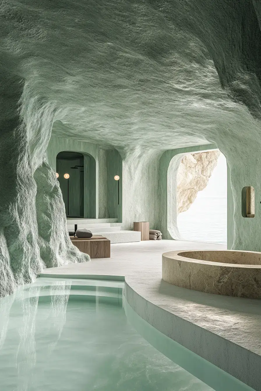
4. Stone Complements Sage Beautifully
\n
\n
Stone and sage are basically best friends. The cool grey of natural stone makes the green feel intentional instead of random, and the texture keeps it from looking flat. Pair them and you’ve already won half the battle.
\n
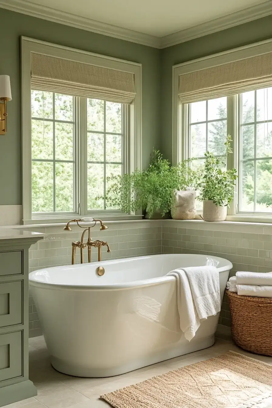
5. Warm Neutrals Embrace Sage
\n
\n
Warm neutrals give sage a cozy place to land. Creamy walls and tan accents let the green be the star of the room while everything else stays quietly supportive. It’s timeless and modern at once — no trend-chasing required.
\n
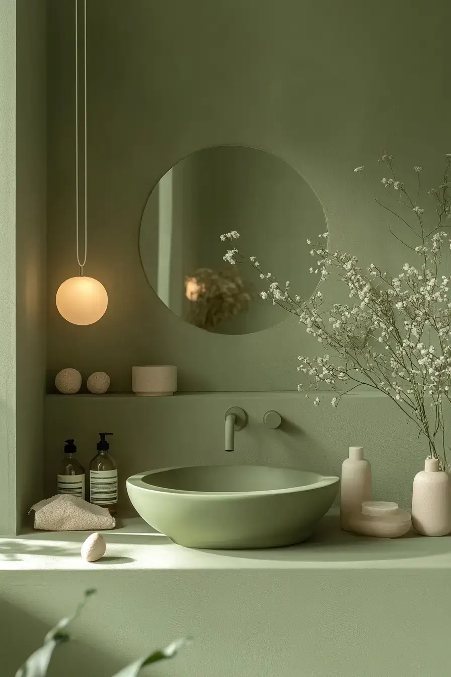
6. Minimal Sage Feels Luxurious
\n
\n
Minimal doesn’t mean empty — it means nothing wasted. A barely-there sage palette with clean lines reads as expensive because there’s nowhere for cheap decisions to hide. Less stuff, more calm. :/
\n
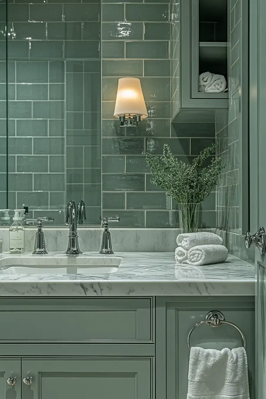
7. Textured Sage Looks Stunning
\n
\n
Flat green is fine; textured green is unforgettable. Think ribbed tile, woven baskets, a fluffy mat — anything that catches the light differently. The depth you get is what makes people stop and stare.
\n
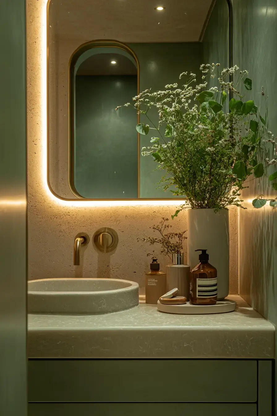
8. Satin Sage Glows Softly
\n
\n
Satin finishes are the unsung heroes here. They catch light at an angle and give the green a soft glow that gloss can’t fake. It’s subtle, but your eyes notice.
\n
9. Marble Elevates Sage Elegance
\n
\n
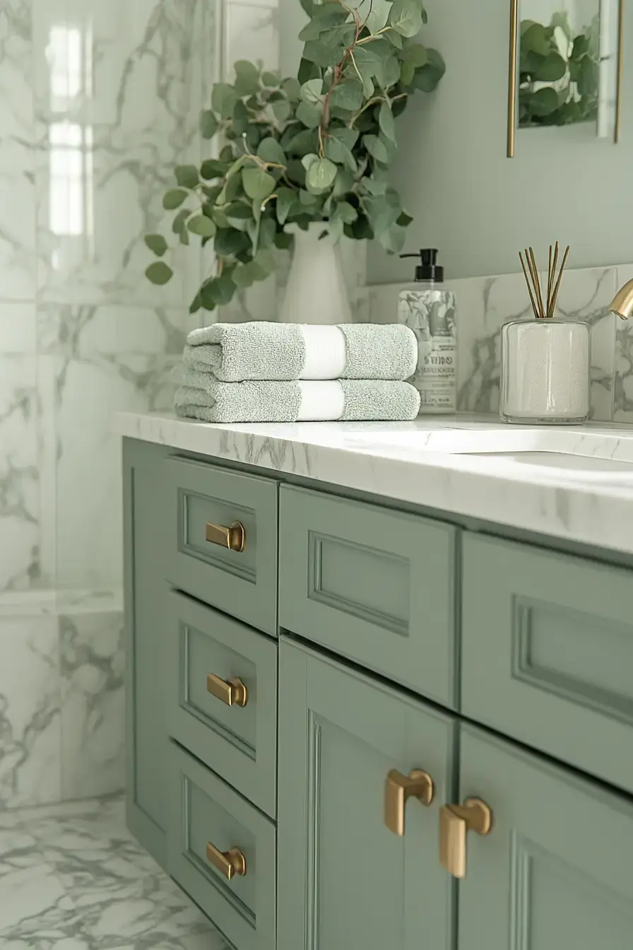
Marble and sage are a match made in renovation heaven. The grey veins in the stone echo the green and suddenly the whole room feels curated. FYI — you don’t need a full slab; a marble vanity top does the heavy lifting.
\n
10. Layered Sage Creates Harmony
\n
\n
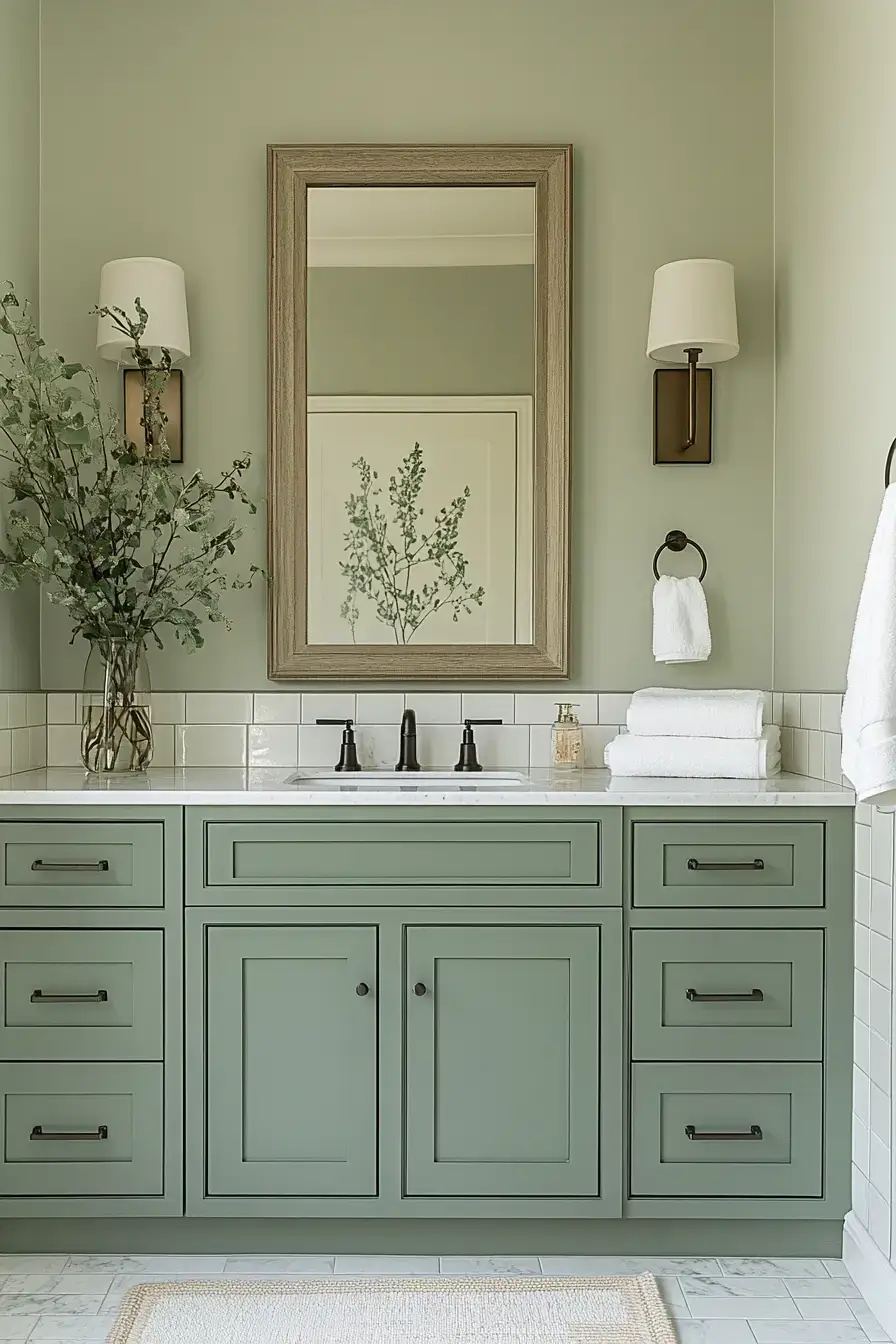
Layering different shades of sage is how you avoid a one-note room. Go pale on the walls, deeper on the cabinetry, and let them talk to each other. The result feels layered and lived-in instead of staged.
\n
11. Serene Greens Inspire Relaxation
\n
\n
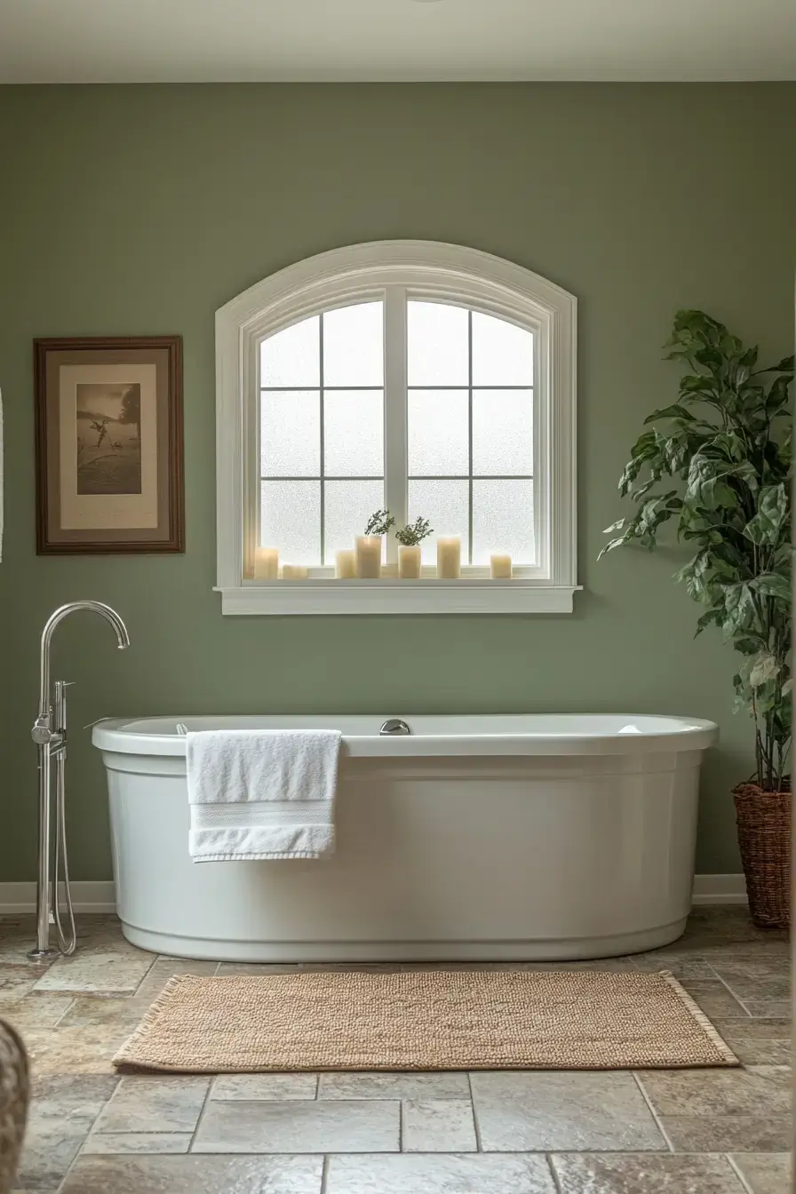
Some greens energize; these greens exhale. A serene, slightly greyed sage turns a bathroom into the one room where nobody expects anything from you. Light a (battery) candle and call it a win. 😉
\n
12. Smoky Sage Feels Chic
\n
\n
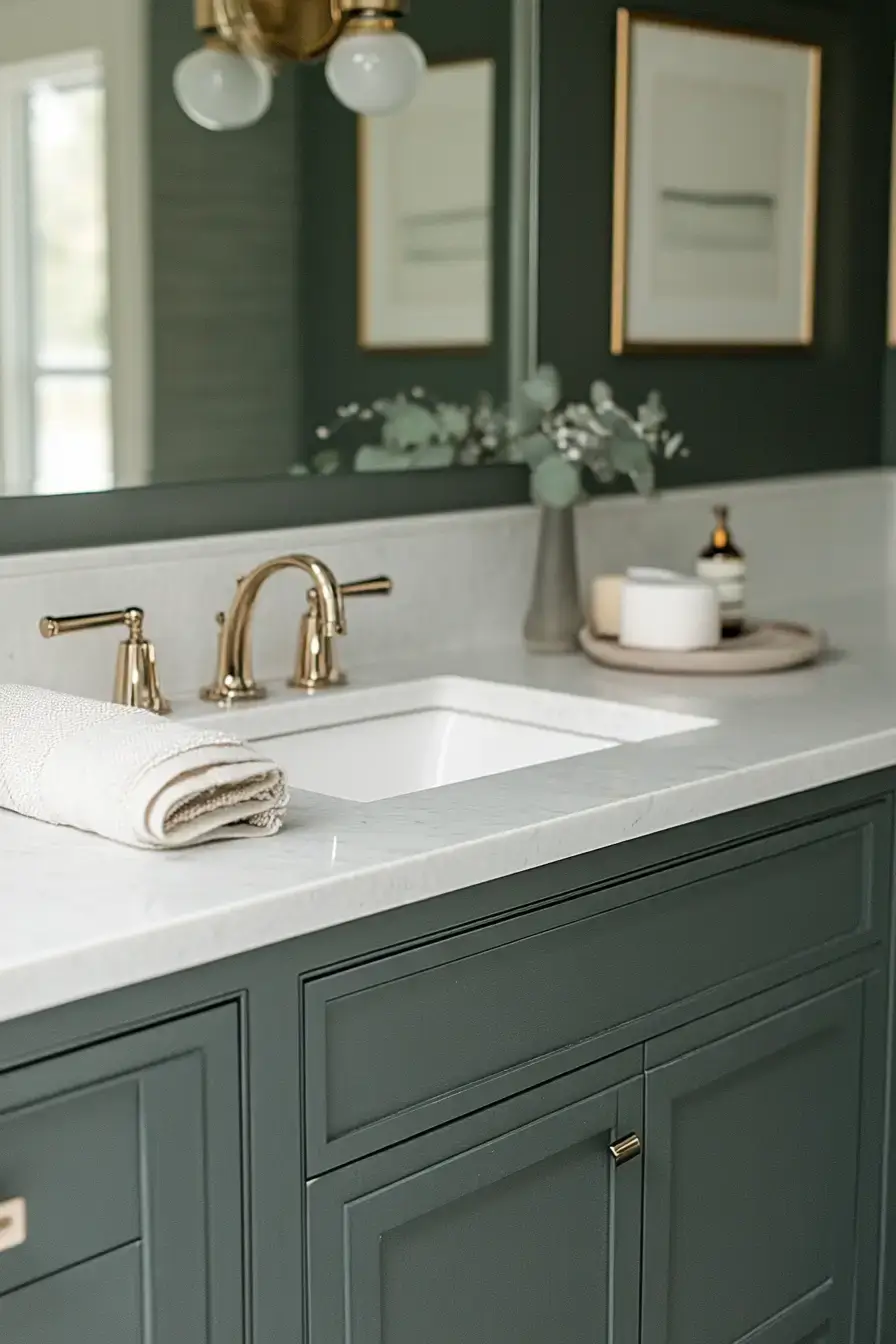
Smoky sage is what happens when green grows up and gets a leather jacket. It’s deeper, moodier, and somehow more sophisticated than its pastel siblings. Perfect for anyone who finds pale green a little too sweet.
\n
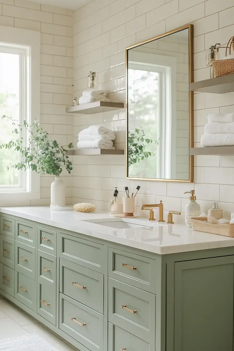
13. Cream Loves Sage Perfectly
\n
\n
Cream and sage are the comfort-food pairing of bathroom palettes. The warmth of cream takes the edge off the green and makes the whole space feel hugged. You can’t really mess this one up.
\n
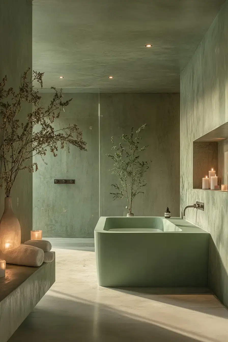
14. Modern Sage Stays Timeless
\n
\n
Trendy colors date fast; sage just… doesn’t. Even with modern fixtures, the green keeps things feeling current without screaming the year. That’s the kind of future-proofing I can get behind.
\n
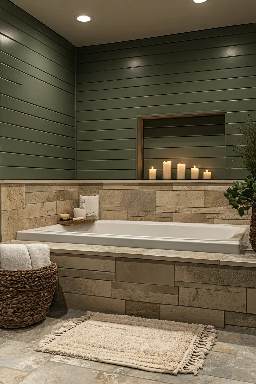
15. Matte Sage Feels Cozy
\n
\n
Matte sage is the sweater-weather version of the color. No shine, all softness — it makes a bathroom feel like a place you’d actually linger. Cozy isn’t a word we use for bathrooms often, but here we are.
Save this article
Enter your email and we’ll send it straight to your inbox.
\n
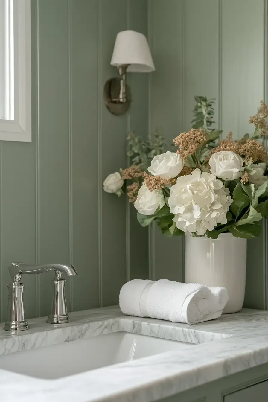
16. Sophisticated Sage Feels Refined
\n
\n
Refined sage is about precision: sharp grout lines, considered hardware, zero visual noise. It reads as “designed” rather than “decorated.” The discipline is what makes it feel expensive.
\n
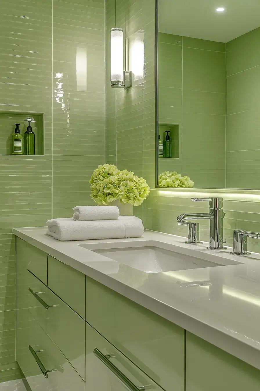
17. Glossy Sage Reflects Beauty
\n
\n
Glossy sage bounces light around like it’s got somewhere to be. Polished tile and sleek cabinetry turn every shade of green into something livelier. Warm lighting enhances the reflective surfaces while maintaining the room’s calm — and if you want that warm, layered vibe, our warm boho living room ideas are a solid place to steal from.
\n
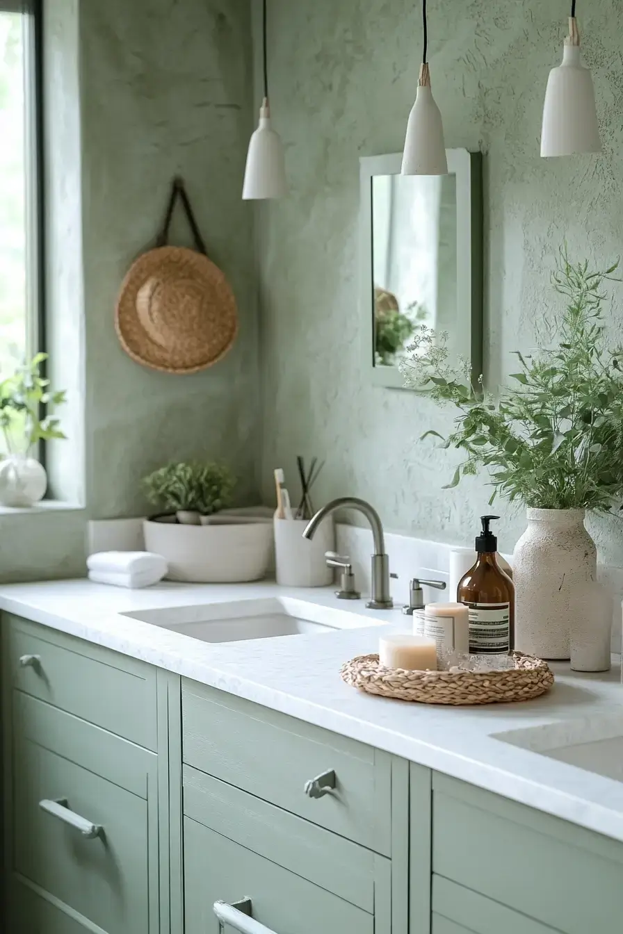
18. Misty Sage Inspires Serenity
\n
\n
Misty sage is the palest, dreamiest version — almost a whisper of color. It’s the kind of wall you’d happily stare at with a coffee. Serene without trying, which is the whole point.
\n
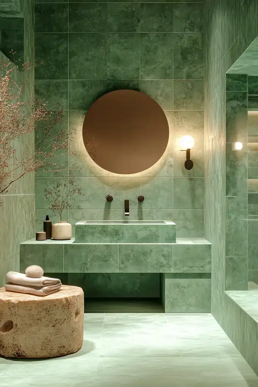
19. Sanctuary Starts With Sage
\n
\n
A sanctuary doesn’t need a fountain and a sound machine; it needs sage and intention. This room proves that a calm green plus a few thoughtful touches makes your home feel like an escape. Start here and the rest follows.
\n
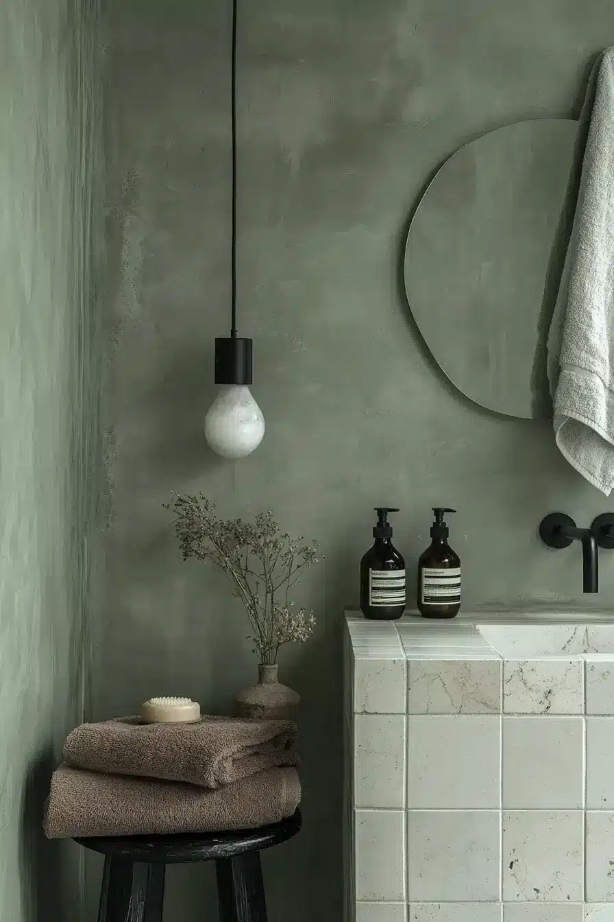
20. Gentle Contrast Feels Timeless
\n
\n
Contrast doesn’t have to mean black-and-white drama. A gentle pull between soft green and warm white keeps things interesting without tipping into busy. Timeless is just good contrast done quietly.
\n
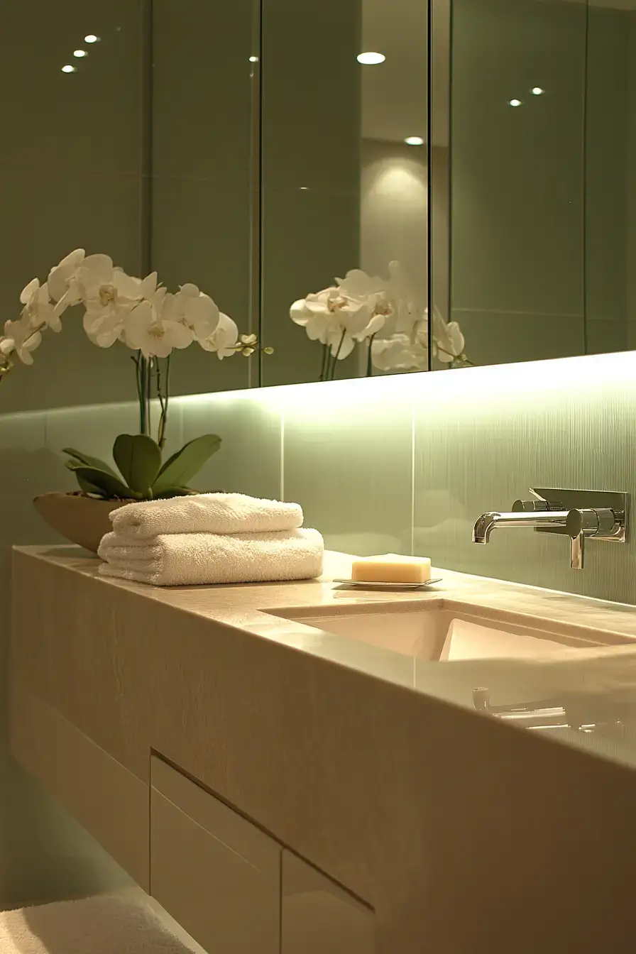
21. Minimal Color Maximum Impact
\n
\n
Proof that you don’t need a rainbow to make a statement. One confident sage, used well, carries the entire room. Maximum impact, minimum noise.
\n
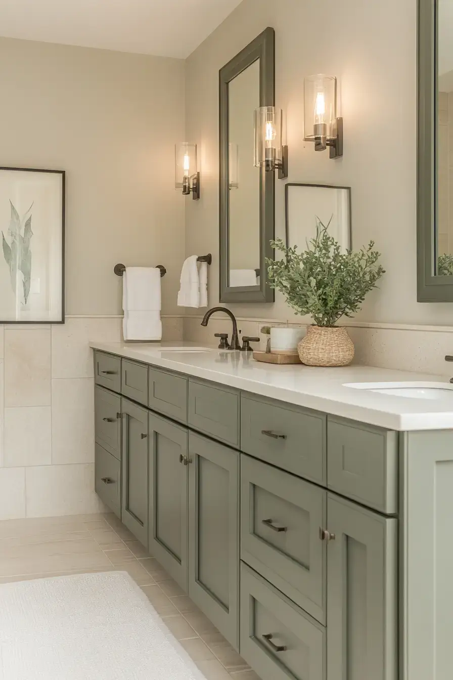
22. Balanced Sage Feels Harmonious
\n
\n
Harmony is when nothing fights for attention. Balanced sage with equal parts warm and cool makes the eye settle instead of bounce. It’s the visual equivalent of a deep breath.
\n
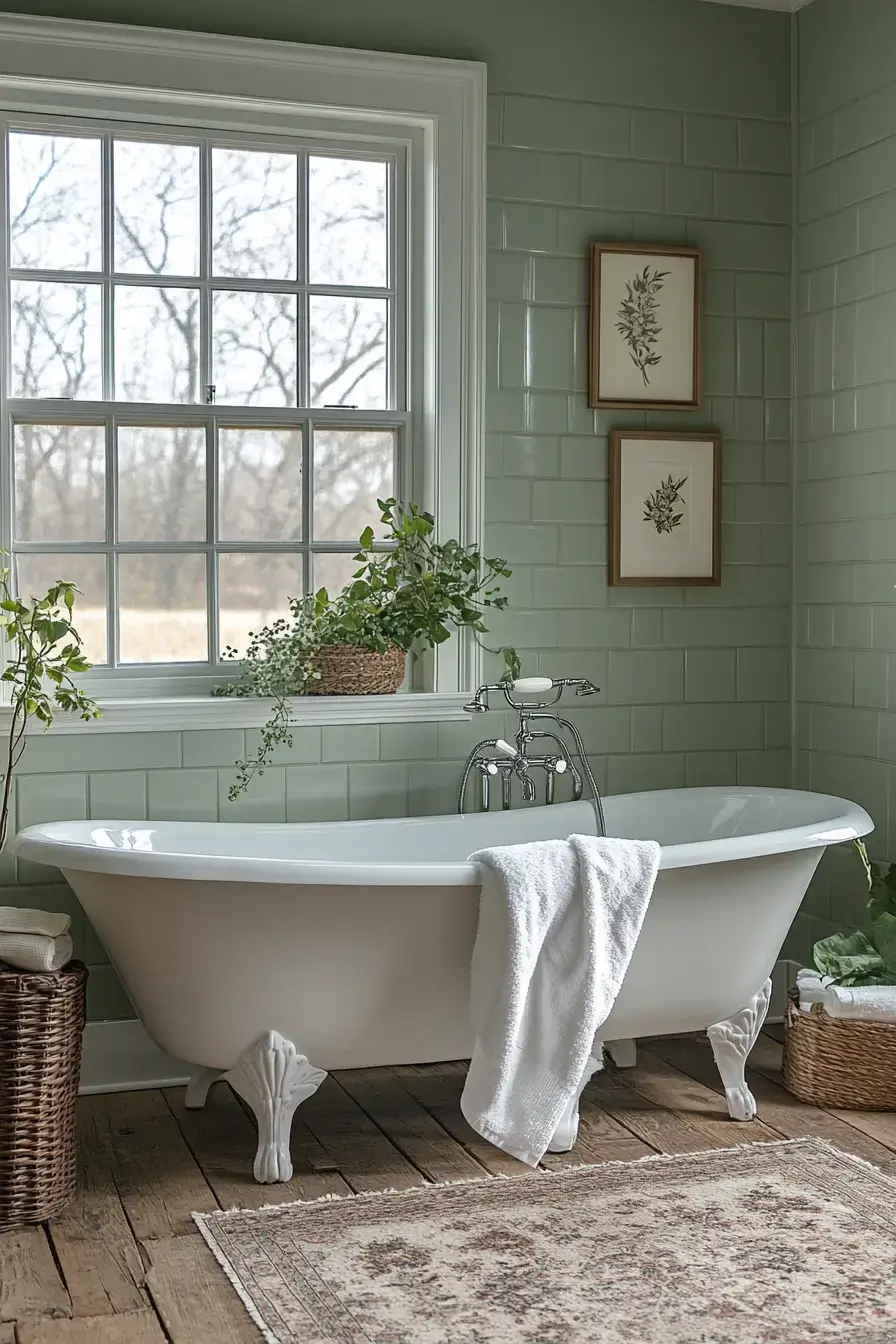
23. Simple Sage Lasts Forever
\n
\n
Simple sage is the tortoise of bathroom trends — slow, steady, still here in ten years. Skip the gimmicks and you get a room that ages gracefully. I’d bet on it outlasting any accent wall you’re tempted to paint.
\n
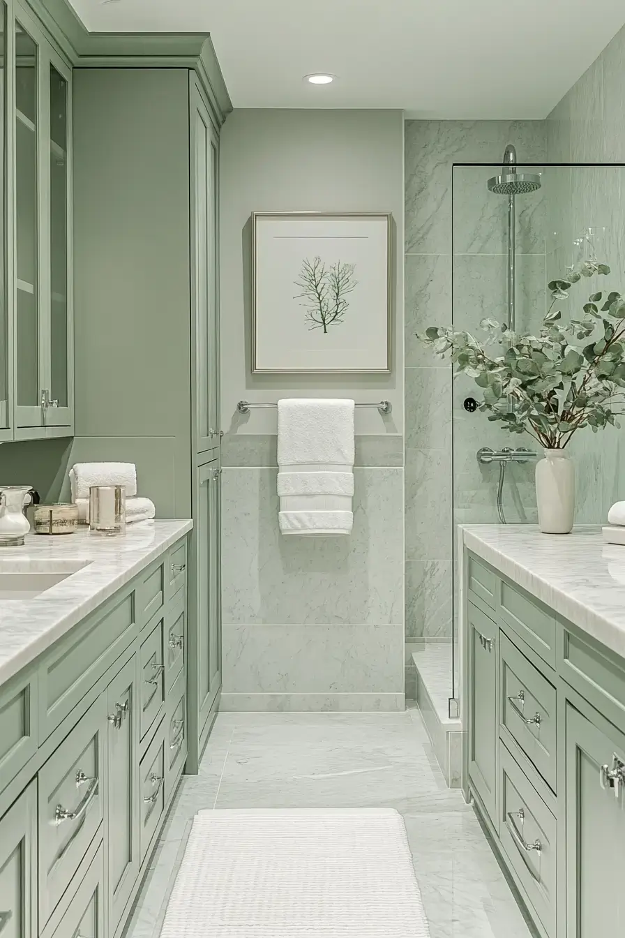
24. Sage Blends Beautifully Gray
\n
\n
Grey-green is the chameleon of the palette — reads sage in daylight, grey at night. That shift keeps the room feeling alive through the day. Clever and calm at once.
\n
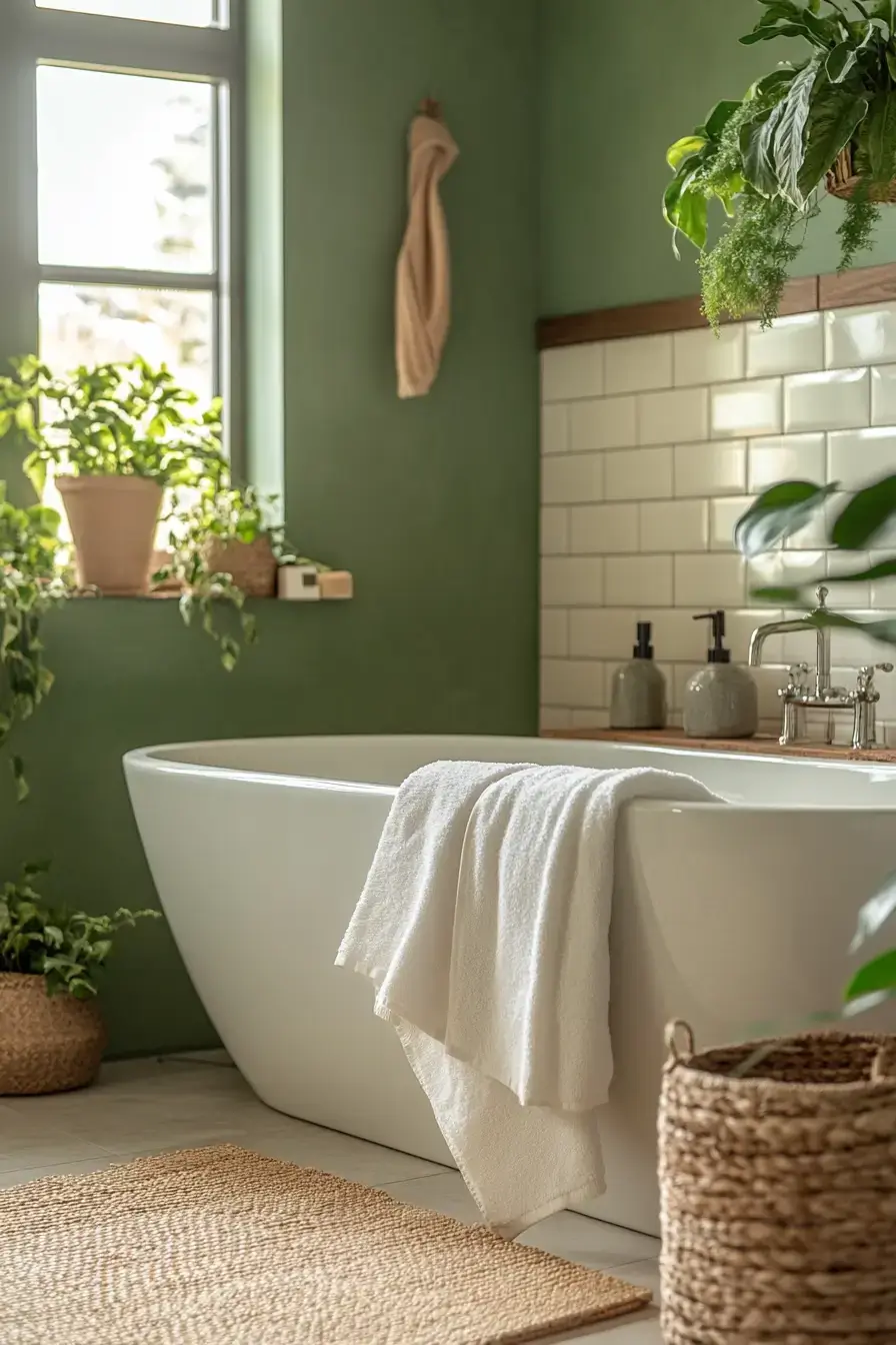
25. Soft Neutrals Soothe Naturally
\n
\n
Soft neutrals are the quiet backup singers to sage’s lead vocal. They let the green glow without competition and keep the mood soothing. Natural, never forced.
\n
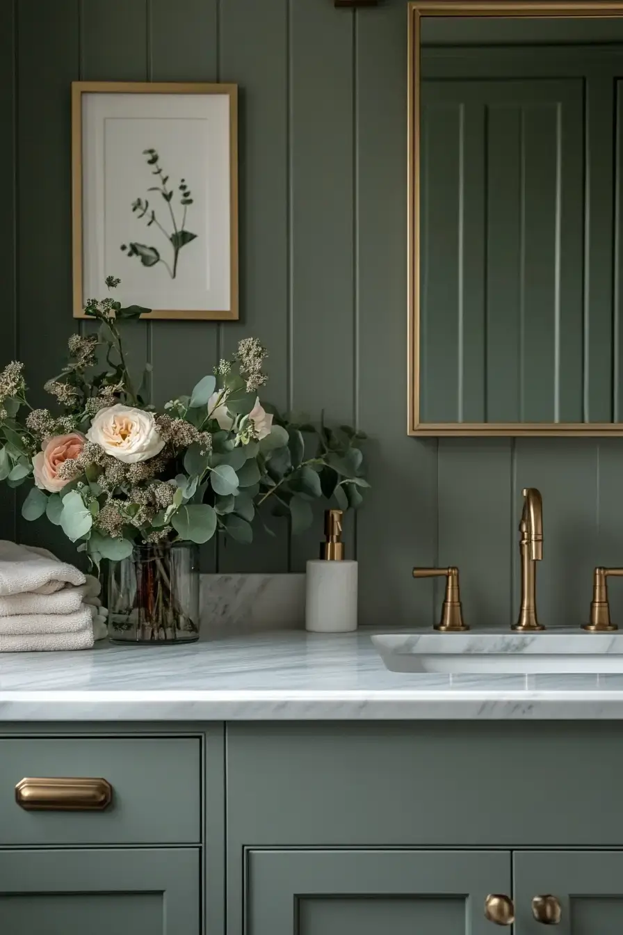
26. Brass Brings Warmth Beautifully
\n
\n
Brass is the secret weapon against cold green. A few warm-toned fixtures and suddenly the sage feels inviting instead of clinical. Spend your hardware budget here — it pays off.
\n
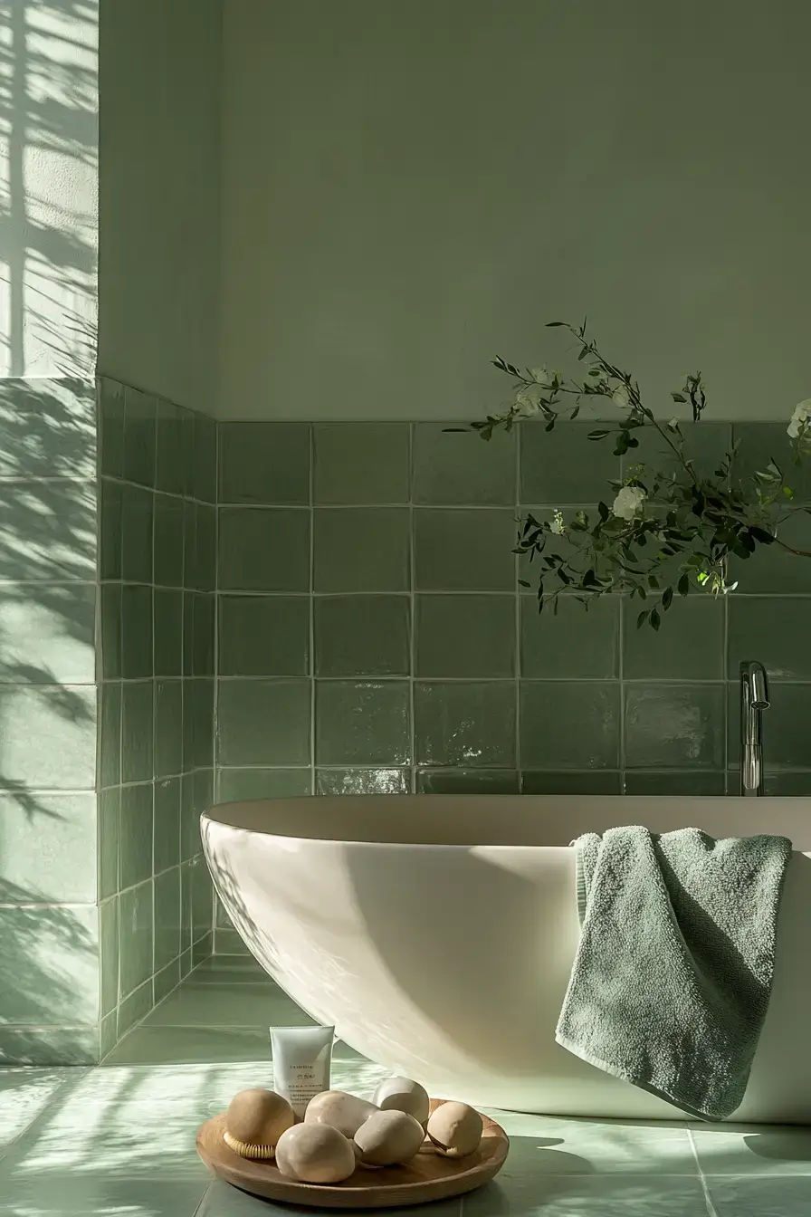
27. Modern Serenity Starts Here
\n
\n
Modern and serene usually fight; here they shake hands. Clean lines, calm color, zero fuss — this is serenity for people who like a tidy vanity. Starts with the green, ends with your shoulders dropping.
\n
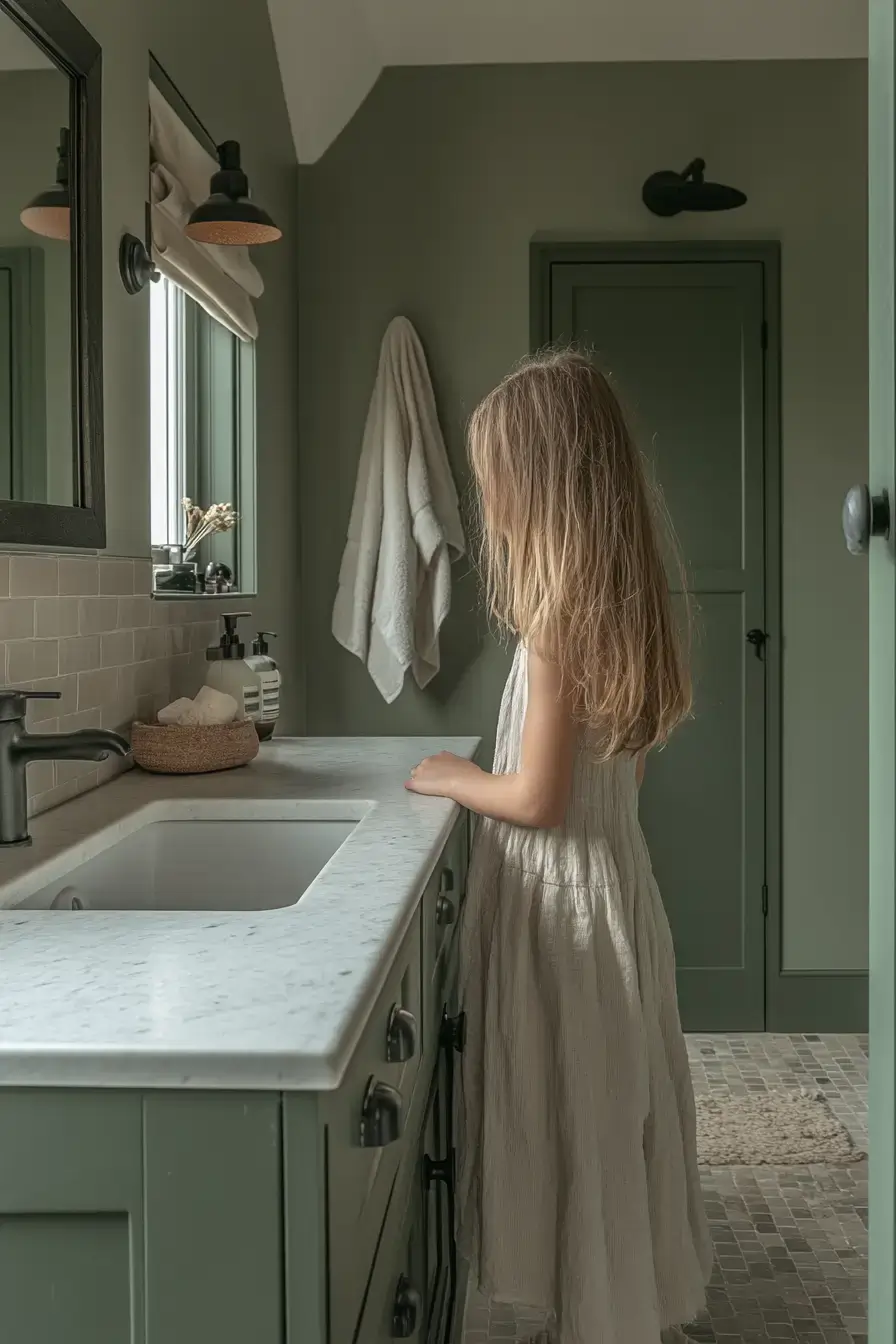
28. Monochrome Sage Makes Statements
\n
\n
Monochrome sage is bold in the sneakiest way — same color, different depths. The layering does the talking so you don’t need art or accents. A real statement without raising its voice.
\n
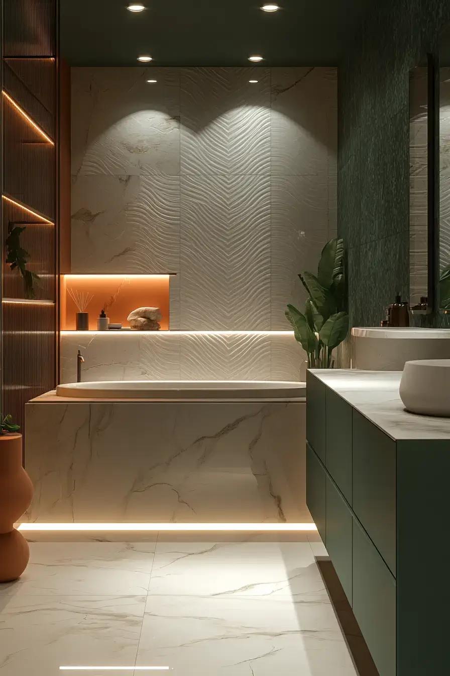
29. Marble Perfects Sage Elegance
\n
\n
Marble closes this list the way it should — as the finishing touch. A marble moment next to sage pulls the whole elegant story together. Perfect is a strong word, but here it earns it.
\n
Wrapping It Up
\n
So there you have it — 29 ways to make sage green feel quiet, warm, and actually lived-in. Pick the angle that matches your nerve level, from misty whispers to smoky statements, and run with it. Give it a shot — what’s your favorite? 🙂
Save this article
We’ll email you the link so you can find it again later.


